ESPN’s app brings the iconic sports channel to mobile devices. The app has performed well since its launch, with 291,625 ratings on the App Store and 505,437 on Google Play. What’s the secret to ESPN’s success? And is there anything they can do to further improve their user experience?
In this App Engagement Analysis, we’ll explore the elements that comprise ESPN’s in-app experience.
Signup & Onboarding
What ESPN Does Well
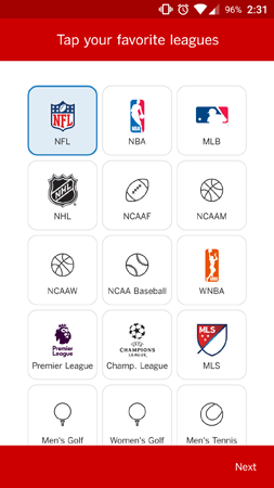
During the signup process, new users are asked to select their favorite leagues. This decision will filter content that’s displayed in the news feed.
It’s unlikely that users follow every league for every sport, so it makes sense to filter out irrelevant content as soon as possible. By placing this selection prompt in the onboarding process, ESPN ensures that in-app content is personalized right away.
One Way to Improve
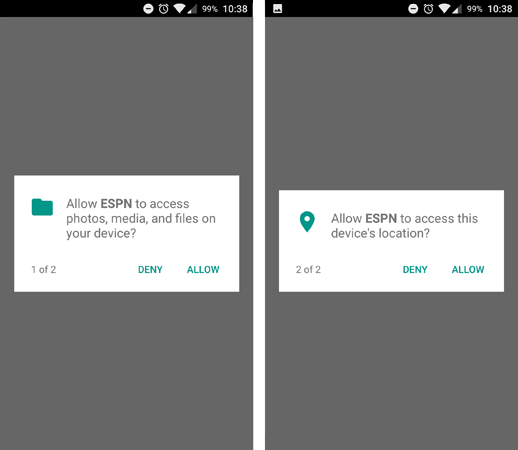
The favorite league prompt is a good addition to the onboarding flow, but it’s actually not the first step. On Android, the first prompt I saw upon launching the app was a generic permissions request for media and location.
As a rule of thumb, it’s better to delay permissions requests until the moment they’re needed. Well-timed requests have a much higher acceptance rate — Last Minute Travel actually lifted its push notification opt-ins by 182 percent after personalizing the prompt. If you give users a chance to explore the app, they’ll be more inclined to share their data.
Another factor to consider: Why does the app need these permissions? Most users probably ask themselves this question before tapping Allow.
Location is not too surprising here, because a sports app might want to deliver news about local teams. But the “photos, media, and files” request stands out. It’s not immediately obvious why the app needs access to local files.
App marketers should keep in mind that users will ask these questions. If the reason for the permission isn’t obvious, it helps to include an explanation alongside the system prompt.
News & Videos
What ESPN Does Well
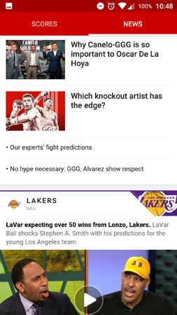
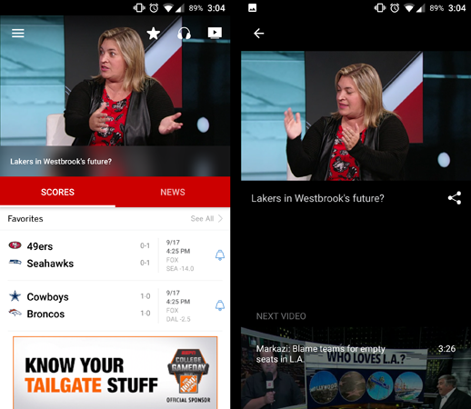
Once the onboarding is complete, users are dropped into the main news feed. This feed is generally well done. The layout consists of headlines, videos, teasers, and more. The layout’s variety makes it easier to browse, and it makes important pieces of content stand out.
Conveniently, videos are viewed in a pop-out player that doesn’t require loading a new screen (and losing your spot on the old screen). Articles are given their own dedicated screens, but the app still remembers your place on the news feed when you tap back.
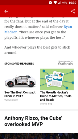
Internally, articles work much the same as on the web. At the bottom of each article, we find ads from a content aggregator and a link to the next article. One more vertical swipe will load the upcoming article, like a mobile app version of the web’s infinite scroll. This design keeps people reading, and it ensures that each article gives ESPN a few ad impressions.
One Way To Improve
Placing a video at the top of the home screen isn’t a bad idea in itself, but it’s unfortunate that it autoplays by default. Furthermore, tapping the video doesn’t immediately pause it; instead, the app brings you to the video player shown on the right while the video keeps playing. It takes another two taps to stop the video altogether.
There are many reasons why autoplay makes for poor UX, especially on mobile devices. If a user’s volume is up, autoplay could easily result in an untimely outburst on public transit or at school/work. And if the user just wants to browse headlines, it takes extra effort to pause the video before continuing.
Sometimes, app teams try to hook users by autoplaying videos at app launch. If it works, a single video could lead to a full browsing session, so it’s not always a bad decision. If your app team is committed to autoplay, ensure that the video can be paused with a single tap for the best UX.
Game & Player Details
What ESPN Does Well
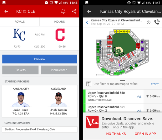
Tapping on a match (past or upcoming) brings up a detailed screen with information on the teams and venue. From here, it’s easy to explore the past games of each team and player.
ESPN wisely includes partner upsells here. The Tickets button brings you to a checkout screen on the Vivid Seats website. This is a good way for ESPN to add value for users and monetize its app without directly selling tickets. By linking to a partner, users enjoy more functionality in the ESPN app.
One Way To Improve
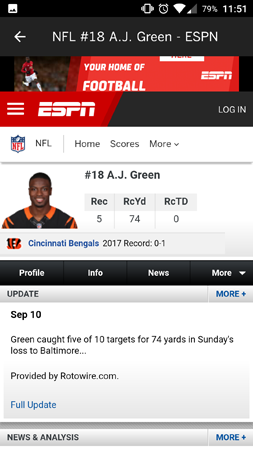
The pages for individual players are extremely detailed, with stats on each person’s performance history. The catch? These pages actually load from the ESPN website, not the app.
The ESPN app uses its own internal browser, so it’s not entirely obvious when you load external content. This leads to some confusion about how the app works. The website takes a bit longer to load than in-app content, and of course it requires an internet connection. Ideally, information like this would be browsable within the app.
If the app must link to external content, a courtesy alert could help. Even if there aren’t any security issues, users will likely feel more comfortable browsing the app if external links are distinct from internal. This would make the load times and different UI less jarring.
ESPN’s Mobile Engagement in Review
On the whole, ESPN’s mobile user experience is impressive. The app aggregates a plethora of news, media, and game data from several different leagues. It also integrates with external features like ticket purchases and the WatchESPN live stream player. With a few tweaks, ESPN could provide seamless access to all of its in-app content.
For more in the App Engagement Analysis series, check out our posts on the NBA app, NFL Mobile, Etsy, Airbnb, and Soundcloud.
—
Leanplum is the mobile marketing platform built for engagement. We help brands like NBC, Tinder, Grab, TED, and Zynga orchestrate multi-channel campaigns — from messaging to the in-app experience — all from a single, integrated platform. Schedule your personalized demo here.


