Ah, the social media newsfeed. A constant bombardment of endlessly addicting, yet mostly useless content from friends, your grandma, and a person you met once five years ago — all at the same time.
The Flipboard app exists to remove you from this chaos, curating digital media based on your personal interests, reading history, and in-app behavior. Content is displayed in a magazine-like format, and, this being the digital age, you simply have to flip up to see more.
Join us for the latest App Engagement Analysis in our ongoing series and learn how Flipboard is personalizing media for the new, distracted generation.
Onboarding
What Flipboard Does Well
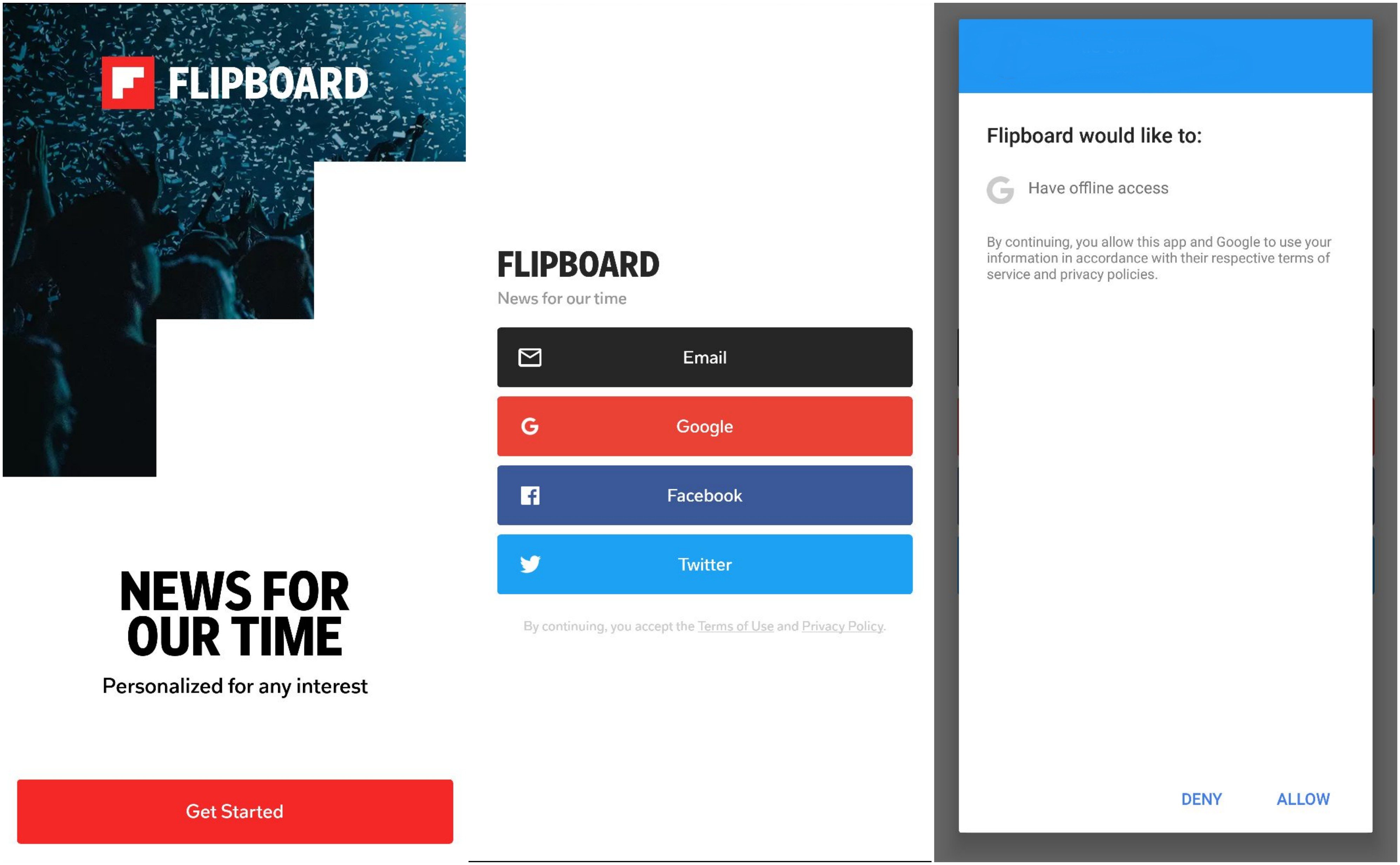
Upon visiting Flipboard for the first time, I am greeted by a welcome screen with a logo, a short value proposition explaining the app’s purpose, and a CTA button. Its simplicity is effective — I have an idea of what the app has in store for me, and it is clear how to move forward in the onboarding process.
I click “Get Started” and am prompted to create an account. Since the entire premise of Flipboard is smart, personalized content, registering this early on makes sense. Without an account to track usage history, sophisticated personalization is impossible.
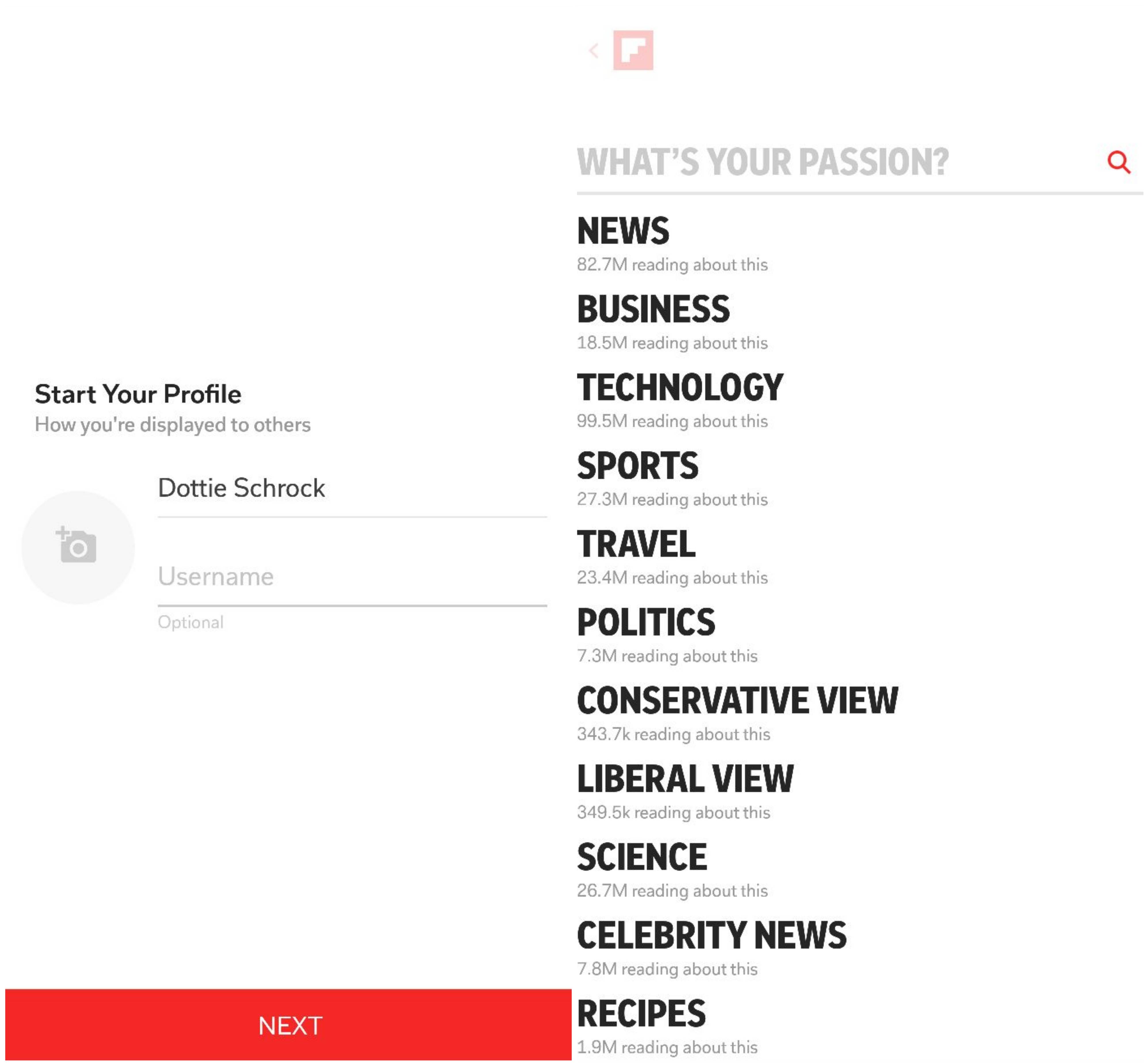
I choose to sign up with Google, and am immediately asked for offline access. After some hesitation (why is this needed from me?), I click “Allow” and am ushered forward to start my profile. Once I fill in my full name and username, the app gets deep with me and inquires about my passions.
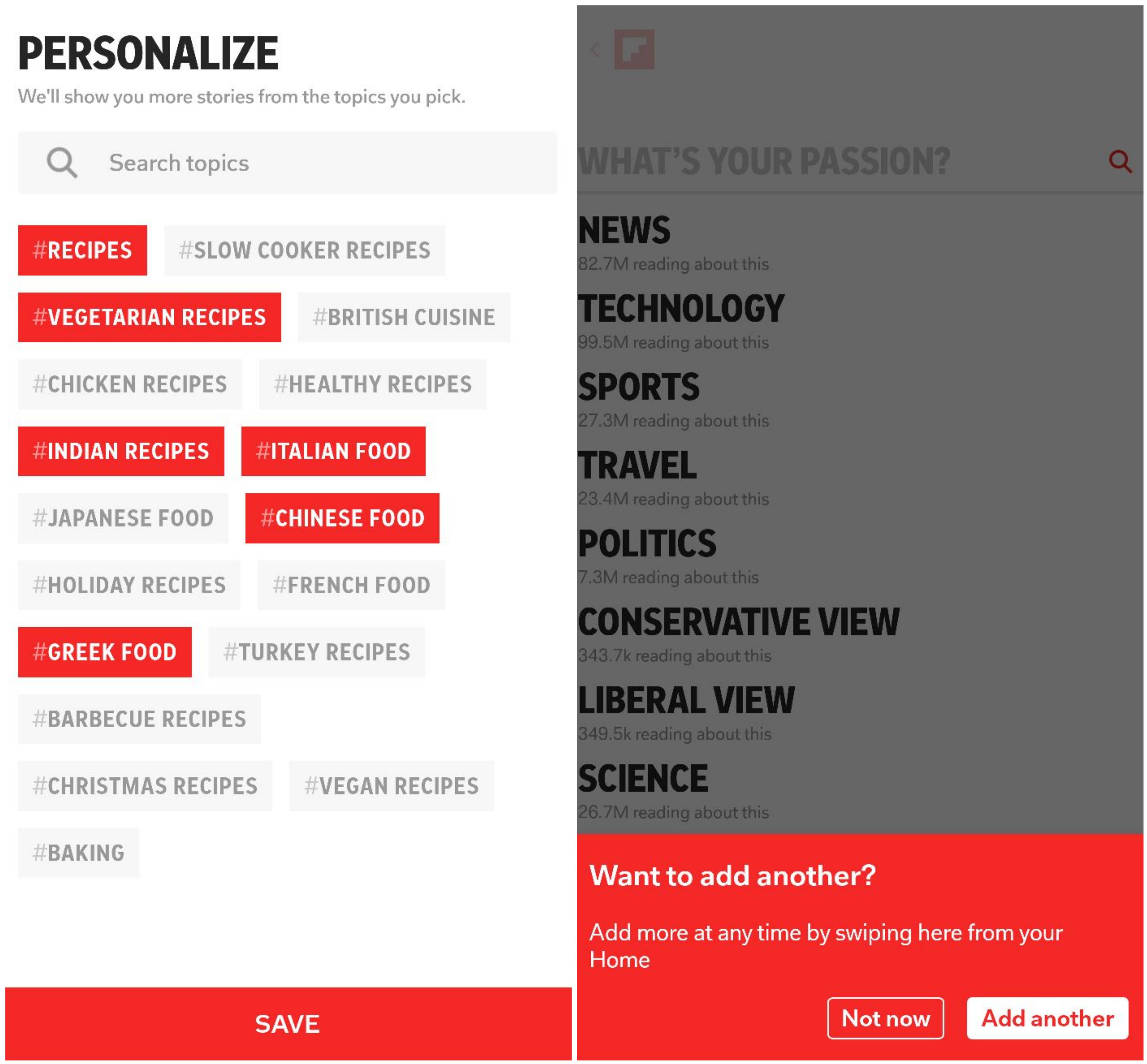
I am passionate about eating, so I move forward with “Recipes.” The app then provides distilled subtopics for me to choose from: Chinese, Indian, Italian, vegan, etc.
I save my choices, and a small pop-up lets me know that I can add more interests by clicking the displayed CTA, or by swiping the “What’s Your Passion?” tab in the app. The app then drops me directly into a personalized homepage.
What Flipboard Can Improve
In general, users must opt into push notifications or data sharing to squeeze the most value out of an app. Doing so also increases chances of long-term user engagement and retention — arguably the most important mobile conversion metrics. Thus, asking for permissions is a critical moment in the user experience.
I may have been more susceptible to Flipboard’s request for offline access if I had more time to explore the app. Looking into the future, Flipboard could kick it up a notch by optimizing its opt-in request time to catch users at a moment of engagement.
Flipping
What Flipboard Does Well
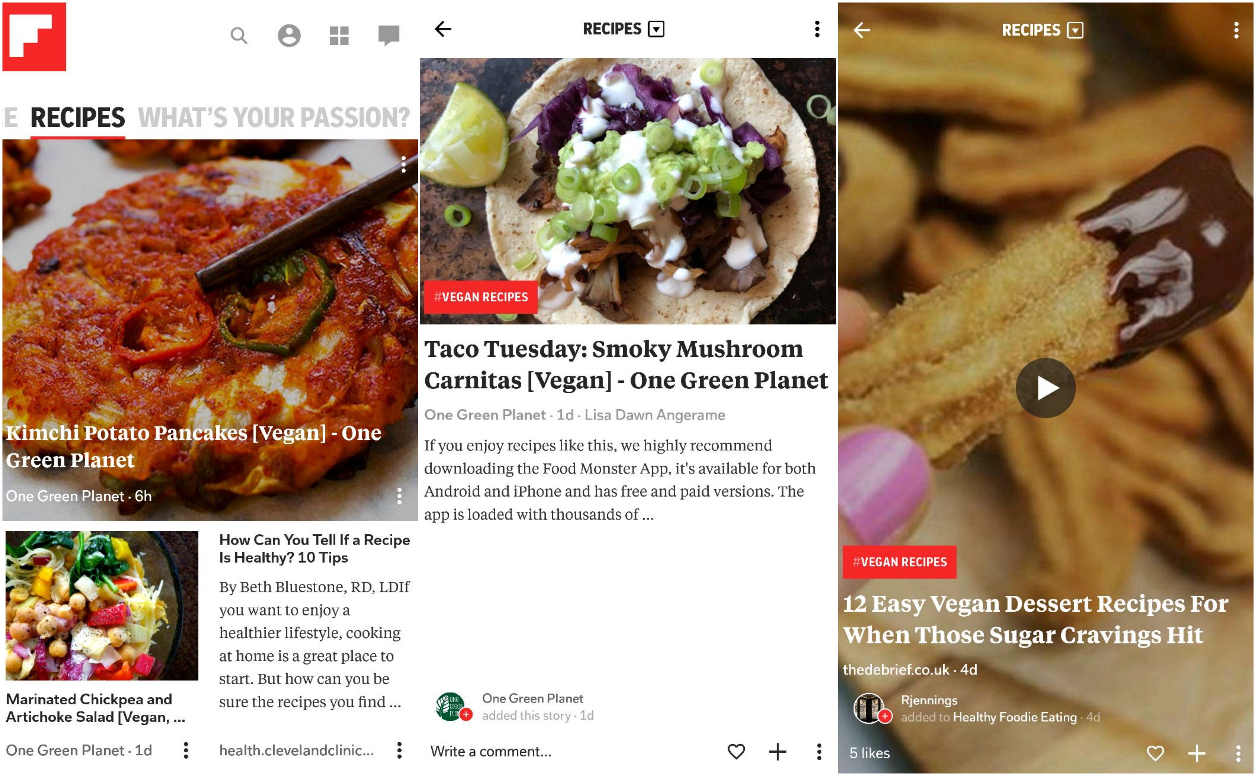
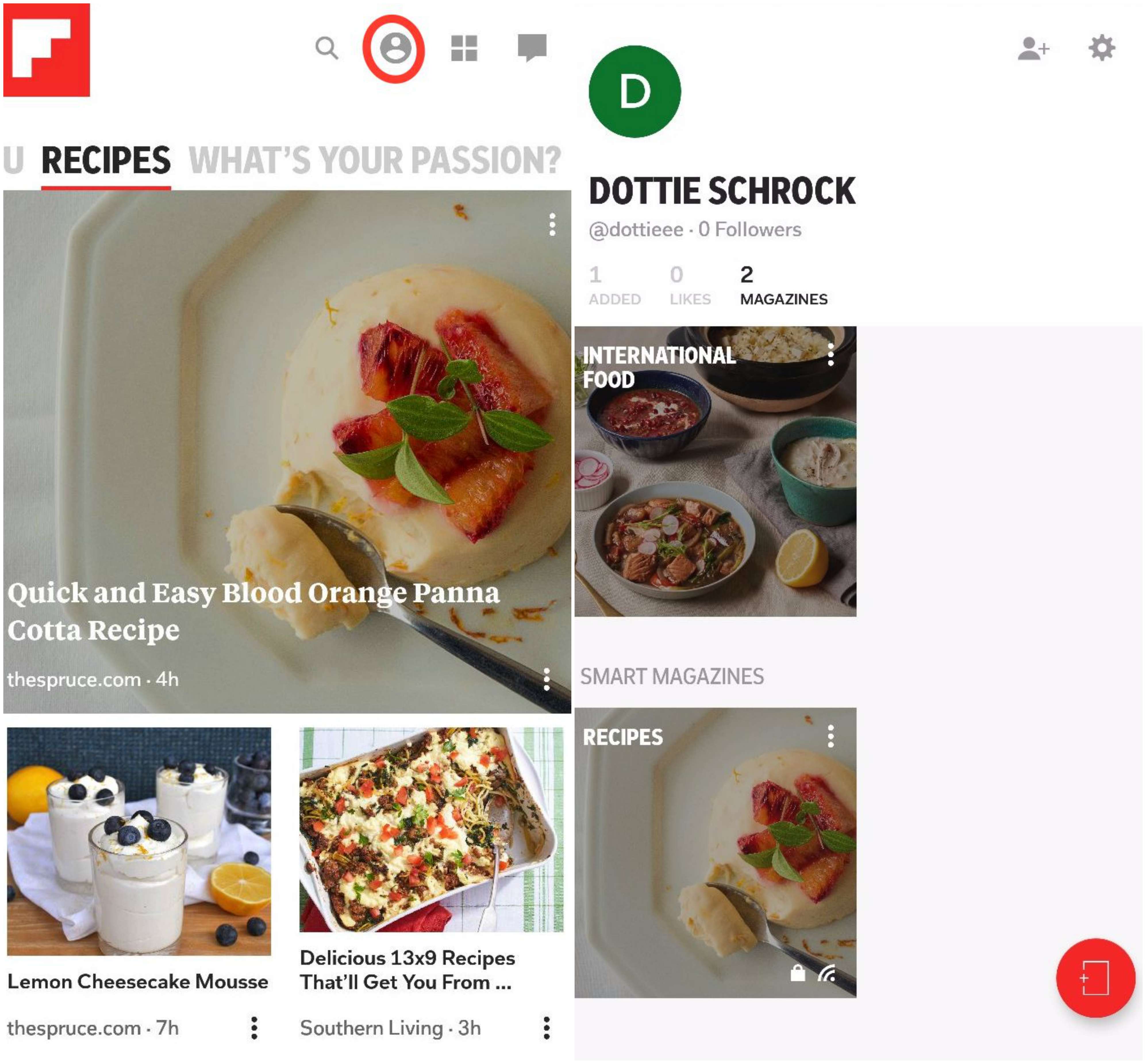
On my personalized homepage, what Flipboard calls “smart magazines” (created based on my passions) have been organized into tabs. There is a “For You” magazine that the app defaults to, as well as a “Recipes” magazine and the “What’s Your Passion” tab. These magazines will get more sophisticated with time as my reading habits and in-app activity are tracked. It is like a Spotify “Discover Weekly” playlist, but for news, blog posts, and other media.
When I click on “Recipes”, Flipboard displays food-related content it has pulled for me and I can easily swipe up (or flip!) until I find something I like.
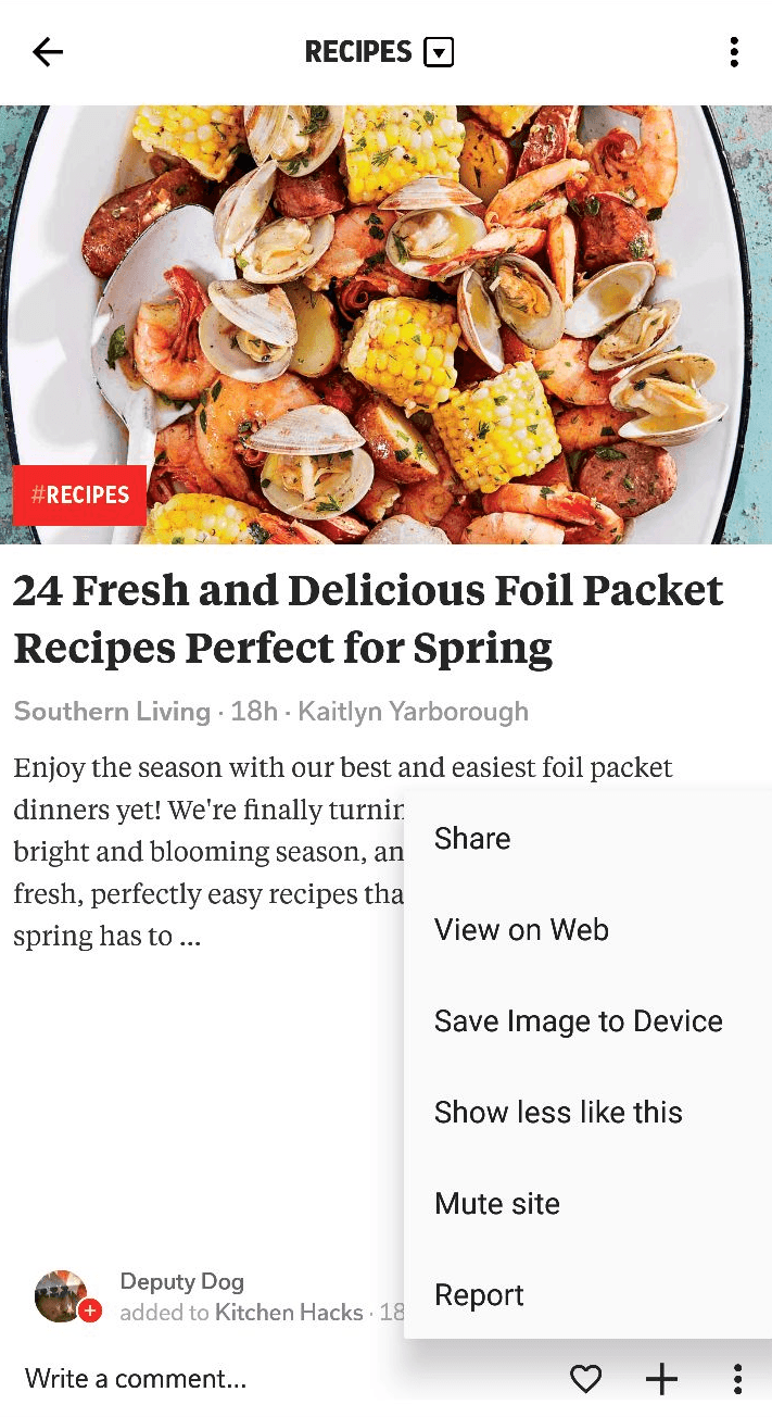
Towards the bottom of each flippable story, there are three icons. The ❤allows you to favorite content, the + lets you add the story to your own magazine (more on this later), and the ⋮ brings up a dropdown list with the options to share the piece, view it on web, save the image, or show less similar content. It is a handy menu that shows Flipboard’s dedication to mastering personalization for each user.
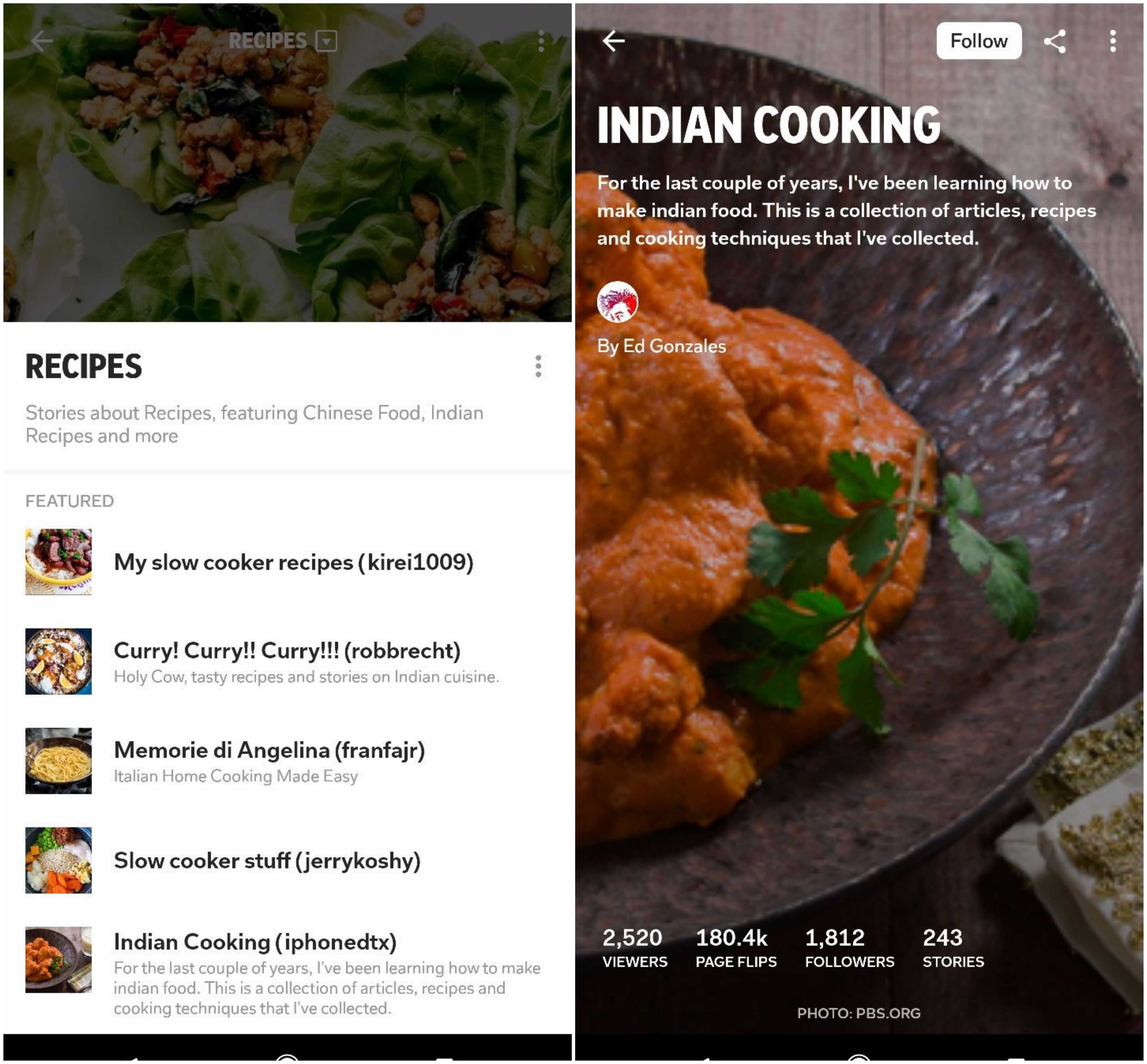
At the top of the page, a downward arrow next to “Recipes” shows magazines compiled by other users when clicked. From here, I can follow magazines I like, as well as users whose interests align with my own.
What Flipboard Can Improve
For a new user coming in without any knowledge of Flipboard or its features (me!), swiping up for individual articles did not come intuitively. Keeping less tech-savvy users and new users in mind, Flipboard could incorporate a short tutorial covering key features and functionalities right into the onboarding process. Another option is sending dynamic in-app messages or push notifications to educate new users throughout their first-time experience.
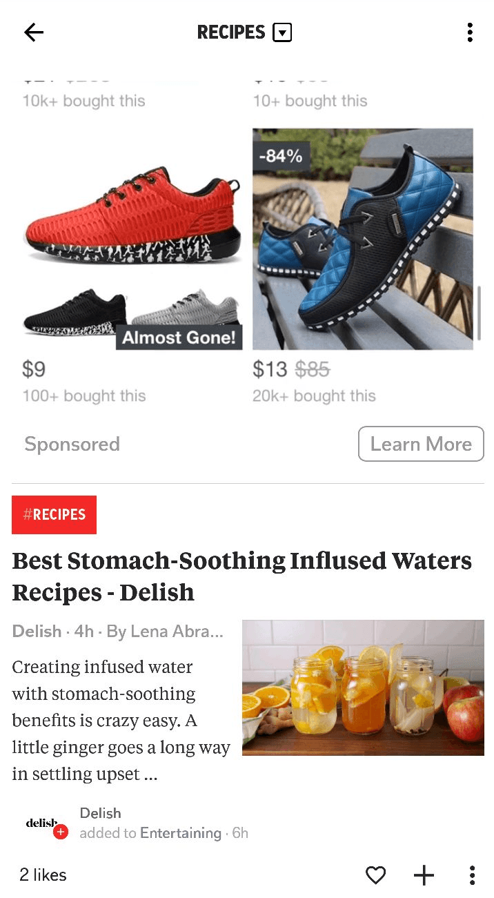
During flipping, I also noticed off-topic advertising embedded into my stories. At one point, I was pushed shoes alongside an article about stomach-soothing infused waters in my “Recipes” magazine.
While monetizing an app is difficult, and free apps have to take what they can get at times, I can’t help but feel that Flipboard could have pulled more relevant ads. In my case, food product or appliance advertisements would have made much more sense.
Personalized Magazines
What Flipboard Does Well
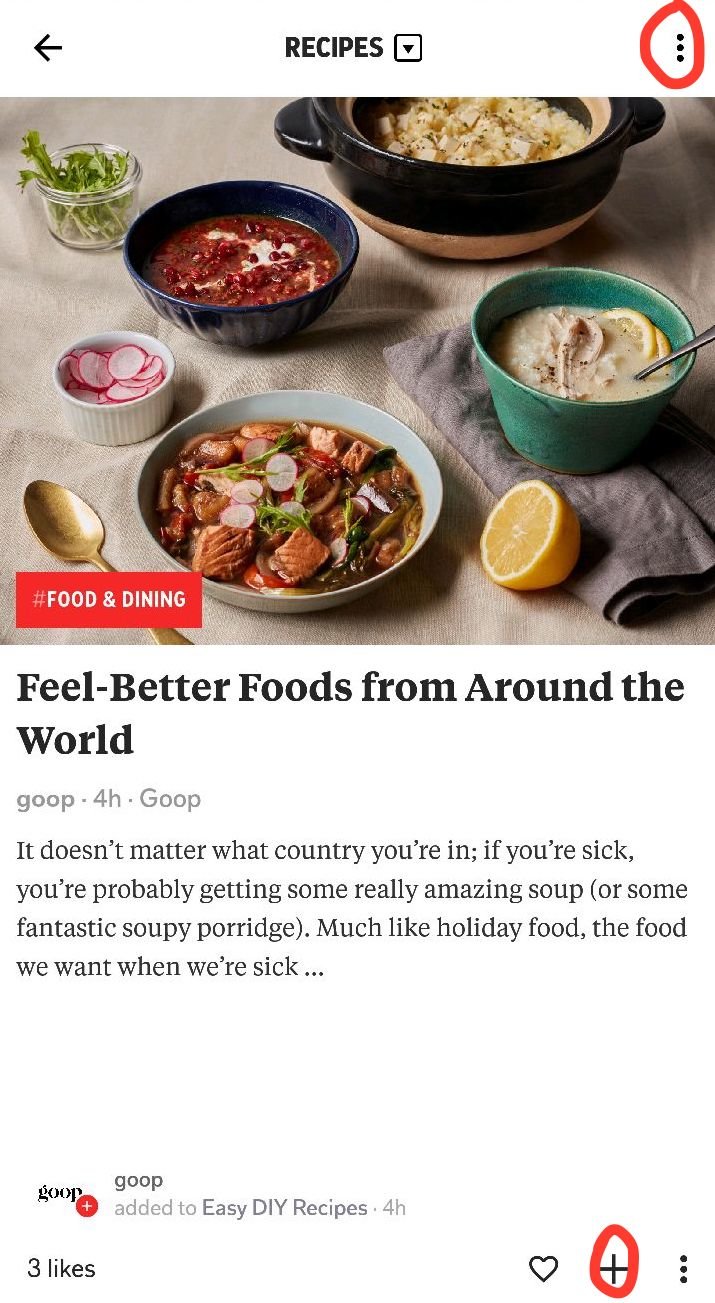
Flipboard users can manually create their own magazines and fill them with content they love. The process is simple. Visit a “smart magazine” from your home feed and begin flipping. Once you come across a story you want to save for later, click on the + sign on the bottom right corner of the page, or on the ⋮ symbol at the top right corner of the page.
After flipping through some recipes, I find a post from Gwyneth Paltrow’s lifestyle blog, Goop, that seems intriguing. I tap the + sign, name my magazine “International Foods,” and add my first story.
To access any magazines I create now and in the future, I can click the profile icon on the app homepage. From here, all my magazines are organized on a visual tile grid.
What Flipboard Can Improve
Similar to my feedback above for flipping, it is not immediately obvious to new users that they can create their own magazines. To call attention to this key functionality, Flipboard could include it in a short tutorial (as discussed earlier), or with dynamic in-app messages throughout the first time user experience. It is worth testing to see if any changes in user engagement occur.
Another strategy is leveraging cross-channel messaging as part of a comprehensive lifecycle campaign. After users have familiarized themselves with adding passions and flipping through stories, Flipboard could reach out via push notifications or email and introduce more features. For example, the day after a user first downloads and tinkers with the app, a friendly push notification (“Now that you’ve mastered the basics, let’s create your own magazine!) may just bring them back. Similar messages can be distributed on other channels throughout the customer lifecycle to continuously re-engage users.
Additional Features
What Flipboard Does Well
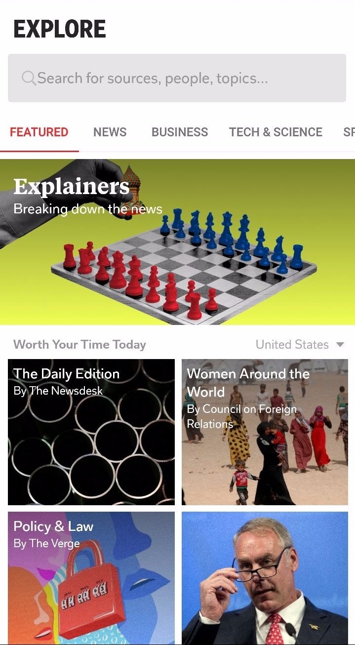
On top of personalized content, Flipboard has a search page where users can find articles based on keywords and interests such as news, business, tech and science, sports, and more. This feature allows users to stay in-app if they want to look for something specific rather than just flip for fun — a very good strategy for increasing app engagement!
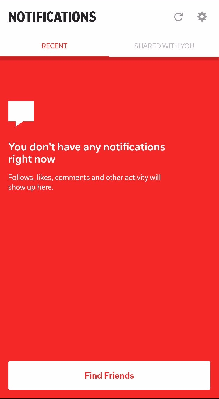
Flipboard also incorporates features commonly seen in social media platforms. Users can follow one another, as well as magazines curated by individuals. A notification feed keeps you updated whenever a new follower is gained, or if someone likes or comments on your magazines. Another feed pings you when users share stories with you. The difference from traditional social media? All content is fully personalized, and comes from people you are actually interested in — no news about potholes in Uncle Freddy’s suburban neighborhood here.
What Flipboard Can Improve
There are no functional issues with Flipboard’s additional features. But, following a common theme, they are once again unintuitive. It took some deep digging for me to figure out everything, and I consider myself a modern, tech-savvy gal. On this note, a tutorial please, Flipboard, a tutorial!
If Flipboard is unsure whether or not this measure will be effective, A/B testing with set audiences prior to launching is a great way to avoid faux pas. By experimenting every step of the way, experienced users won’t get annoyed by unwelcome change, and new users will have a clear roadmap of how to use the app.
Flipboard App Engagement
The Flipboard app was developed as a solution for modern media consumers, who more often than not are overwhelmed by the smorgasbord of headlines coming from all directions. While the app could invest in better educating first-time users about unique features and functionalities, it is overall an innovative (and fun) approach to organizing digital content.
For more in our ever-growing list of App Engagement Analyses, see our articles on Trulia, Delta, and Southwest.
—
Leanplum is the mobile marketing platform built for engagement. We help brands like Tinder, Grab, Tesco, and Zynga orchestrate multi-channel campaigns — from messaging to the in-app experience — all from a single, integrated platform. Schedule your personalized demo here.


