Snapchat has been all over the media lately.
Earlier in 2018, Kylie Jenner erased $1.3 billion of Snap’s market value with a single Tweet about Snapchat’s publicly scorned UX redesign efforts.
Just last week, the app came under fire for featuring a tone-deaf ad featuring Rihanna and Chris Brown. The oversight caused Snap’s market value to drop another $800 million.
What’s all the fuss about, Snapchat?
Join us for our App Engagement Analysis of this notorious A.P.P. We’ll be diving into the first-time user experience, quirky filters, and a game-changing new feature that gives a window into the lives of Snapchat users around the world.
Let’s see if that redesign really is as bad as it is rumored to be.
Onboarding
What Snapchat Does Well
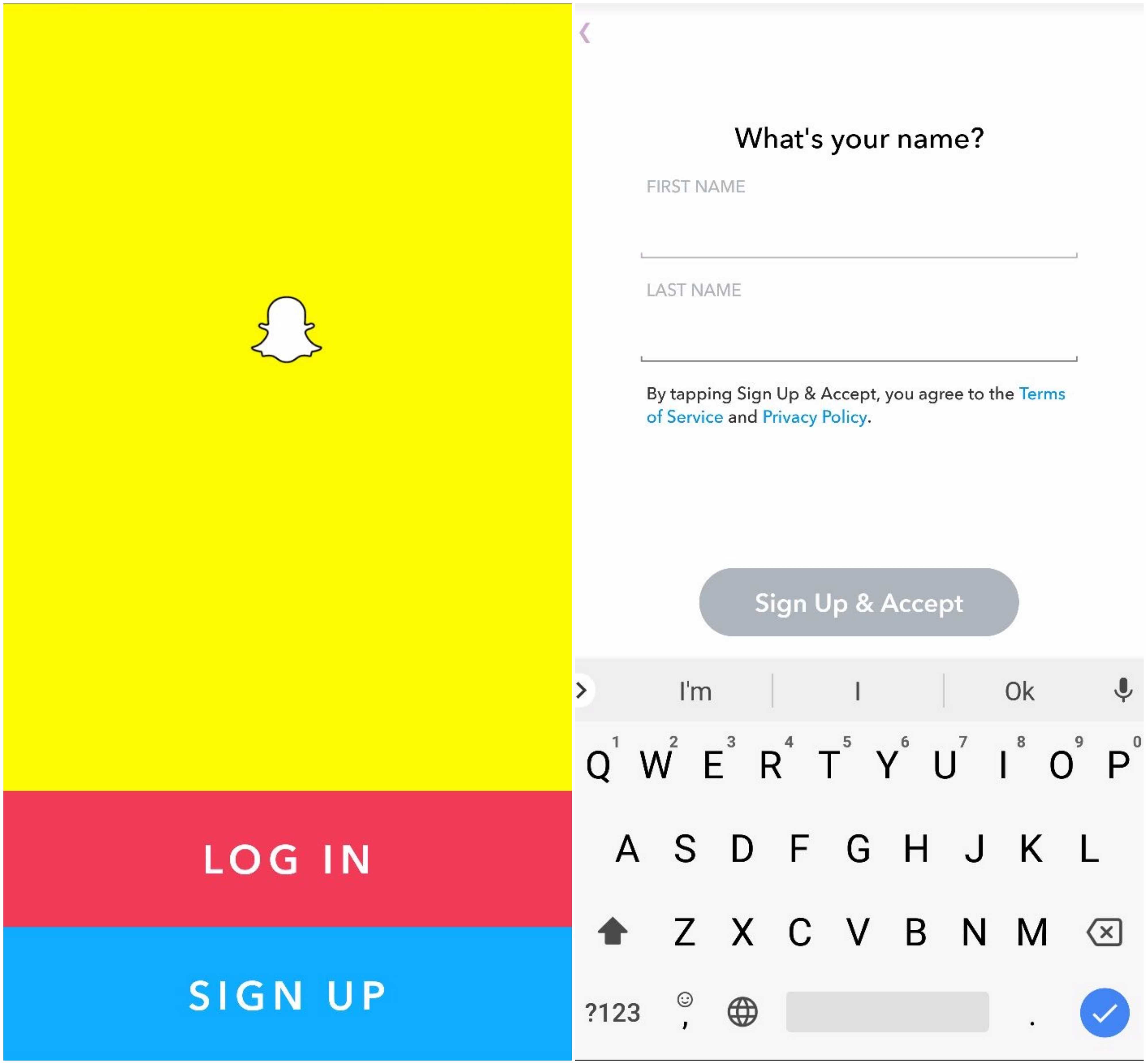
As soon as I open Snapchat for the first time, I am greeted by a branded landing page and the option to log in or sign up. I choose to register and fill in my name, birthday, a new username, and password. Nothing too controversial yet.
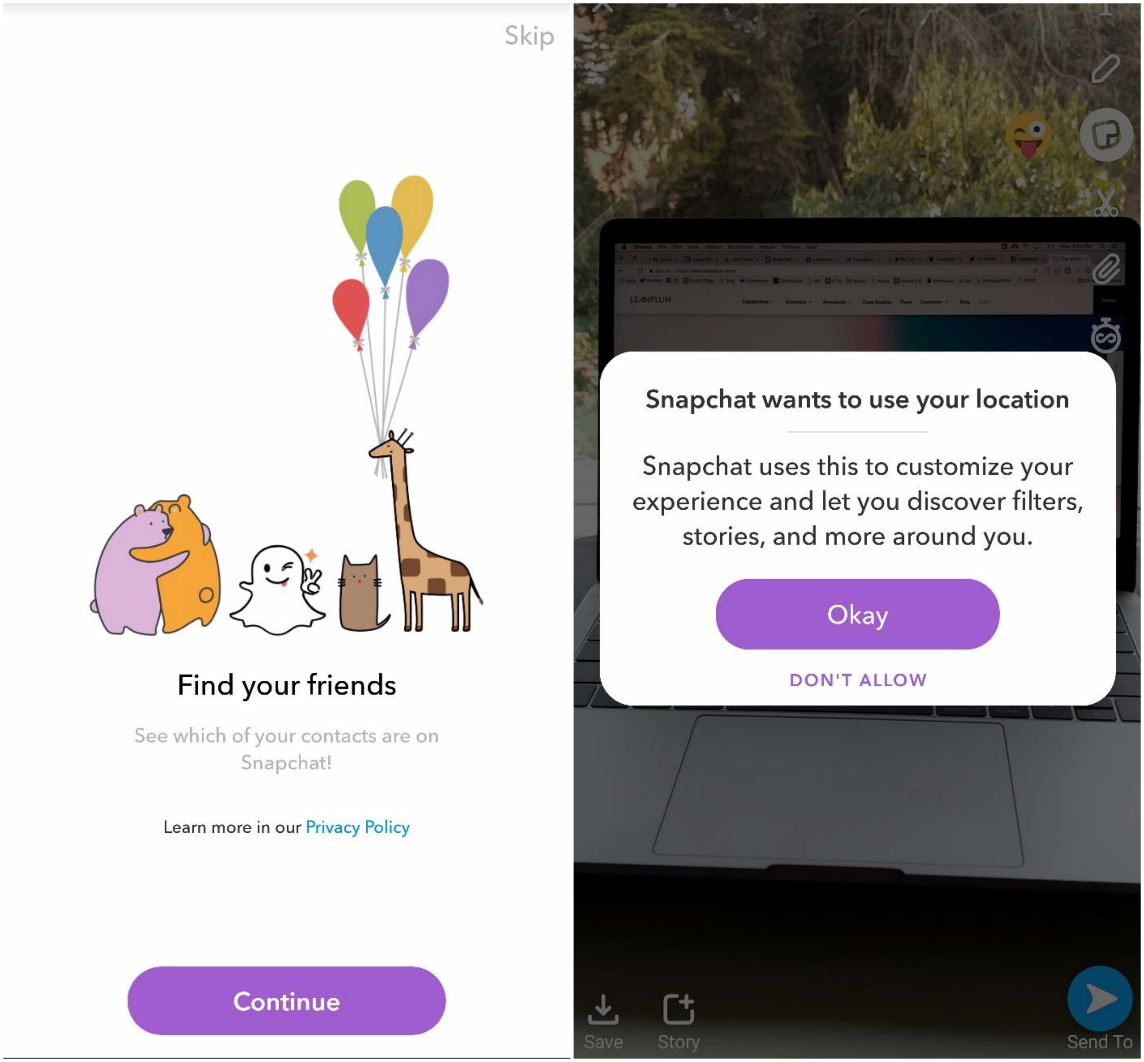
Snapchat then invites me to add friends from my phone’s contact list. I pass and am dropped directly into Snapchat’s camera view. From here, I can immediately begin snapping photos and videos for sharing.
I decide to take a test photo and am promptly asked for access to my location. The request is timely and well explained — I am told that by opting in, I can gain access to local filters and Stories. The entire onboarding flow was intuitive and did exactly what it was supposed to do: move users forward into the heart of the app.
What Snapchat Can Improve
Snapchat has been known for its unintuitive UX even before the uproar caused by its redesign. There are no tutorials, and many fun features are either learned by accident or from a friend who discovered it first. There have even been arguments that Snapchat intentionally made itself difficult to use with the goal of increasing word of mouth.
Whatever the reason, even the most tech-savvy users need instructions every so often. To lend a hand, Snapchat could try a multi-channel onboarding strategy that incorporates in-app messages, push notifications, and email. For example, the first time a user logs in, the app could send a string of in-app messages that explain navigation and useful features. If a user taps out of the tutorial, Snapchat could then send reminders via push notifications with deep links so they can pick up where they left off. New users may also find emails including tips and tricks helpful.
If done right, this initiative would result in more return visits — an important app conversion metric.
Snapchat App UX
Basic In-App Commands
As mentioned above, Snapchat does not put any meaningful effort into educating its users. Thus, I set out to explore this unchartered territory on my own. Here is what I learned:
📷 Default Camera View: Snapchat’s default screen is its camera view, where you can take photos and videos (called Snaps and Stories) to send to your friends. Whenever you open the Snapchat app, this screen is what pops up.
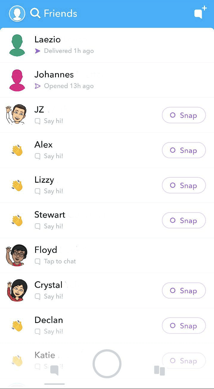
👈 Swiping Left: Swiping left (from the default camera screen) leads you to your friends’ list. From here, you can watch Snaps and Stories, as well as send private messages.
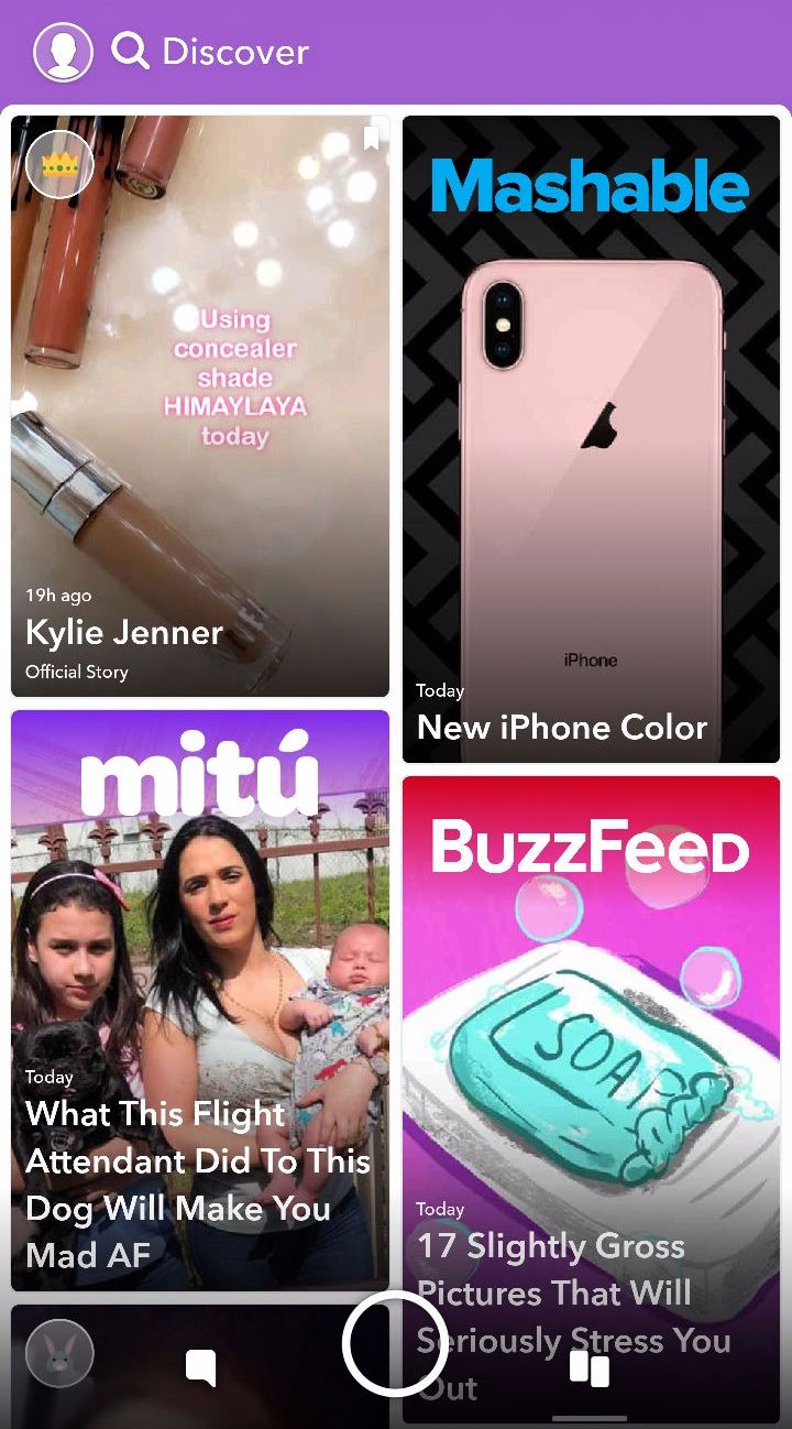
👉 Swiping Right: Swiping right leads to the Discover page, where you can see curated content from publications, creators, and celebrities.
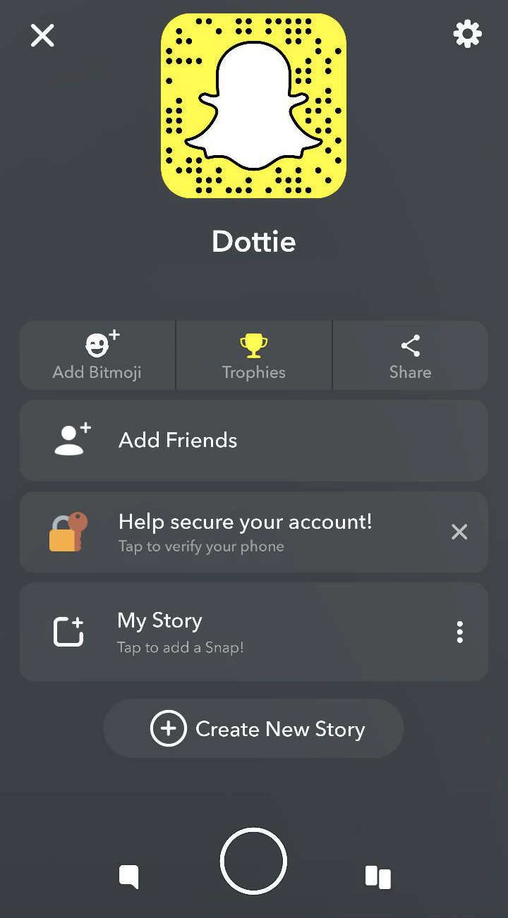
☝ Swiping Up: Swiping up leads to your profile page. Personal settings such as your Bitmoji and profile picture can be toggled with here.
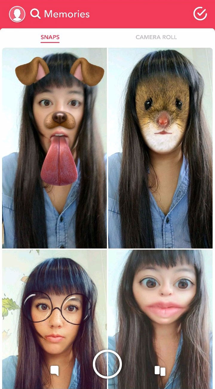
👇 Swiping Down: Swiping down leads to a “Memories” page. This is where any Snaps and Stories you save will live.
What Snapchat Can Improve
An interactive in-app tutorial of commands throughout the first-time user experience would be very helpful in getting a hang of the app. For example, Snapchat could place moving arrows in each direction (accompanied by explanatory text) within the default camera view so users can avoid any confusion.
Prior to launching, an A/B test could determine how engagement will be impacted by this addition. This way, Snapchat can be sure that new users benefit from the efforts without existing users getting annoyed.
Creating Snaps & Stories
What Snapchat Does Well
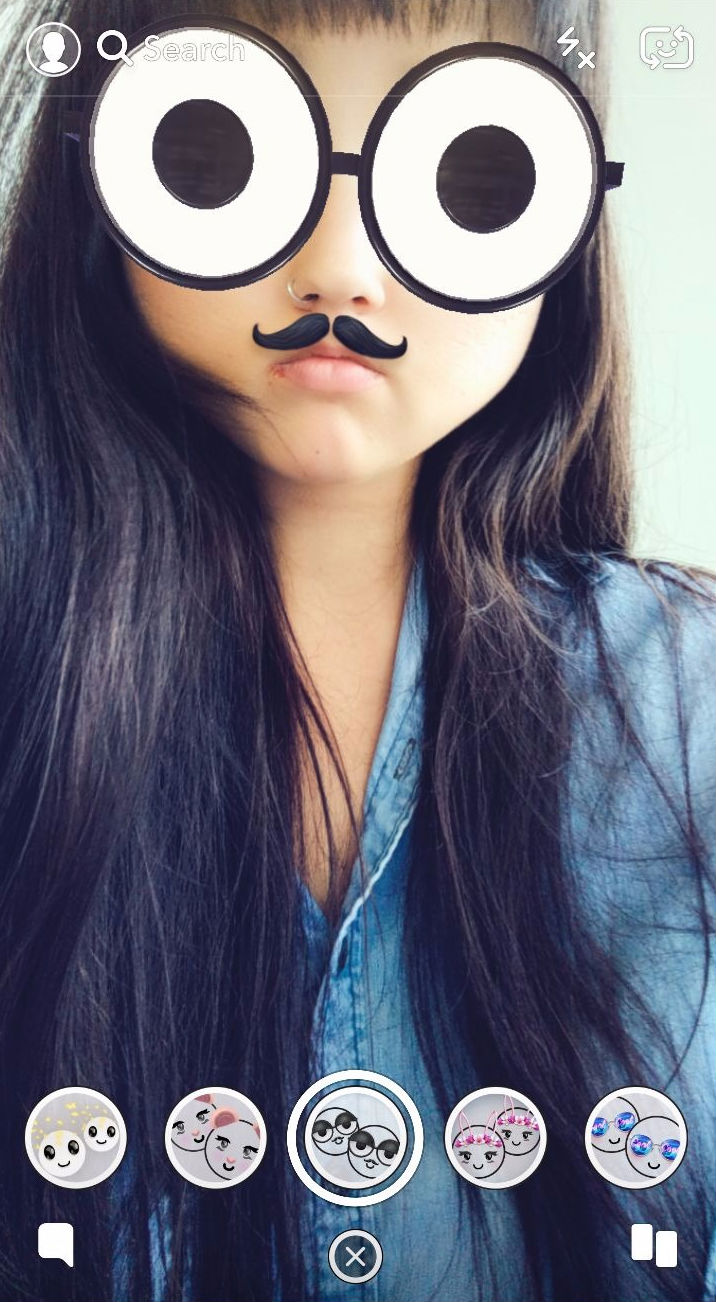
Snapchat filters are fun. Like, super fun.
To use a filter, tap your finger anywhere on the app’s default camera view. You can then try out a myriad of options on the menu that pops up.
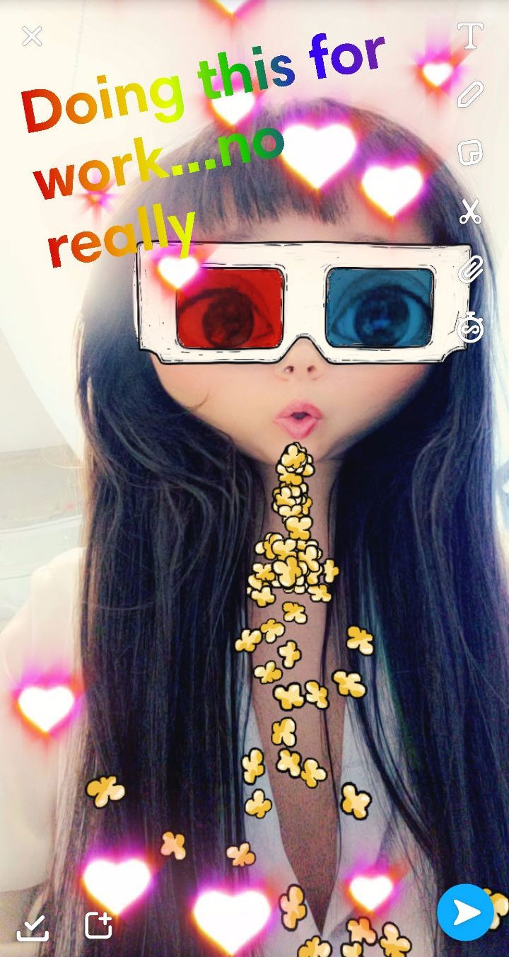
Once you take a Snap or Story, another menu appears towards the top right of the screen. From there, you can add backdrops, emoji, text, sparkles, color swaths, and whatever else you may desire.
When you finish expressing yourself, simply tap the right-hand arrow at the bottom corner of the screen, choose which friend (or friends) you want to witness your masterpiece, and send it off into the digital vortex.
On the new version of Snapchat, you can take up to 60 seconds of video at a time (the previous limit was 10 seconds). Once recorded, the footage is segmented into 10-second loops for editing. However, it will play for the full time when viewed.
What Snapchat Can Improve
I did not find any issues with the Snap and Stories creator. Filters and other editing tools are arguably the app’s claim to fame (they are, in my opinion, better quality than many of Instagram Stories’ offerings), and I found myself playing with them for longer than I’m willing to admit.
Definitely a highlight of the Snapchat user experience!
Friends List & Story Feed
Snapchat’s Updates
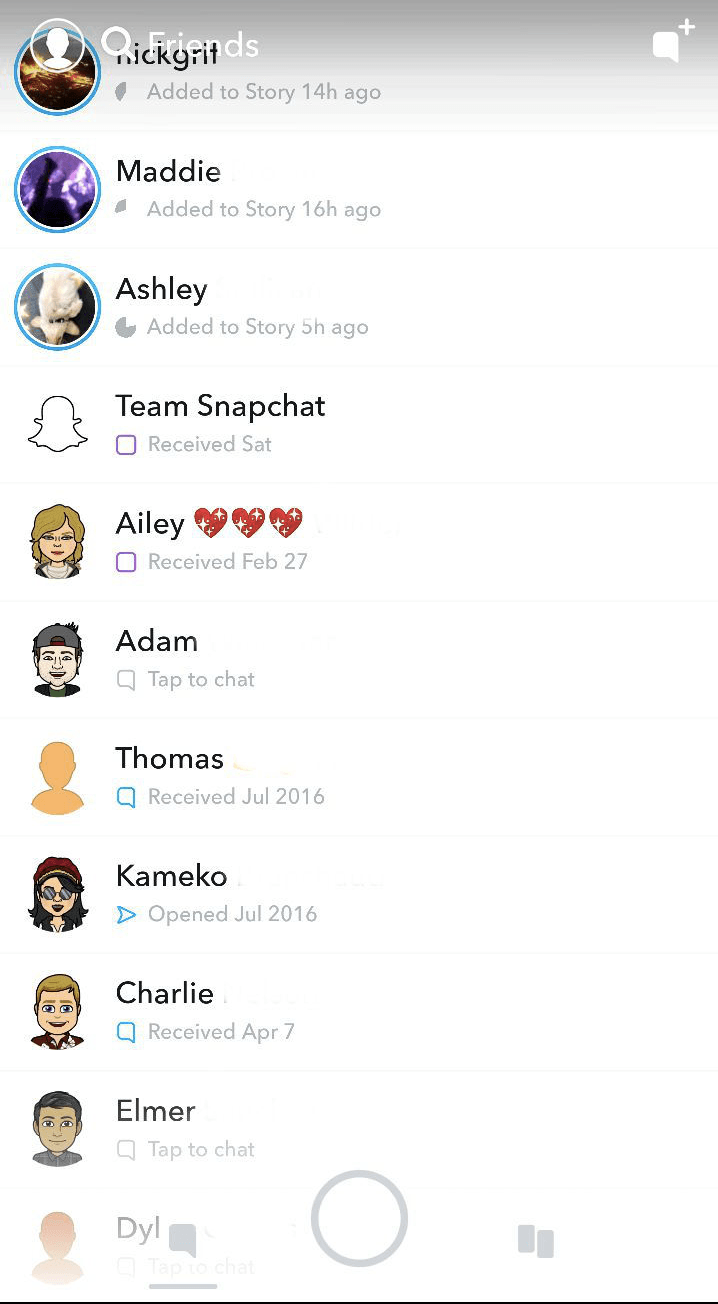
The friends’ list (accessed by swiping left on the default camera view) is where you can watch Stories and view inbox messages from other Snapchat users. In the older version of Snapchat, these feeds were completely separate. The content was also displayed chronologically.
In the new version, content that an algorithm thinks you will be interested in is pushed to the top — much like how other major social media apps display content.
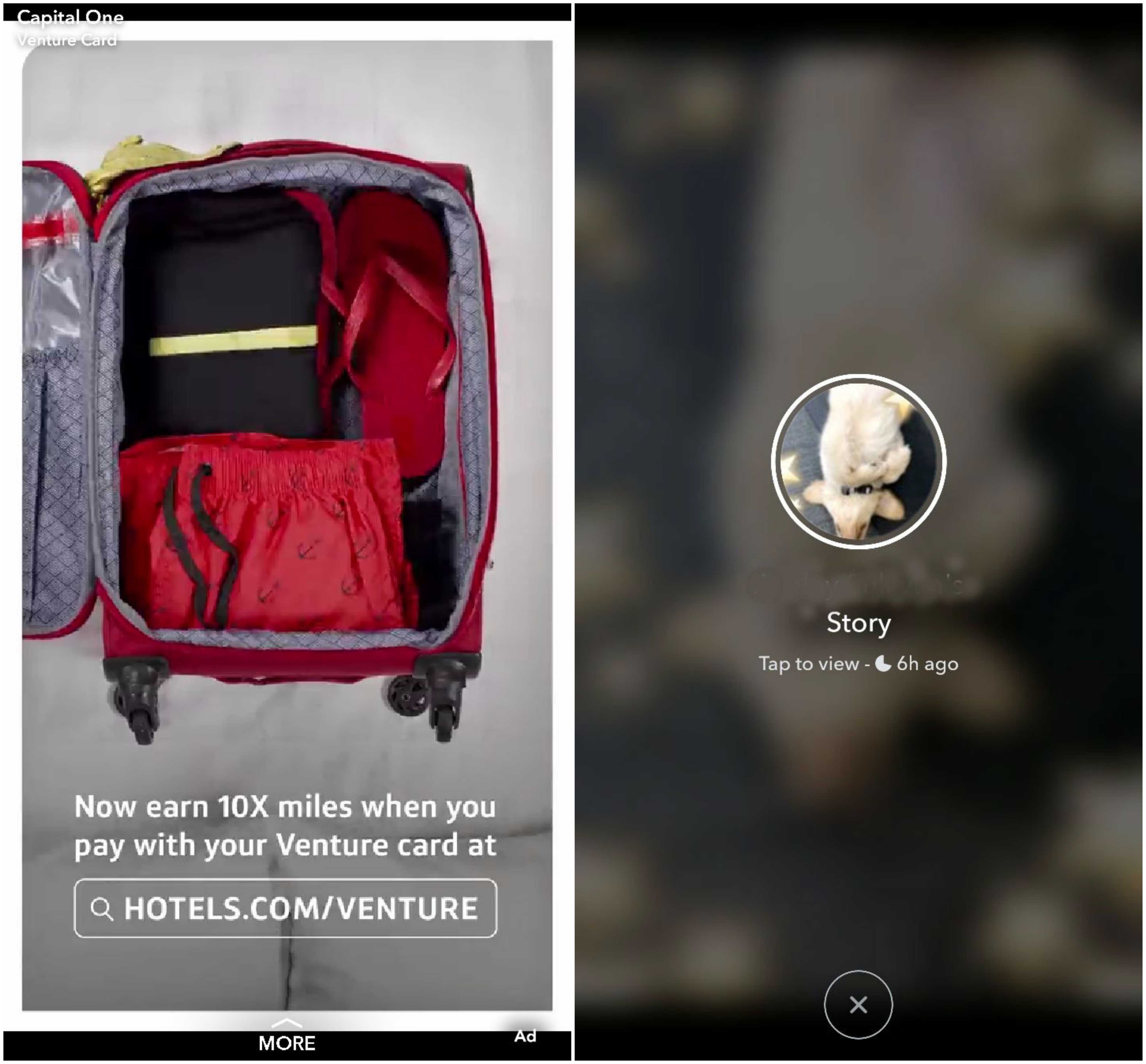
If a friend posts a new Story, you will see a circular preview button next to their name. Simply tap it to begin watching. After you finish, Snapchat will first show an ad, then a preview of another friend’s Story. Tap the preview screen to continue watching, swipe to skip, or swipe down to exit.
It is important to keep in mind that not all unwatched Stories will populate at the top of your friend’s list. You may have to scroll down quite a bit to see everything you’ve missed since your last log in.
To rewatch a friend’s Story, you’ll have found them via the app’s search bar, then tap the bitmoji icon towards the left of their name. Not the easiest process, but it gets the job done.
What Snapchat Can Improve
Changes in the app inbox and Story feed are some of the primary complaints from long-time Snapchat users. To be honest, I see where they’re coming from. Here are some reasons why:
- Scrolling down to find unwatched Stories instead of immediately seeing them available makes it hard to engage with new content.
- The new Story preview page is an unnecessary extra step that interrupts a smooth viewing experience. The frequent ads in between Stories are even worse. These changes actively break a user’s engagement with what was previously one of Snapchat’s most addictive functionalities — a steady stream of video that you could effortlessly zone out on.
- Rewatching a story has become very complicated. In the previous version of the app, you could simply retap your friend’s name on the Story feed. The new version sends users on a wild goose chase with no instruction whatsoever.
To prevent further dissatisfaction in the future, Snapchat could implement sophisticated A/B tests on all design updates with tailored segments of users prior to launching.
Every change potentially has both positive and negative effects. For example, frequent ads between Stories may appeal to advertisers but seriously turns off previously loyal Snapchat users. By carefully defining the criteria for user segments, Snapchat could deliver variations of each update to a particular audience. With the proper tools, they can then measure how these updates influence various KPIs, not just one north star metric.
This 360 insight will ultimately help Snapchat avoid the consequences of hasty decision-making.
The Discover Page & Snap Map
What Snapchat Does Well
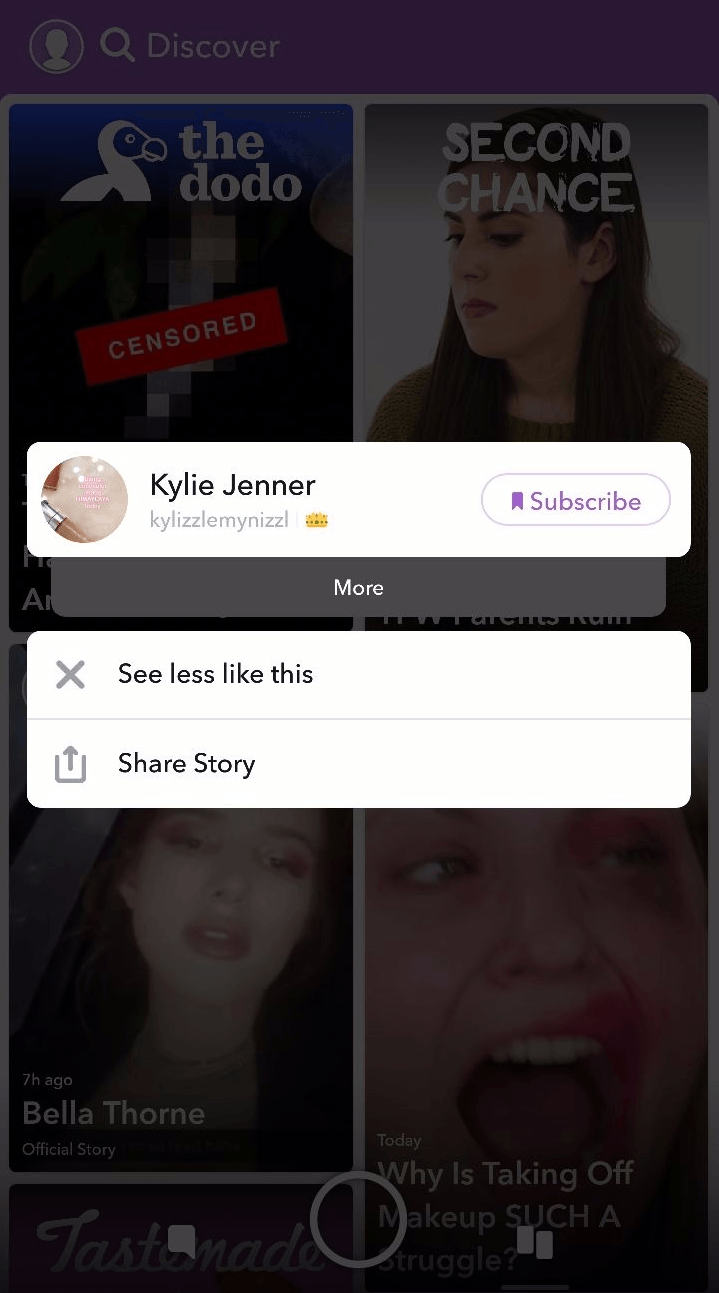
The Discover page (accessed by swiping right on the default camera view) is a personalized feed of media from publications, celebrities, and other public figures you subscribe to.
My feed is full of beauty tips and celebrities and looks like a digital version of Seventeen magazine. Not quite personalized to my tastes (this may come with time as Snapchat captures more insights), but the content is fun, I’ll admit.
If you want to see less of a certain type of content, all you have to do tap and hold a tile and click “See Less Like This” or “Unsubscribe”.
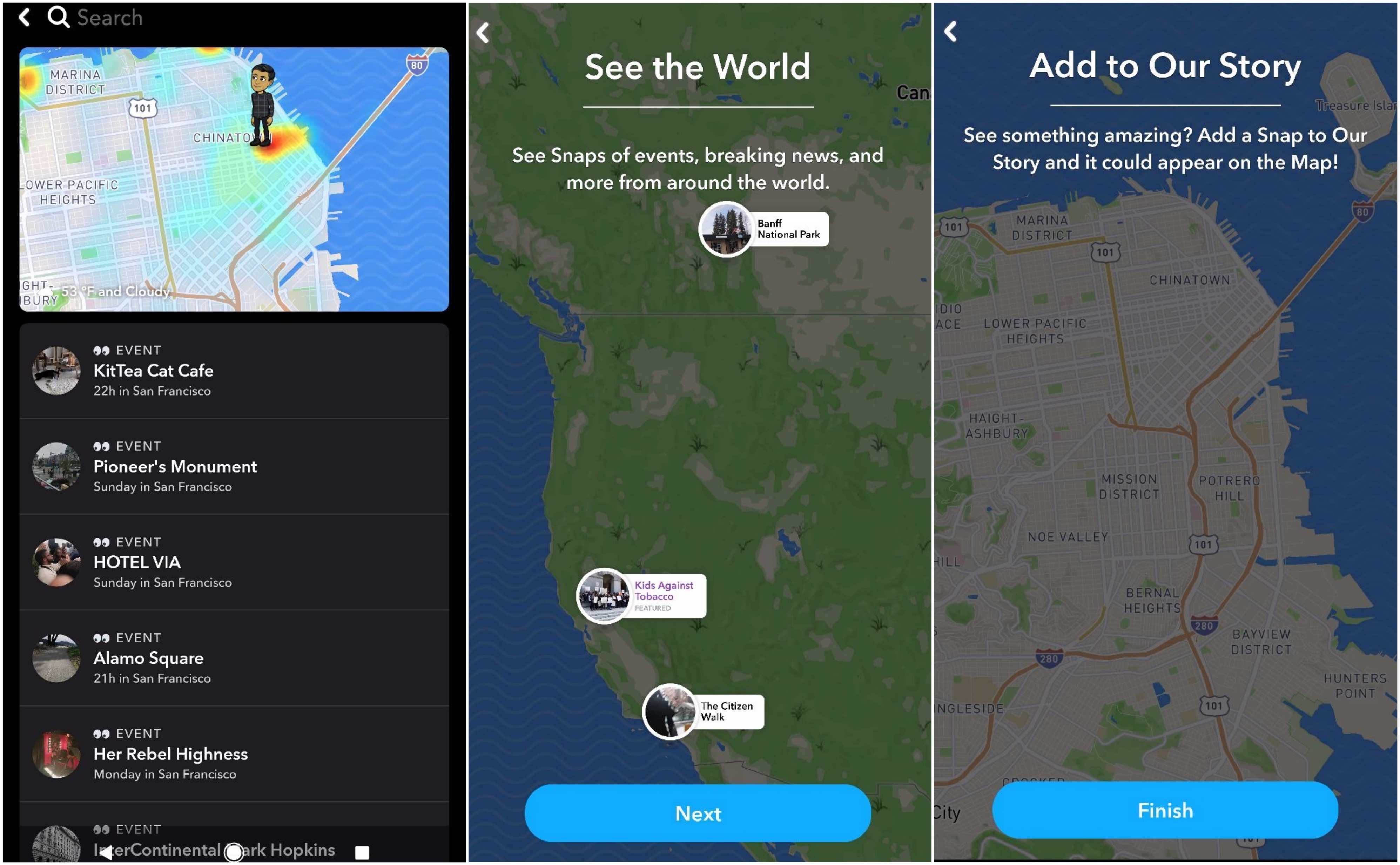
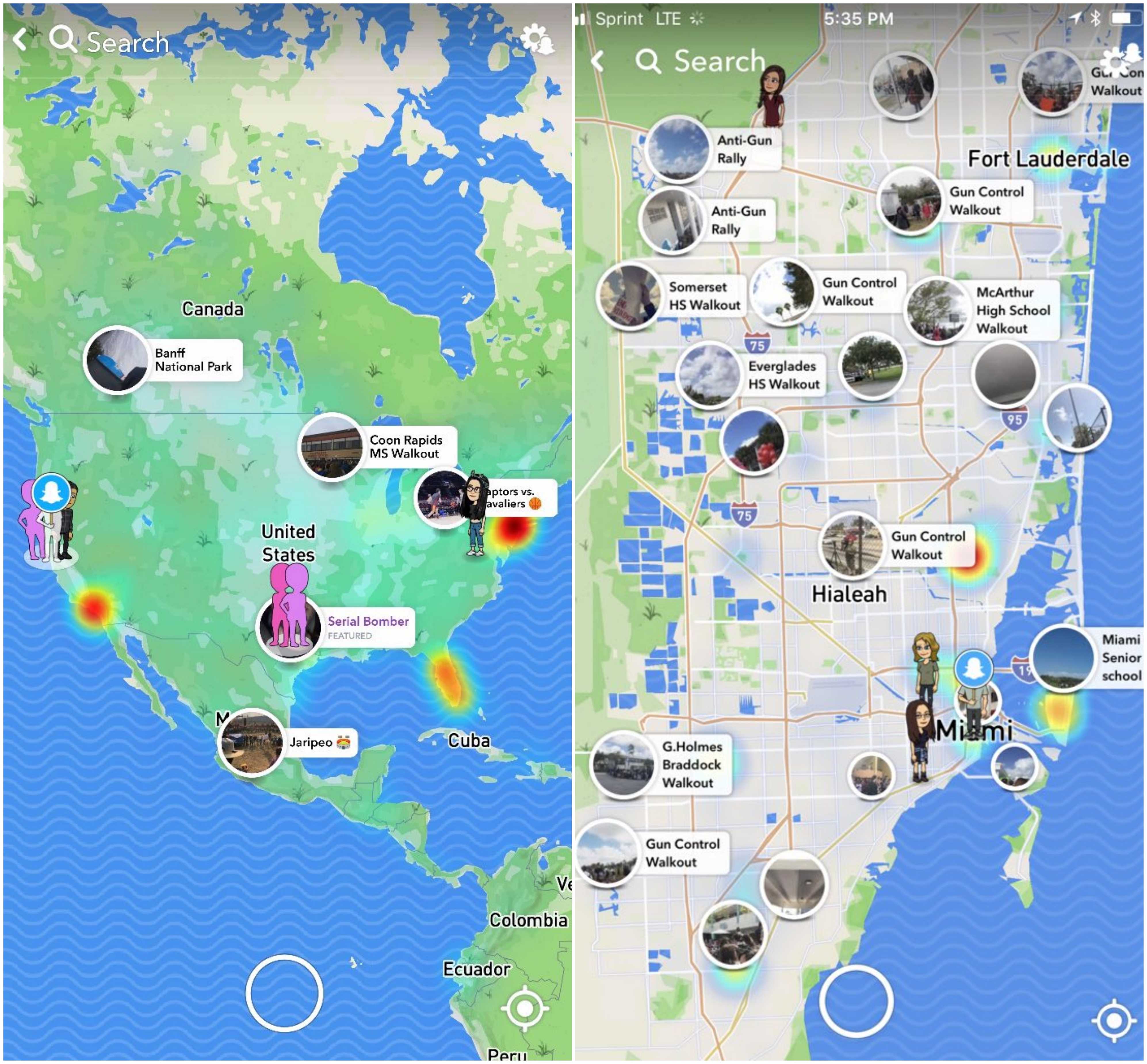
But Snap Map, a recently debuted feature, completely knocked my socks off. The map allows you to explore user Stories from all over the globe, and is described by Snapchat as a “whole new way to explore the world.”
To watch Stories, pinch on the map to zoom in or out and tap on any location. Colored spots in certain areas indicate increased activity. I watch a stream of Stories from people in Rio de Janeiro (I am visiting for vacation soon!) and then move on to Stories from Iceland. It feels a little voyeuristic, but my gosh — is it cool.
A super zoomed-out view pinpoints significant social events happening around the world in real-time. This feature was very powerful in the recent gun control walkout.
If you prefer not to be seen by strangers, you can choose to enable ghost mode on your account. This way, only friends can see your activity.
What Snapchat Can Improve
Snap Map reminded me of why I love technology — it was incredible to see slices of life and global social movements organized in such a simple and intuitive way.
On the other hand, privacy is a big concern for many, and I did not see any effort on Snapchat’s part to fully educate users about the implications of Snap Map’s functionalities. To address this issue, alerting users via a multi-channel onboarding strategy would be considered.
The Discover page has a lot of room for improvement as well. As someone who is generally uninterested in celebrity gossip, I was certainly exposed to a lot of it. Looking into the future, Snapchat could smartly leverage data to populate users’ Discover pages with content they actually care about. Done right, the app could become a go-to resource for social news, à la Flipboard, in addition to being a video-sharing platform. Oh, the possibilities!
In Conclusion… Snapchat App Engagement
Snapchat’s redesign proves that nothing is ever black and white. Although the app severely disrupted the seamless Story-viewing experience that long-time users know and love, it introduced Snap Map — a game-changing tool with the potential to revolutionize how the world comes together for social change.
How will Snapchat overcome this period of intense public criticism and plummeting market value? Only time will tell. But leveraging a platform that empowers them to build messaging campaigns across communication channels, as well as A/B test critical new features within their app, would certainly put them on the road to redemption.
For more in our ever-growing list of App Engagement Analyses, see our articles on Flipboard, Trulia, and Delta.
—
Leanplum is the mobile marketing platform built for engagement. We help brands like Tinder, Grab, Tesco, and Zynga orchestrate multi-channel campaigns — from messaging to the in-app experience — all from a single, integrated platform. Schedule your personalized demo here.


