Southwest Airlines is one of the most popular airlines in the US, and for good reason. It may not be the largest in the country, but it has developed a reputation for friendly customer service (partly due to its sense of humor).
Does the user experience of Southwest’s mobile app measure up to its in-flight experience? Let’s explore the app’s engagement strategy to find out.
Login & Home
What Southwest Does Well
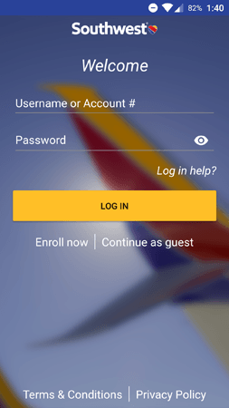
The Southwest app opens with a login screen. To mimic a first-time user’s experience, I decided to explore the app without logging in.
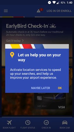
Upon tapping the Continue as guest button, the app brought me to the home screen and displayed this prompt. Asking for permissions via an in-app message is generally a good move: This lets mobile teams write custom copy and personalize the message’s appearance to fit the look and feel of the app.
In this example, the in-app message provides a compelling reason to turn on location services. A generic system prompt might not perform as well, because the user wouldn’t know which features are dependent on location data.
Another reason to ask for permission with an in-app message rather than a system prompt: Users can’t respond with a hard “no.” The Maybe Later button leaves the door open for another permission request in the future. Meanwhile, if a user denies a system prompt, the option can only be manually changed from within the app settings — marketers can’t send another prompt to change it.
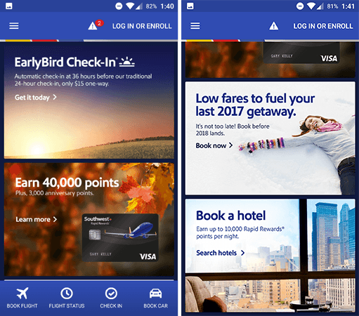
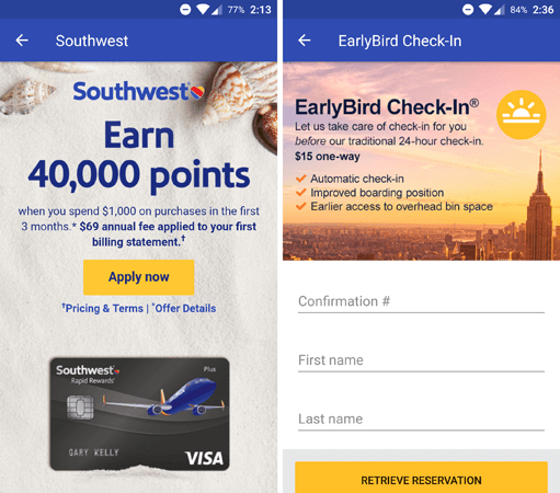
After the permission request, users are dropped into the home screen. This screen showcases a few different promotions, like the EarlyBird Check-In feature and opportunities to earn more rewards points by booking a hotel. The footer menu provides quick access to key features like flight booking and check-in.
The Southwest app is generally good at upsells. Each promotion on the home screen brings you to a dedicated landing page. These screens provide details on the promotions while offering a user-friendly form to sign up.
One Way to Improve
There’s one downside to promoting upsells on the home screen: They obfuscate the main purpose of the app, which is to book a flight.
As a first-time user, I might have downloaded the app simply to book a trip. Credit cards and rewards points are mainly relevant to loyal users — a first-time traveler doesn’t know if they’ll use Southwest frequently enough to accumulate points. The home screen can be improved by promoting upsells only to long-time users, and letting first-time users explore the app unhindered.
Mobile teams can implement this with tools like our variable manager, which can toggle in-app elements based on behavioral triggers. This way, you can select content that will only be shown to users who’ve already made a purchase, for instance.
Main Menu
What Southwest Does Well
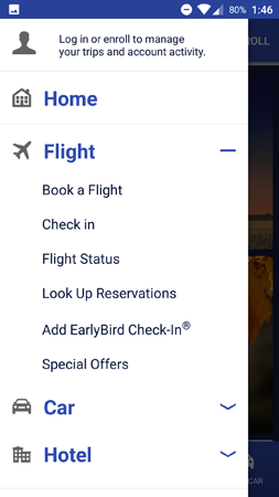
The sidebar menu provides easy access to each of the app’s features. The Flight, Car, and Hotel submenus all host a few options, so it’s good that these submenus are collapsible.
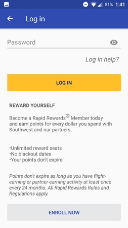
Furthermore, people who aren’t logged in receive a reminder at the top of the menu. This is a subtle way to remind new users of the benefits of creating an account.
If you decide to tap the Log in button, you’re brought to the above screen. This screen is effective because it briefly explains the benefits of enrolling in the Southwest rewards program, instead of checking out as a guest.
One Way to Improve
There are a couple of practical issues that make the main menu a bit awkward to use. For one, the Hotel submenu isn’t built out in the app yet — to book a hotel, users must visit the Southwest website.
To be fair, the menu warns you that hotel links will open in your mobile browser, but it still comes as a surprise because both cars and flights are managed through the native app. The UX is even more confusing if you tap a hotel-related promotion on the home screen, because it will open a new browser tab without warning.
The second (and less critical) issue is that the Home button is redundant. Tapping this button returns you to the home screen, but you can also swipe the menu left (or tap the back button on Android) for the same effect. If the Home button is necessary for certain devices, Southwest could create a segment and only display the button for users with those devices.
Booking
What Southwest Does Well
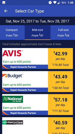
The booking screens for Southwest are information-packed but user-friendly. The above picture is from the car rental screen, and the flight bookings are displayed in a similar fashion. Users can filter by dates, times, and seats at a glance to find the best option.
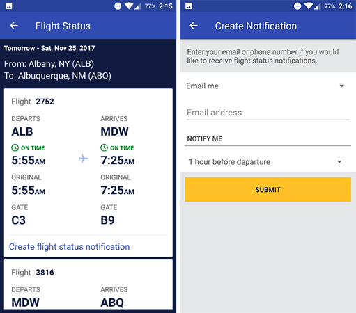
Once users book a trip, they can look up the details with the Flight Status menu. In addition to confirming the gate and flight number, you can even set up a notification to receive alerts about last-minute changes.
One Way to Improve
The notification feature is effective as it is, but Southwest can go one step further. It would be even easier for users if the app automatically sent alerts about upcoming flights.
Of course, if the app team is worried about spamming its audience with unwanted messages, they could still ask people if they want flight notifications during the checkout process. This way, users are still in control of their notifications, but the app saves them the trouble of manually creating an alert.
Acing the Mobile User Experience
Southwest delivers a compact but effective user experience. The app doesn’t need layers upon layers of submenus to get the job done — it simply helps users book more trips, while promoting upsells and cross-sells along the way. With a few tweaks, the app could become even more user-friendly.
For more in the App Engagement Analysis series, check out our posts on Reuters, Starbucks, ESPN, NBA, NFL Mobile, Fidget Spinner, Etsy, Airbnb, and Soundcloud.
—
Leanplum is the mobile marketing platform built for engagement. We help brands like Tinder, Grab, Tesco, and Zynga orchestrate multi-channel campaigns — from messaging to the in-app experience — all from a single, integrated platform. Schedule your personalized demo here.

