It’s Pumpkin Spice Latte season, as every Starbucks across the country is keen to remind us. Whether you take your coffee black or your lattes with extra whip, there’s always a reason to consume caffeine. The Starbucks app eases the process for frequent shoppers, enabling digital payments and tracking reward points. The app has already taken off with customers — about a quarter of orders being placed or paid for via the app.
How does Starbucks keep customers engaging with its mobile app? And is there a way for similar chains to do the same? Find out in our latest App Engagement Analysis.
Onboarding
What Starbucks Does Well
First impressions count, which means the first screen of your app is one of the most important.
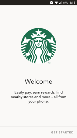
Starbucks makes a good first impression by pairing its iconic logo with a simple value proposition. The app prompts users to create an account on the next screen, but this initial screen is free of any pushy calls to action (CTAs). It’s welcoming, not least because the headline simply says “welcome.”
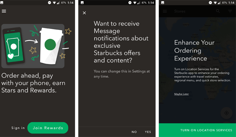
The rest of the onboarding flow covers the key steps that nearly every app team must think about.
The first prompt is the Sign In/Sign Up screen. There are a few reasons why an app team might want users to create an account.
- User accounts allow for more consistent and complete analytics because marketers can track behaviors across multiple platforms and map them to a single profile
- User accounts let customers save their payment and shipping info, which makes for a frictionless shopping experience
- User accounts can track rewards points automatically, which may encourage even more conversions
Rewards are a major part of the Starbucks app’s value proposition, so it makes sense that they emphasize the importance of signing up. In this flow, the signup button doesn’t even say “sign up” — it says “join rewards.” The app makes it clear that users can save money by creating an account.
The next two screens are all about securing permissions for push notifications and location tracking. Push notifications are a powerful tool in the mobile marketer’s toolkit — they can single-handedly lift retention rates by 7x. Likewise, geolocation marketing is especially valuable for brick-and-mortar retailers like Starbucks. By securing location permissions, the app can deliver timely and relevant promotions to drive in-store purchases.
One Way to Improve
The Starbucks app’s onboarding is pretty effective as it is. Each screen properly explains the value of ask, instead of hitting the user with a series of generic system permission prompts.
One way to potentially earn more push notification opt-ins is to delay the task until later in the user journey. Even though the opt-in screen gives users a good reason to say yes, some people might not want to commit to the app before using it.
By waiting until users reach certain engagement milestones before asking for push permissions, there’s a higher chance they’ll trust the app and say yes. Engagement milestones include actions like signing up for an account, making your first purchase, or sharing in-app content on social media. Last Minute Travel implemented a campaign along these lines and earned a 182 percent lift in opt-ins.
Ordering
What Starbucks Does Well
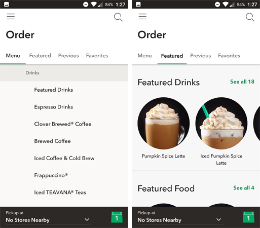
The in-app menu for Starbucks combines several elements to create a pleasant user experience. The core functionality is there if you want it: the menu tab features a full list of drinks, conveniently split into categories.
But the app goes one step further to maximize conversions. When users open the “order” menu, the default tab is “featured drinks,” pictured on the right. This allows Starbucks to tempt shoppers with seasonal favorites and to upsell with food and whole beans. This technique potentially earns more in-app conversions without harming the user experience.
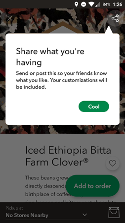
The first time users open a product listing, this in-app message pops up to promote social sharing. This message reminds users that the share button exists, and it provides a good reason to tap it.
Customizations and personal preferences are a big part of this promotion. Normally, customers might not think to tweet about their morning coffee — but it’s a different story if you’re tasting an exclusive single-origin brew or custom latte. This message plants the idea in the customer’s mind that some Starbucks items are worth sharing on social.
One Way to Improve
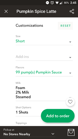
Frankly, I didn’t identify any usability problems with the ordering menu. Everything works as expected, and there are a few customizable options that I didn’t know existed. The only “problem” I found was a technical one, where it’s possible to place infeasible orders like the one below.
Glitches aside, Starbucks could potentially optimize this section even further by personalizing drink recommendations based on a user’s purchase history. Instead of featured drinks, the app could suggest past favorites (or new options that are similar to past favorites).
Starbucks Cards
What Starbucks Does Well
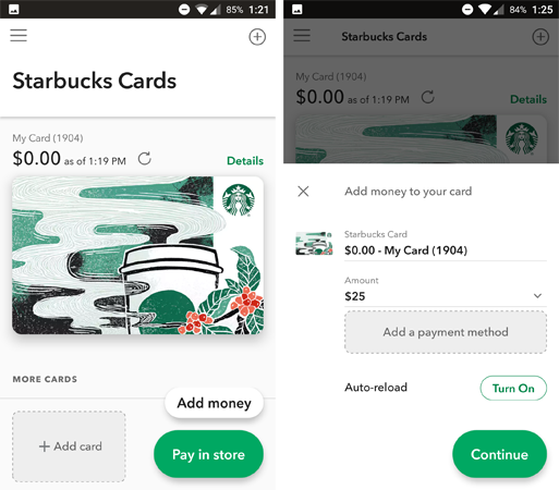
Starbucks cards are given their own menu in the app, driving home the point that this app helps customers save money. The practical functionality is all here on one screen: users can check their balance, top-up their card, or register a new card. There’s also a “pay in-store” button, which brings up a bar code for the cashier to scan. This way, digital cards have the same functionality as physical ones.
In addition to the practical features, the fact that the app displays the card’s artwork is a nice touch. Starbucks cards are often marketed as a collector’s item, with many different themed/seasonal options. Emphasizing the art on this screen makes digital cards feel just as valuable and collectible as physical ones.
One Way to Improve
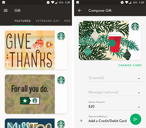
The many categories of gift cards are both a blessing and a curse. It’s good to have options, but the 10+ tabs are a bit much to sort through, especially with the overlapping listings. For example, one card that reads “you’ve so got this” shows up under both “workplace” and “encouragement.”
It would be easier to create a master list of all cards and let users filter them based on thematic tags like “encouragement.” Right now, there appears to be no way to browse all of the gift card designs in one place.
Rewards
What Starbucks Does Well
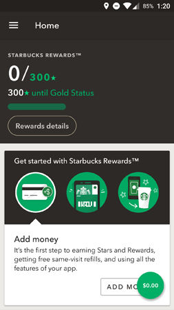
The app’s home screen focuses on rewards. There’s a bit of gamification going on — the green progress bar and the 0/300 are both constant reminders that there’s a goal the customer hasn’t yet achieved.
Meanwhile, the next tile down acts as a secondary onboarding. My account is new, so the screen displays the steps you’d go through to start earning rewards. It makes sense that this flow isn’t part of the initial onboarding (people aren’t eager to whip out their credit cards when they first download an app). Still, the information is here for whenever the customer wants to earn rewards points.
In this reward system, users receive two stars for each dollar spent on an order. At 300 stars, frequent shoppers are granted gold status, which provides perks like drink add-ons and a personalized gold card.
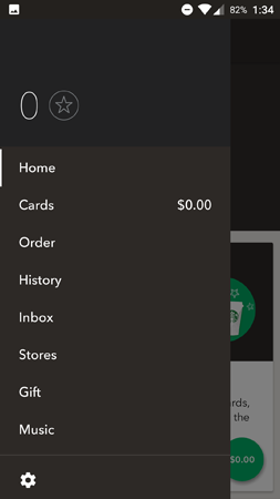
Rewards are so central to the Starbucks app that it even displays your number of stars in the main menu. There’s simply no way to use the app without seeing your star count and remembering you’re not at gold status yet (or seeing your gold status and feeling proud).
Interestingly, the app says more about how close you are to gold than about what you receive when you reach gold. It seems as though the reward system is more about personal pride for the customer, which explains why it’s more gamified than your typical points card.
One Way to Improve
The rewards system is more or less as optimized as can be. The only way to improve would be to mention the specific perks of reaching gold status. However, the perks appear to be inconsistent — the official website that there’s a reward for every 125 stars, but it doesn’t explain what these rewards are. Given the situation, it’s likely more effective to sell the gamification/personal pride angle than the discount angle.
Music
What Starbucks Does Well
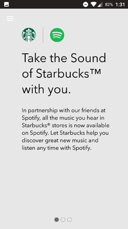
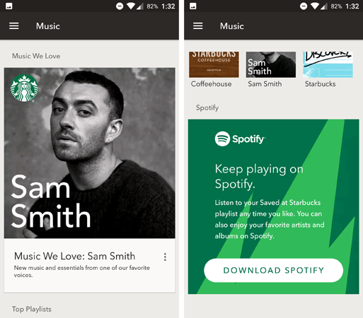
Finally, the Starbucks apps feature a partnership with Spotify where you can look up and listen to the playlists from Starbucks locations. This is a unique feature that adds value to visiting the stores (and staying a while).
The music menu begins with promotions for specific artists. Scrolling down, we see a large CTA for Spotify, pictured on the right. The app lets you explore different artists who’ve been featured in Starbucks.
One Way to Improve
Unfortunately, there’s not much to do in this menu without a Spotify account. All of the links are CTAs to open the playlist in Spotify. Ideally, Starbucks would include music samples for each artist within its own app. This most likely isn’t possible due to licensing restrictions, so another option is to provide biographical info on each artist, like Last.fm. Adding more content to this menu would make it feel more like a Starbucks feature and less like a partnership designed to drive users to Spotify.
Starbucks Mobile Engagement
As a whole, the Starbucks app boasts an impressive experience with full functionality. The app is optimized toward earning more rewards signups, but it also provides practical features that directly benefit customers, like ordering drinks in advance for in-store pickup.
For more in the App Engagement Analysis series, check out our posts on ESPN, NBA, NFL Mobile, Etsy, Airbnb, and Soundcloud.
—
Leanplum is the mobile marketing platform built for engagement. We help brands like NBC, Tinder, Grab, TED, and Zynga orchestrate multi-channel campaigns — from messaging to the in-app experience — all from a single, integrated platform. Schedule your personalized demo here.

