Source: Unsplash
In the world of mobile messaging, email and push notifications generally steal the spotlight. But the beauty of integrated messaging campaigns is their ability to make the most of every channel, big or small.
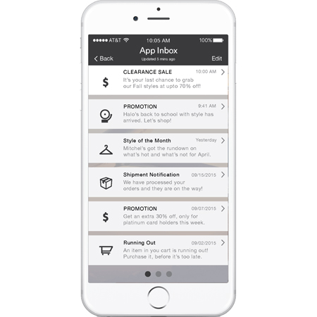
App Inbox is an oft-overlooked channel that can play a role in many engagement strategies. Essentially, an App Inbox is a screen within an app that stores persistent messages. It’s kind of like an email inbox, but it lives inside the app itself.
App Inbox differs from other mobile channels such as push notifications or in-app messages. For both push and in-app messages, they’re gone once you open them. This makes them great for immediate offers and information, but poorly suited to messages that need to stick around for a while.
With these benefits in mind, what are some scenarios where mobile teams ought to choose App Inbox over other messaging channels? Below, we’ll outline a few use cases to illustrate how App Inbox can complement your marketing efforts.
Deliver Coupons With App Inbox
Usually, push notifications are a great channel for discounts and other promotions. They catch the user’s attention, giving them a reason to return to the app and browse around. This is especially true for time-limited promotions.
But what about promotions that either aren’t time limited or that have very long time limit? For example, consider a coupon that lasts a month or a first-class flight upgrade provided annually to frequent fliers with status. A push notification or in-app message is not well suited to these sorts of use cases. If the user misses the message, they may never notice they received the offer, impacting both sales and customer loyalty.
With an App Inbox, it’s easy to keep track of active promotions or offers within the app. If users can double-check the fine print of each promotion, they’re more likely to shop with confidence, knowing exactly what kind of discount they’ll receive.
Recommend New Categories With App Inbox
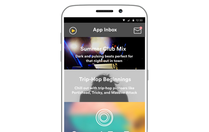
Usually, mobile teams use in-app messages to explain new content and promotions. A message might offer shoppers a discount on a particular category or suggest relevant content to browse. But in-app messages aren’t the only solution. App Inbox offers another way to organize promotions by providing a chronological list of items, browsable at any time.
In the example above, a music app suggests playlists and genres to a user based on their personal preferences. It’s possible to display this information as a standalone screen, but you would have to manually update the screen each time you add a recommendation. With App Inbox, recommending a new category is as simple as sending a message.
It’s easy to personalize messages through App Inbox. In Leanplum, the message creation process gives you a chance to define your user segment and include parameters to be filled in by individual user attributes, such as a person’s favorite music genre. This way, mobile teams can customize recommendations without touching the app’s code.
Design Personalized Menus With App Inbox
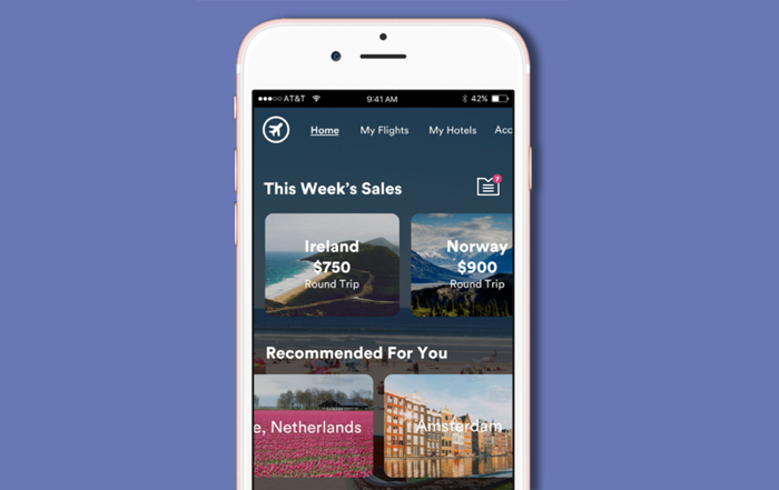
The most elaborate implementations of App Inbox turn messages into entire menus. In the above example, each individual “message” is styled as a trip or location recommendation. When combined, these messages look and feel just like a menu, except they’re created as messages rather than through code.
Just as in the second example, one advantage of using App Inbox messages is that they’re easier to personalize than native app content. But there’s another benefit that’s easy to overlook: these menus can do wonders for your app’s user experience.
With enough customization, App Inbox messages can aid in both marketing and UX. Some pieces of information are simply easier to convey as a scrollable submenu rather than a linear series of fullscreen elements.
App Inbox enables marketers and designers to create and update these submenus without changing the app’s core layout. This way, iterating on UX is as easy as writing or deleting a message.
Provide a Personalized News Feed With App Inbox
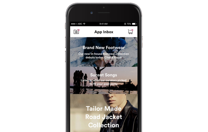
There are plenty of reasons for app teams to include personalized news feeds for each user. By aggregating useful notifications in a single spot, it’s easier for users to discover new content. The type of content you’d include in a news feed depends on the type of app. A social app might deliver alerts from friends, a news app might send top headlines from certain categories, or a retail app might announce when a new item is in stock.
Without App Inbox, news feeds are much harder to maintain. You would have to either manually update a screen with each new piece of content, or deliver announcements through in-app messages and hope that users don’t forget the details afterward.
With App Inbox, you can build and maintain a news feed with ease. Segment users based on past in-app behavior, and deliver personalized, persistent updates. App Inbox is a strong tool to aid in content discovery, increasing app engagement in the process.
App Inbox: For Messaging & Beyond
It’s easy to see why App Inbox messages help inform users about promotions, just like push notifications and email. Where the channel really shines is its ability to improve the user experience.
For promotions, delivering messages through App Inbox helps users keep track of what’s happening. For personalized product recommendations, App Inbox helps mobile teams organize and update campaigns code-free. You can even adjust the look and feel of the whole app by wrapping App Inbox messages in a scrollable menu.
Whether used for marketing, UX, or something in between, App Inbox is a flexible messaging channel with use cases for every vertical. Eager to try it? Sign up for a demo to find out precisely how effective this channel can be.
—
Leanplum is the mobile marketing platform built for engagement. We help brands like Lyft, Tinder, Grab, TED, and Zynga orchestrate multi-channel campaigns — from messaging to the in-app experience — all from a single, integrated platform. Schedule your personalized demo here.


