The first step to building a long-term relationship with app users is a memorable app onboarding experience. Unfortunately, with 20 percent of users abandoning apps within 30 seconds, there is a very limited window to transform initial interest into meaningful engagement.
So, how do you put your best foot forward and convince users to stick around?
Let’s take a look at the best practices of real-life brands that are kickin’ app onboarding 🍑 so you can make the most out of your first impression too.
Showcase Your Value-Add
Your app onboarding flow is the first thing users come in contact with. Without an intuitive grasp of how your app will improve their lives, you run the risk of being forgotten, or — in the worse case scenario — uninstalled.
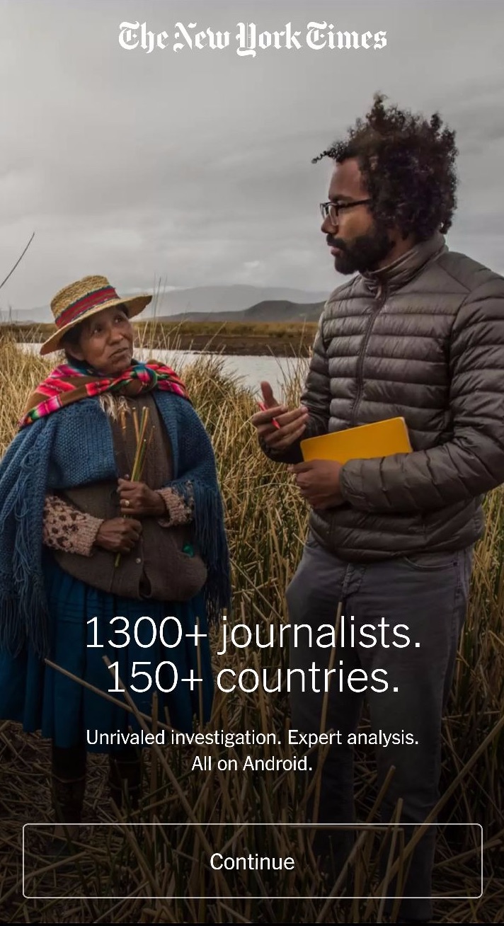
The New York Times mobile app does a wonderful job of showcasing what they are all about right in the welcome screen. Here, a short but powerful value proposition introduces the world-class journalism that the newspaper is renowned for.
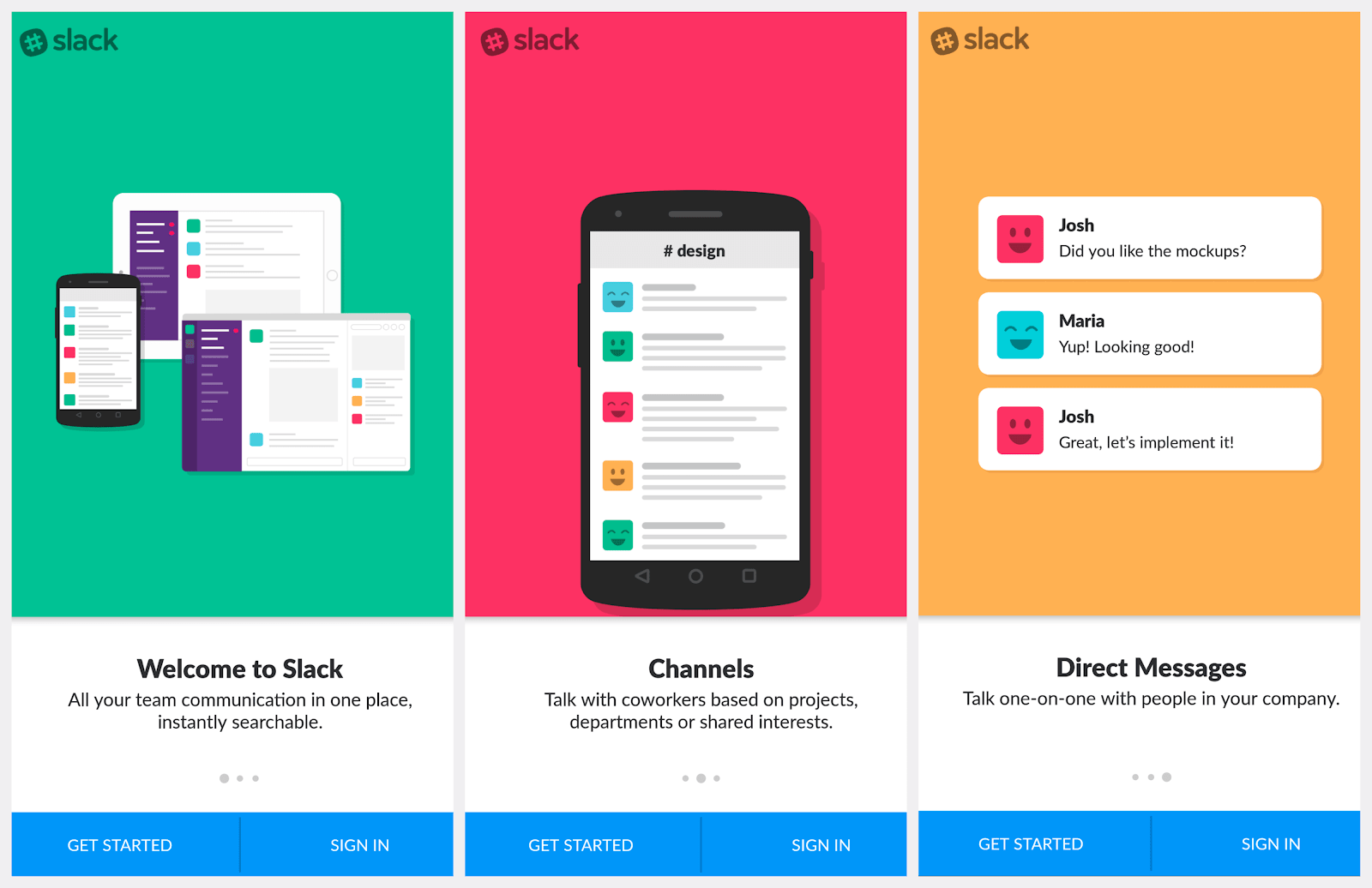
Slack offers another great model. The first three screens of Slack’s onboarding flow succinctly explain how users can take advantage of specific features to improve communications in the workplace.
We won’t tell if you take a page from their books.
Optimize The App Onboarding Flow to Move Users Forward
Ideally, you want users to engage with your app as soon as possible. Thus, an onboarding flow should be all about moving users forward.
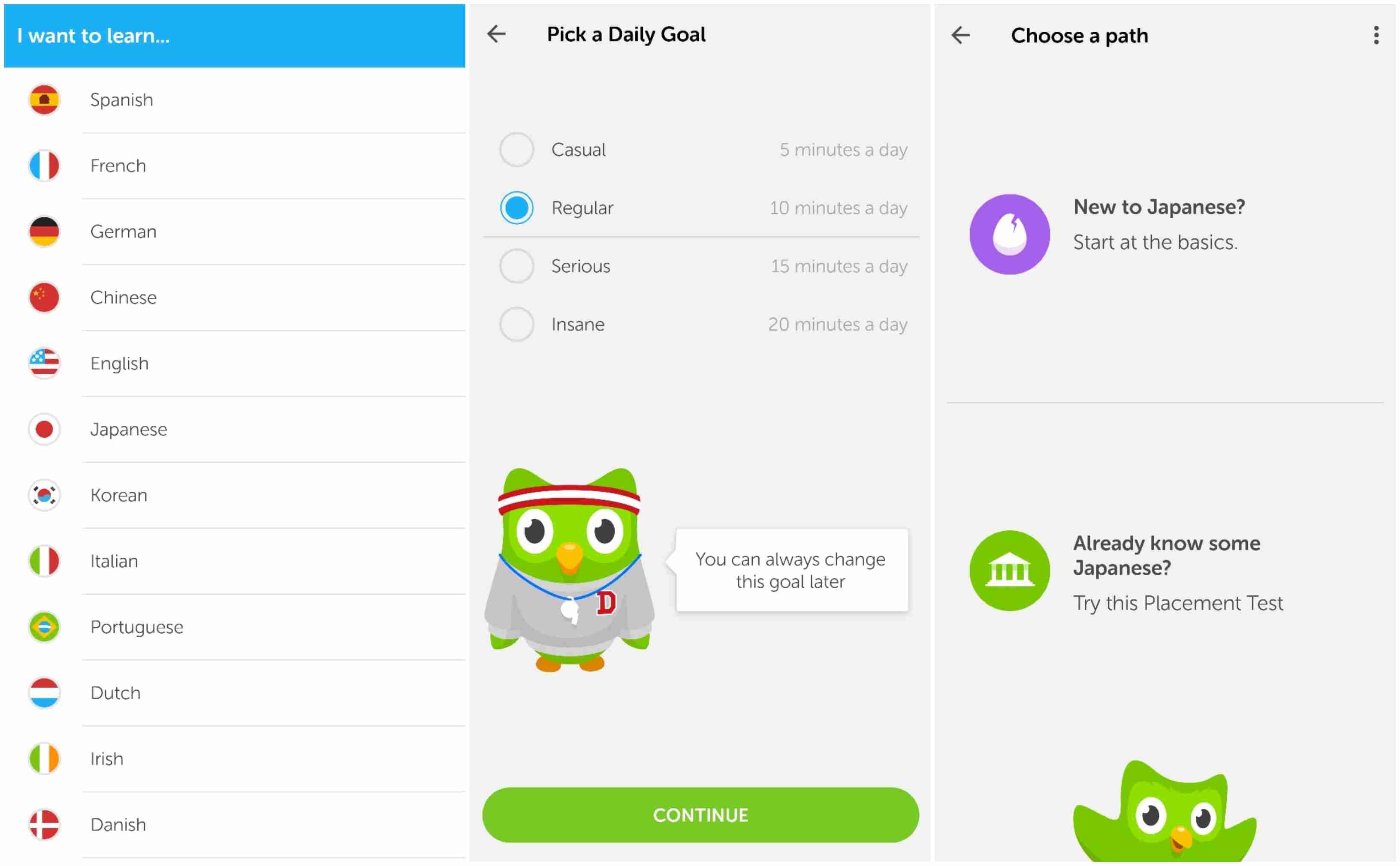
Duolingo, a free language learning app, certainly knows a thing or two about moving users forward. Once I download and open the Duolingo app, I am immediately asked to choose a language, set daily learning goals, and estimate my current skill level. I am then thrust right into the process of learning Japanese (the language I chose).
Some additional tips to optimize your app onboarding flow:
- Include an indicator of the length (a listed number of steps, for example) for transparency
- Provide a way to opt-out so users can dive right into your service
- If possible, encourage users to register for a membership, upgrade to a paid subscription, or to make an in-app purchase to increase conversions
Keep Personalization Top-of-Mind
In today’s crowded app marketplace, personalization is the single thing that can help you brand stand out. And it’s never too early to start. Apps can set users up for a customized experience right in the app onboarding process.
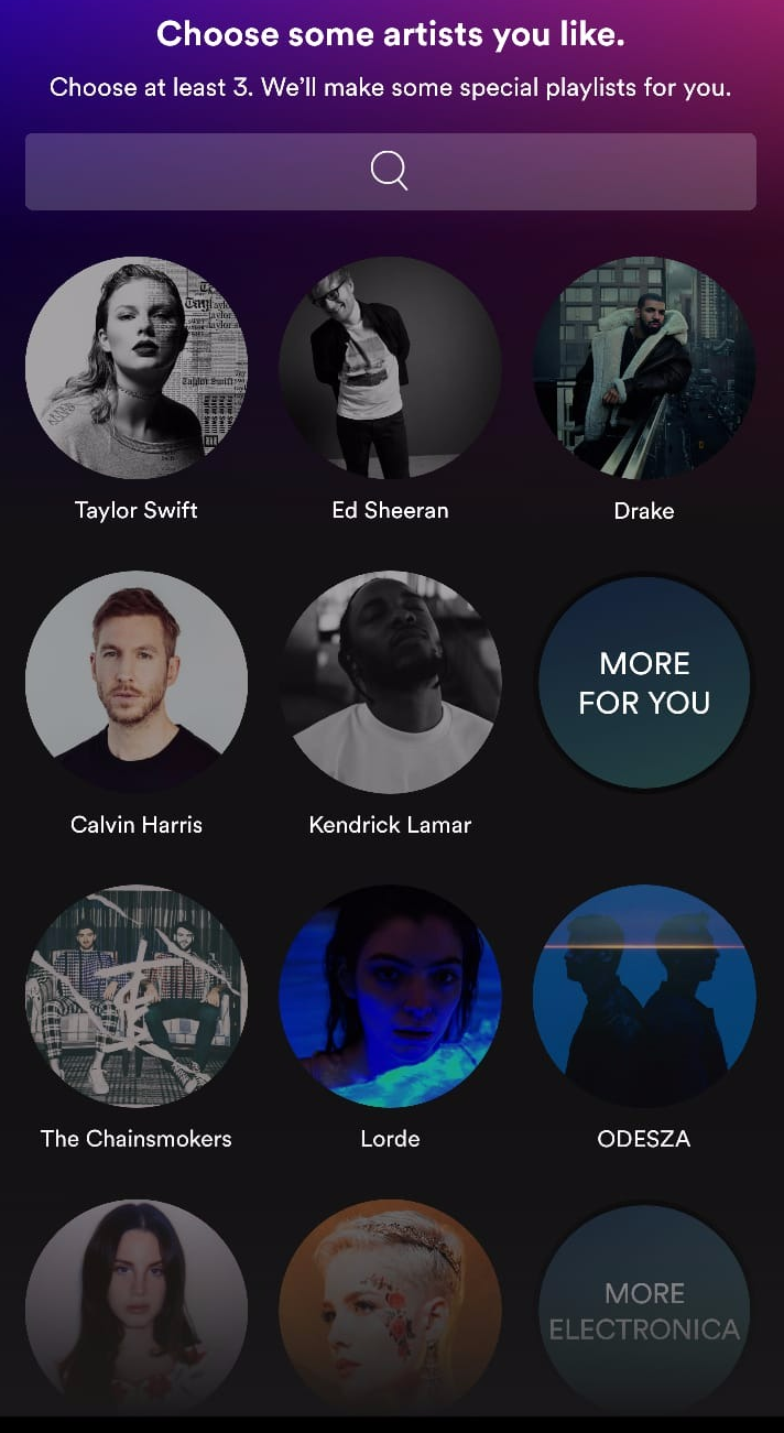
Take Spotify’s onboarding process. Right after I create an account, I am prompted to pick musical artists I like — a “taste onboarding” process that enables Spotify to create tailored playlists for me right away. Though I only pick about five artists, this information allows Spotify to gain a better understanding of my musical preferences, even before I begin engaging with the app.
The road to personalization may not be as clear for other apps as it is for Spotify, but it is important to stay vigilant of opportunities as they come along. It is what ultimate sets a foundation for the sophisticated personalization that will give your brand a competitive edge in the future.
App Onboarding Best Practice : Ask for Permissions
Unlike Android, iPhone’s iOS platform requires a manual yes from users before allowing push notifications. As these nifty little out-of-app messages are vital to any mobile strategy, the sooner you get consent from users, the better.
Other information — like access to contacts or location — are also essential in personalizing the app onboarding experience.
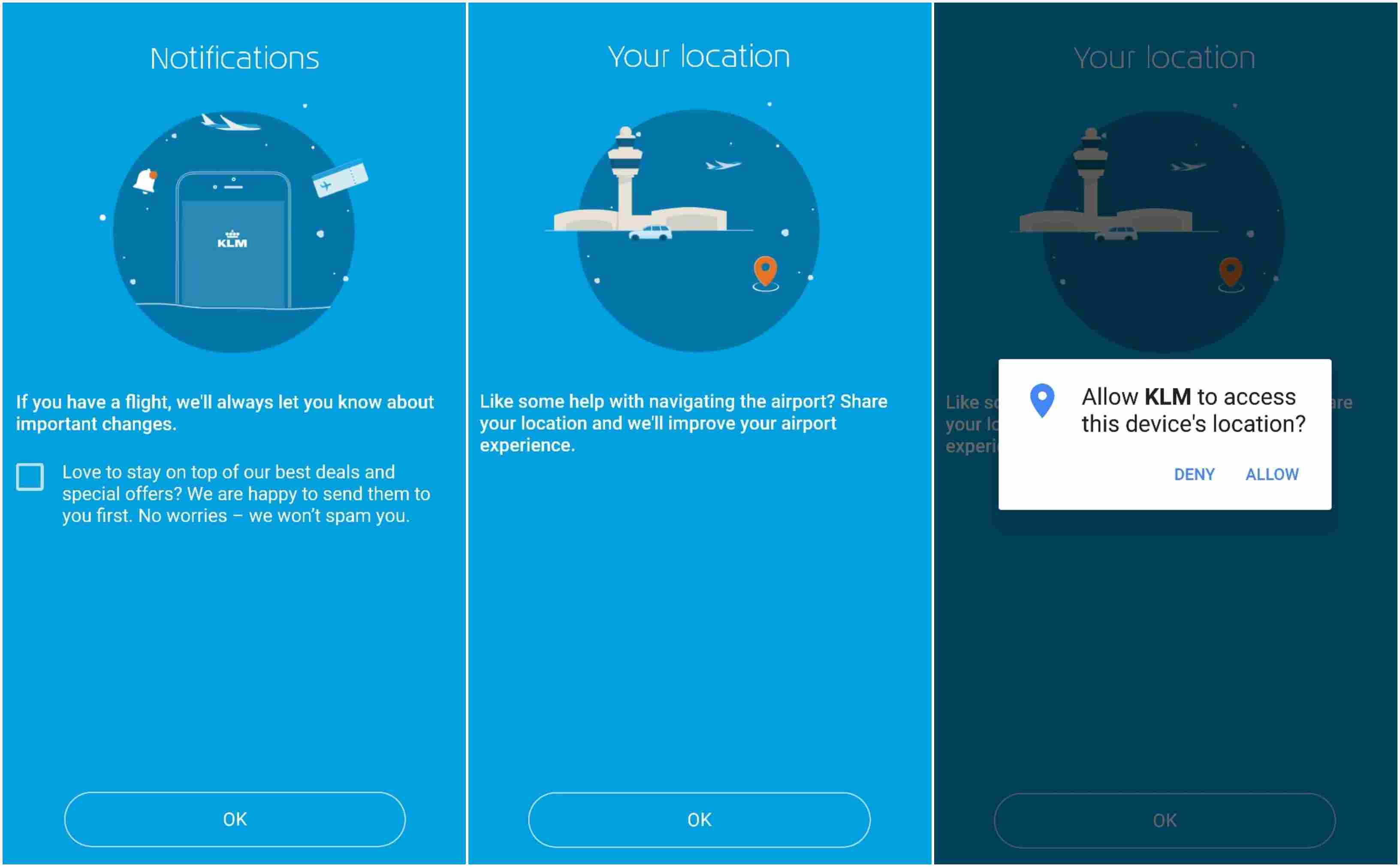
People are more likely to respond favorably to permissions requests if they understand what they will gain by doing so. In its onboarding process, KLM Airlines uses friendly, conversational copy that explains the value of saying yes to notification and location permissions. Because it is crystal clear why this information is necessary, users may feel more inclined to accept the requests.
A cold ask of “do you want to opt into push notifications?” simply won’t cut it in today’s digitally overloaded world.
Meet Customers at Multiple Channels
Any app can enhance their app onboarding process with cross-channel messaging.
For example, push notifications are a gentle way to remind users to complete the onboarding process if they abandoned it halfway. With email and in-app messages, long-form text can be used to communicate features or perks that didn’t fit into the onboarding flow.
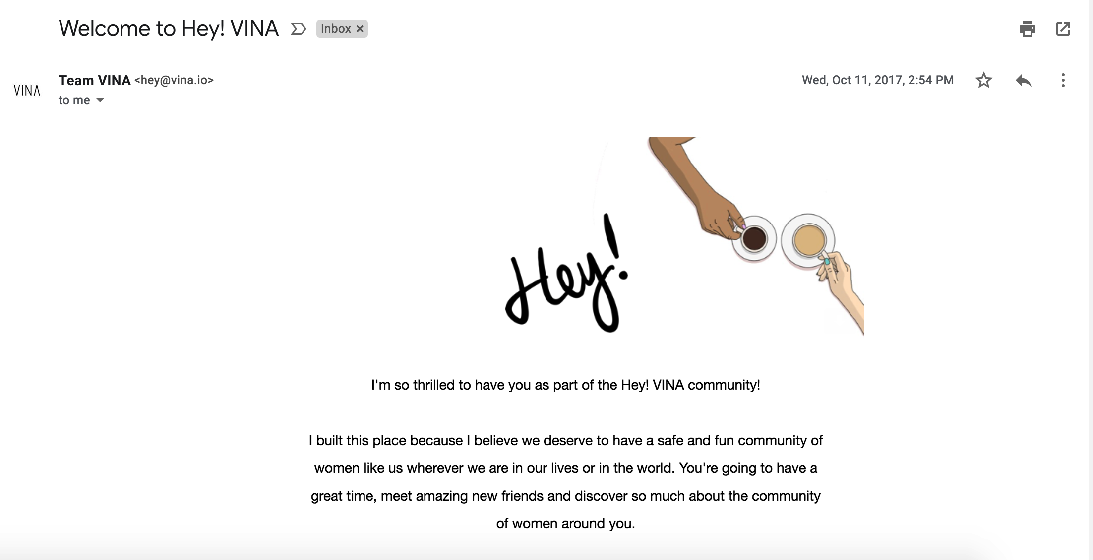
When I signed up for Hey! VINA, a Tinder-like app for platonic female friendships, I received a welcome email that included a warm greeting from the CEO, a description of the app’s key features, and a selection of articles from their in-app magazine.
After reading, I had a much better understanding of the Hey! VINA brand and how I could use it to make new friends in the Bay Area. And it successfully set a friendly tone for future interactions.
App Onboarding Best Practices
A user’s first session with your app can be a make or break moment. While the app onboarding best practices above are a great starting point, it is important to A/B test every step of the way so you know exactly how your efforts will be received. App onboarding is only the beginning of a user’s experience with your app, it is your chance to effectively pave the rest of the user journey. So, get creative, get to iterating, and get it right.
—
Leanplum is a mobile engagement platform that helps forward-looking brands like Grab, Tinder, and Tesco meet the real-time needs of their customers. Schedule your personalized demo here.


