Has an email subject line ever made you laugh out loud?
Like, full-belly-spit-water-out-of-your-nose laugh out loud?
There are many factors that go into crafting a successful email. The audience segment, timing, topic, CTA — none of those should be overlooked.
But as a writer at heart, my absolute favorite part of an email is, undeniably, the subject line. It’s the make-or-break factor that gets your email opened or deleted.
For months, our content marketing team kept track of every email that came our way and flagged the ones that seemed extra-worthy. We came out with a list of a baker’s dozen top contenders.
Some of the tactics that earned senders a spot on this list:
– Personalization
– Emojis
– Power Words
– Data
– Puns
– Fear of missing out
– Pop culture references
– Brevity
We’ll dive into the details below, but without further ado, here are the 13 most attention-grabbing email subject lines we’ve ever seen. (Note: Some of the emails themselves have been cropped for a better reading experience.)
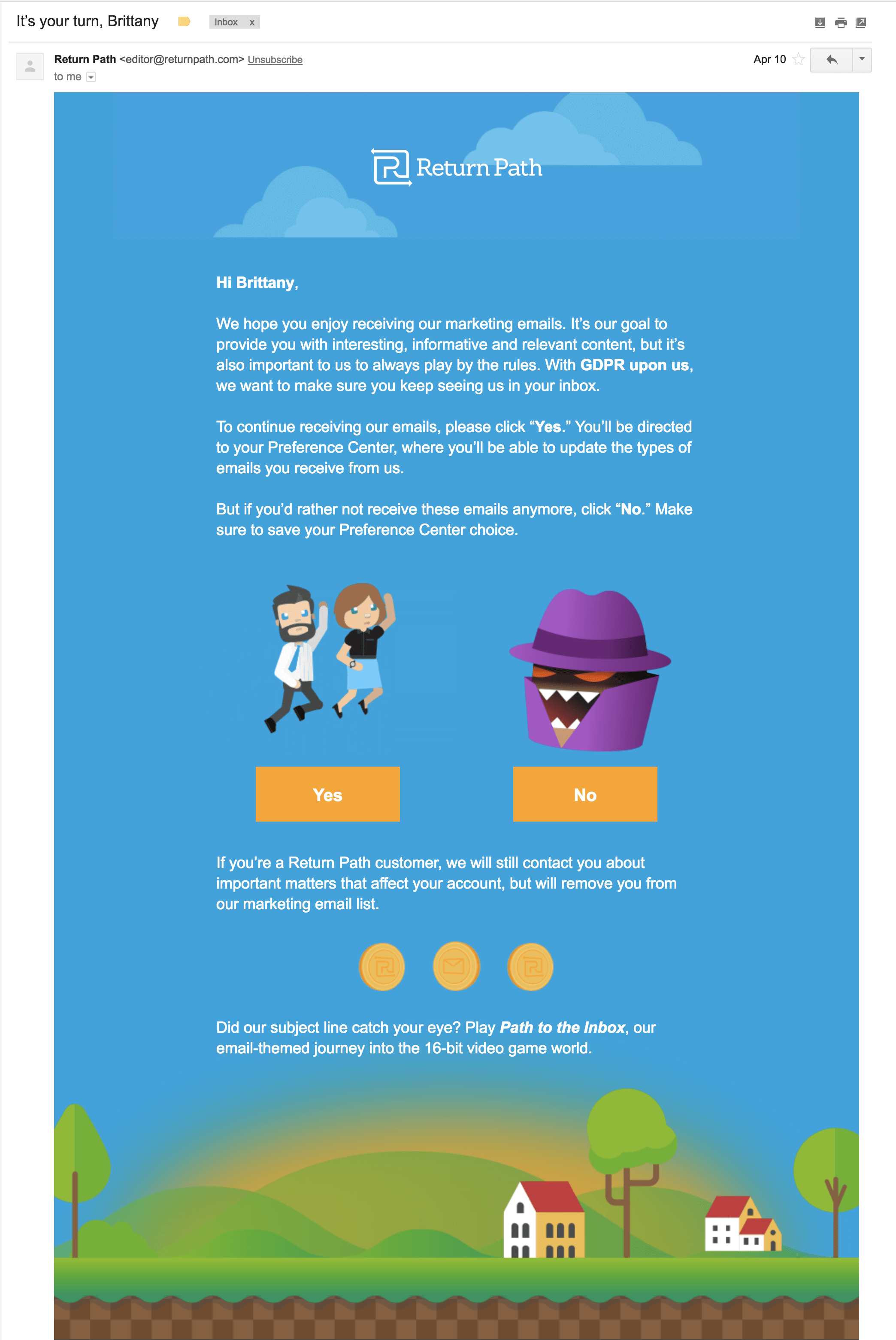
1. It’s your turn, Brittany
Sender: Return Path
Why it’s great: There are two reasons I love this subject line.
First, it’s personalized. It feels quite special to see my name in an inbox of generic blasts.
Second, there’s a sense of urgency. We’ve mentioned before in our report, Push Notification Power Words, how urgency can inspire opens when it comes to emails or push notifications. When the clock is ticking, lighting a fire under users lifts open rates.
For this email, the clock was absolutely ticking. It was a matter of days before the GDPR deadline and brands worldwide needed to convince users to opt-in to communications. On that note, this email deserves an extra call-out. Of the hundreds of emails I received in the weeks leading up to the GDPR deadline, Return Path’s was hands-down the most interesting. They made GDPR less scary — and dare I say, surprisingly fun.
If you want to invoke urgency in your email subject lines, try starting with some of these urgent Power Words.
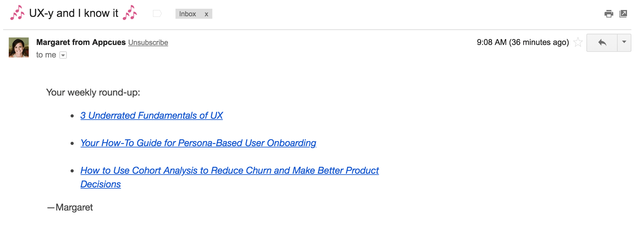
2. 🎶UX-y and I know it 🎶
Sender: Appcues
Why it’s great: Appcues has amazing email subject lines. Every time.
This one, 🎶UX-y and I know it 🎶, is a prime example of Appcues’ brand voice. Some of my other favorite email subject lines from them include, “The devil wears product” and “Oh, hi Mark(eters),” after the best/worst cult movie of all time, The Room.
Source: Giphy
So why is it so great?
First, Appcues draws heavily from pop culture in their blog digest email subject lines. When you see their emails in your inbox, you immediately know the reference — and likely chuckle in your head.
Second, Appcues drops in subtle emojis. As we’ve reported in our study, Unlocking Engagement & Growth With Emojis, when a person sees an emoji, their brain lights up in the same way as when they see a human face. The brain recognizes emojis as nonverbal information, and are therefore processed as emotions.
Sparking the warm-and-fuzzies in your audience is good for business. Everyone wants to click on something that makes them smile.
3. This is creepy, but it works
Sender: Neil Patel
Why it’s great: This email subject line is clickbait at its finest. “What’s creepy? Why does it work?” you ask yourself before you even open.
In his emails, Neil regularly plays on readers’ fear of missing out, commonly referred to as FOMO. Scarcity tactics are highly effective. They make a reader feel like they’re missing out on crucial information if they don’t open it.
But from one marketer to another, be careful not to rely on this tactic too much. If every email you send has the same elusive air of mystery, readers will quickly tire. Instead, switch it up with each send, and save scarcity tactics for emails when you really need to boost opens.
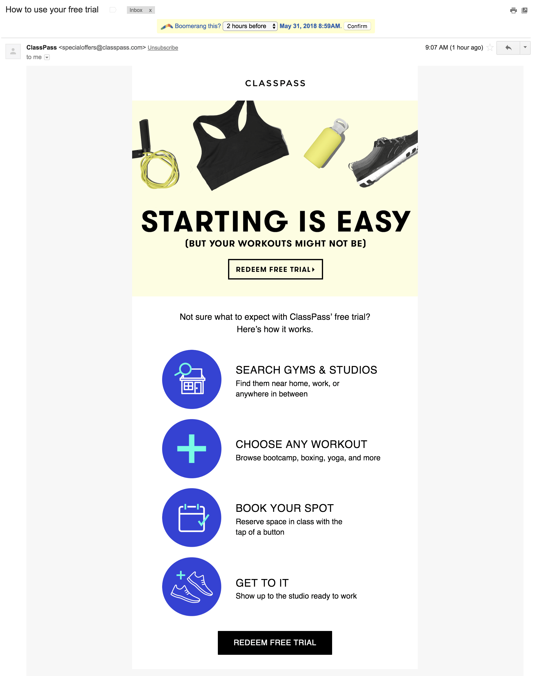
4. How to use your free trial
Sender: ClassPassWhy it’s great: Almost 80 percent of users drop off after the first app open. You have a finite amount of time to convince users of your value or you’ve lost them forever. Successful onboarding is a critical conversion point for every marketer — but unfortunately, it’s extremely challenging.
To streamline users’ onboarding, ClassPass’ email about a free trial is simple and direct. It kills two birds with one stone: ClassPass knows I’m interested (I signed up once but never redeemed), and they’re offering me the chance to try out their service for no cost. Better yet, this email to make it really easy to do so. That’s one hard-to-resist lure.
But my favorite part of this email subject line is its transparency. Unlike more FOMO-inspired lines, I can tell exactly what ClassPass wants me to do before I open.
And of course, ClassPass earns a couple of bonus points for using the Power Word “free.”
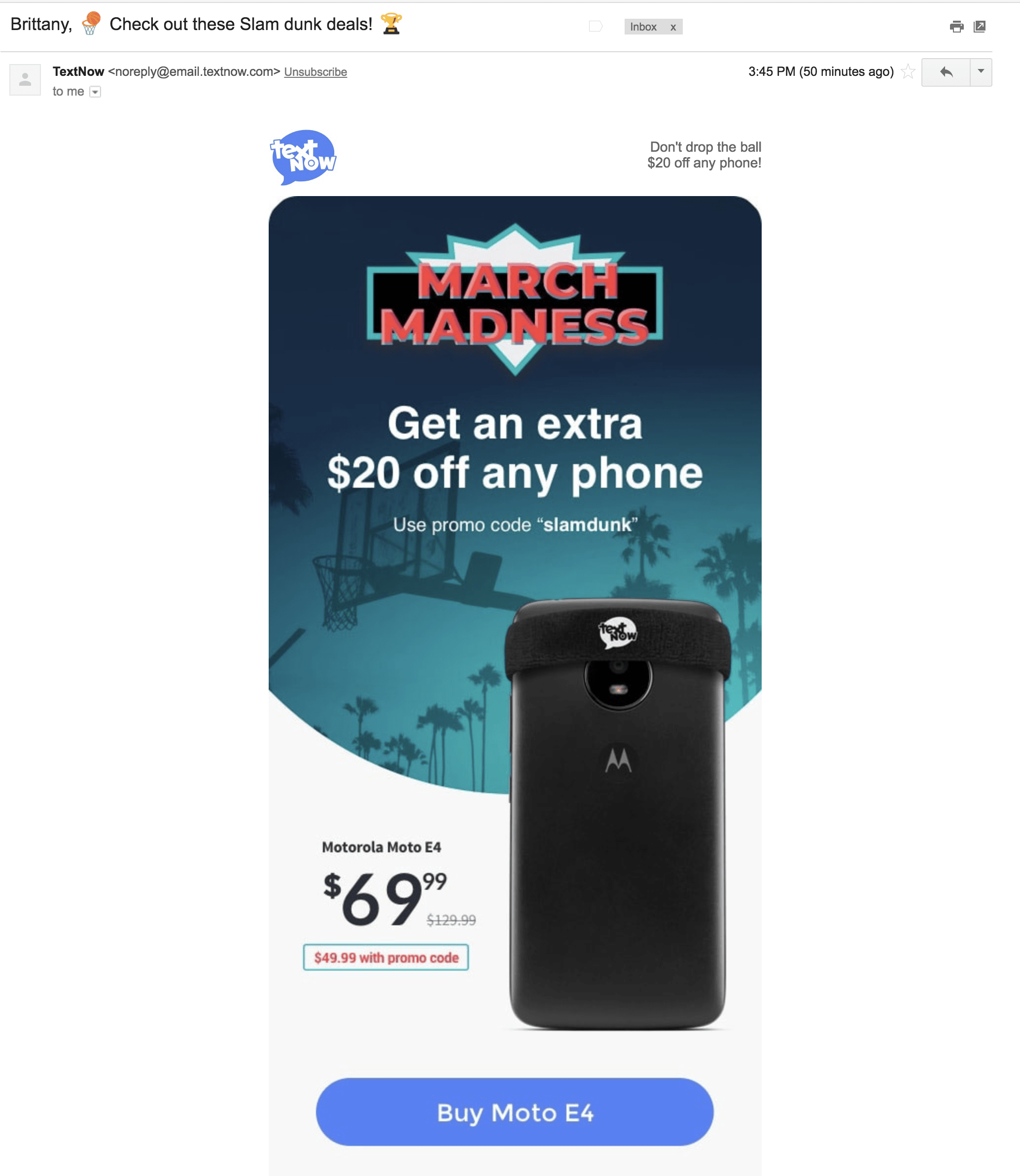
5. Brittany, 🏀Check out these Slam dunk deals! 🏆
Sender: TextNow
Why it’s great: Emojis! Power Words! Personalization! Oh my!
In this one subject line about a sale, TextNow knocked out four best practices.
- It included two emojis
- It added the Power Word “deals”
- It mentioned my first name
- It tied an offer with a well-timed event, March Madness
It’s timely. It’s relevant. And it’s a good offer. I could go on gushing, but I’ll keep my takeaway simple: This may be my favorite email subject line on the whole list.
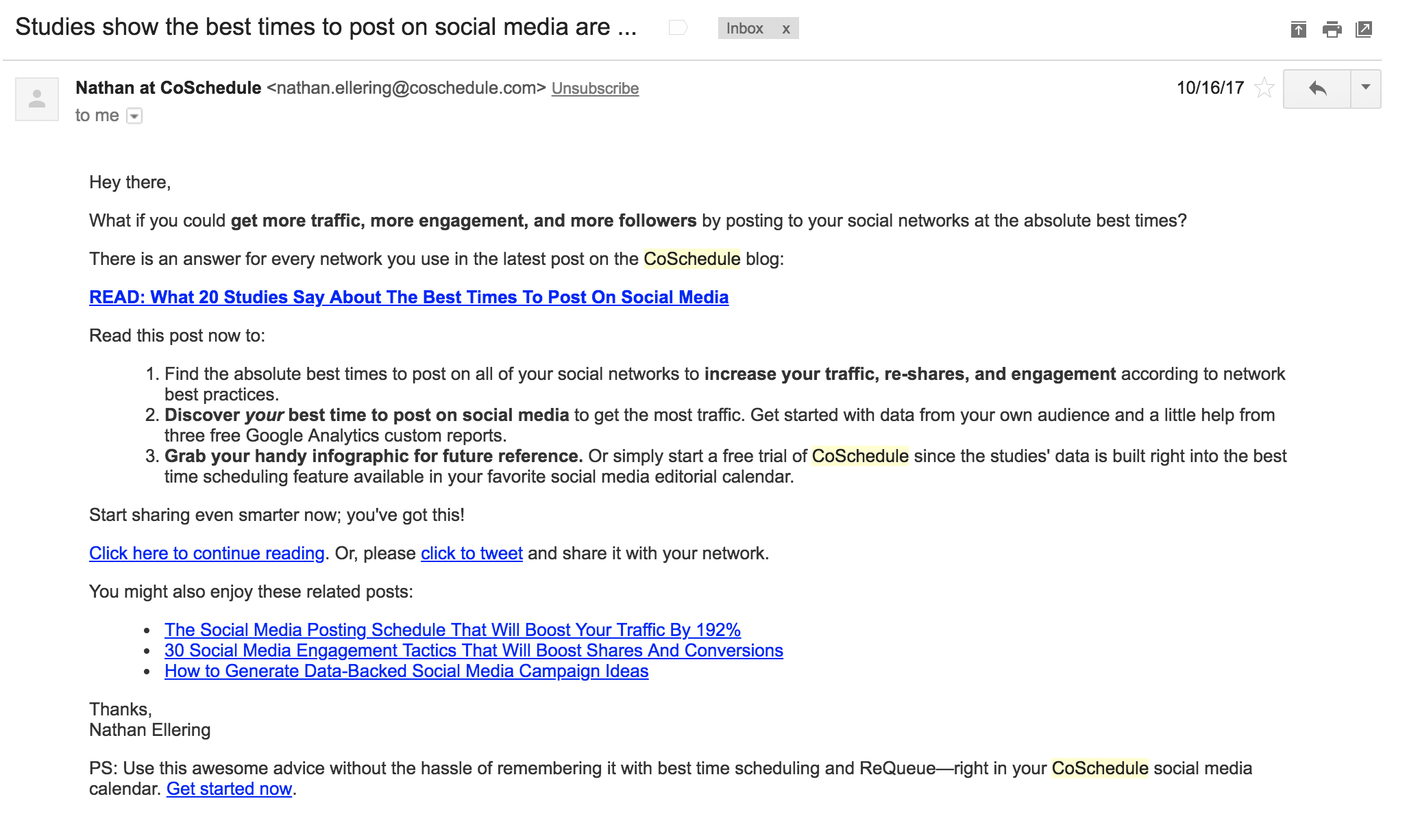
6. Studies show the best times to post on social media are …
Sender: CoSchedule
Why it’s great: This is a fantastic example of a data-backed email subject line.
This subject line expertly teases the best times to post on social media — a “golden answer” to your social marketing woes. But even if you took out the one-post-to-cure-all aspect, a data study that analyzes what other people get right and wrong is inherently useful in improving your own strategy. Everyone wants to know what others are doing, including their successes and their failures.
It’s too good not to open.
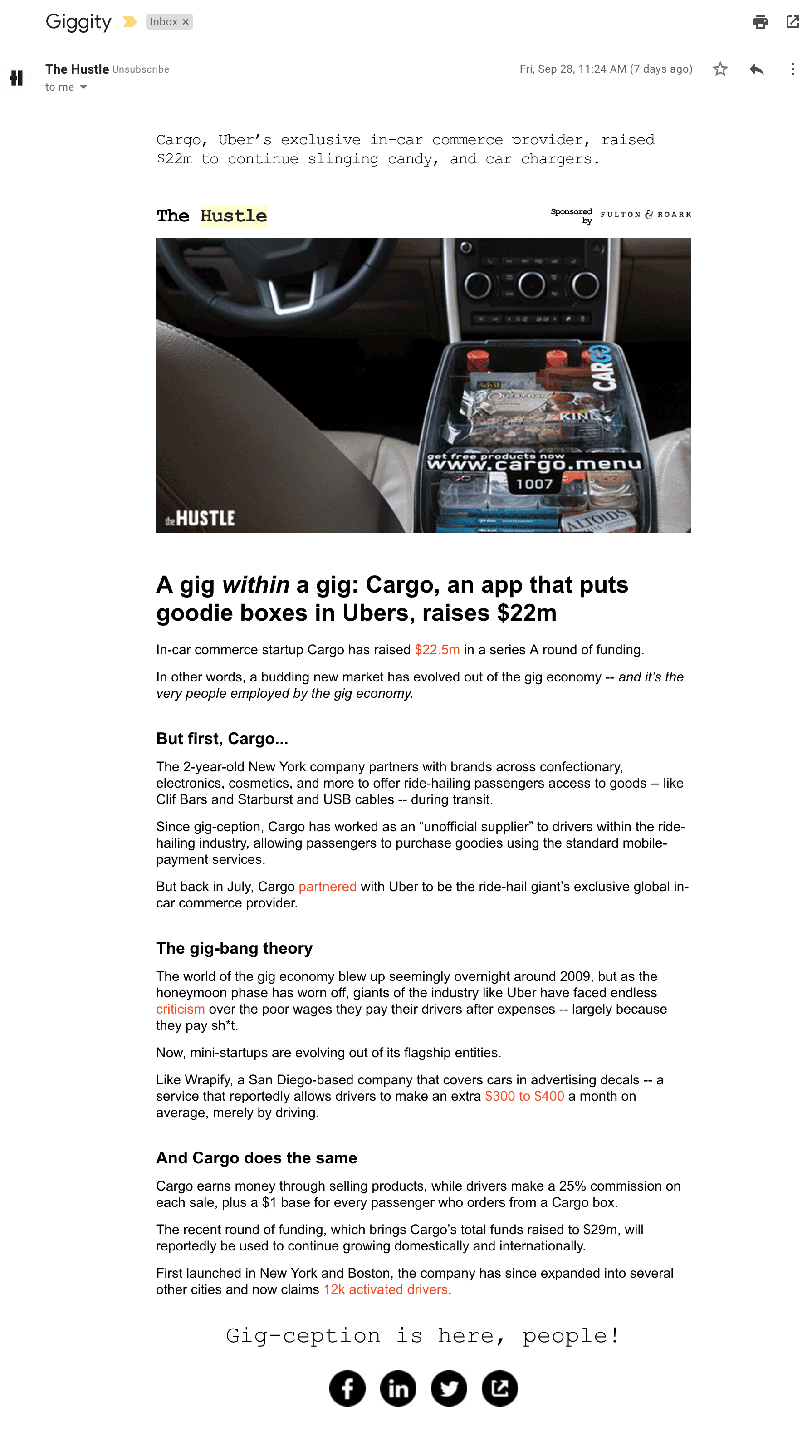
7. Giggity
Sender: The Hustle
Why it’s great: Okay, confession time. “Giggity” isn’t my favorite Hustle email subject line.
I’ve received Hustle newsletters daily for years now and they have some real gems. Favorites have included, “All our money’s in the banana stand” (an ode to Arrested Development), “Missouri beefs over meat” (so punny!), and “The man who won the lottery 14 times” (how can you not read that?!).
The Hustle is often hilarious and brimming with pop-culture references.
So why did I include a subject line that’s not my favorite?
Because it’s so dead simple. It’s one word. And in the realm of email, shorter often means more attention-grabbing.
The Hustle has some really short subject line sends under their belt — often between two and four words. There’s a hint of mystery as to what they might contain, and you’re also guaranteed to see the full title on mobile.
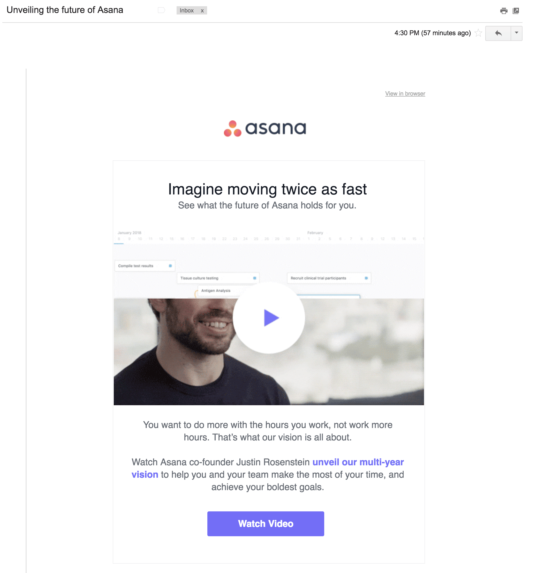
8. Unveiling the future of Asana
Sender: Asana
Why it’s great: I dread writing those big-picture, long-term vision emails. I’m always so worried I’ll get one word wrong and mess up the entire brand story.
So Asana plays it safe by keeping the email subject line to the point. “Unveiling the future” is forward-looking and intriguing enough that you want to know more about what’s in store for the company. But it’s also benign — it won’t cause a controversy internally or ruffle any feathers with customers.
My only recommendation for improving the subject line would be to add the descriptor “[VIDEO]”. In some of our own email subject line testing, we’ve found that adding a descriptor (such as video, webinar, report, etc.) helps users understand what they’re getting and can increase opens. Plus, everyone loves videos.
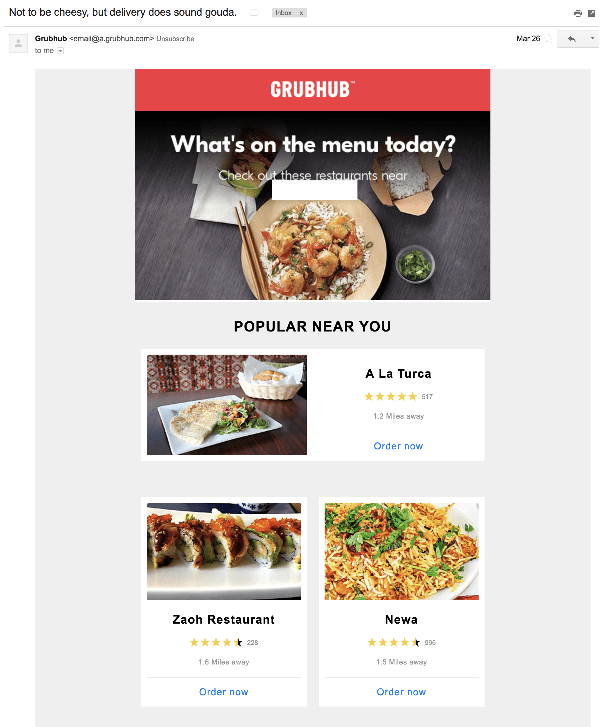
9. Not to be cheesy, but delivery does sound gouda.
Sender: Grubhub
Why it’s great: I love a good pun. And I love cheese. So I had to throw in one email subject line that’s “gouda.” Grubhub routinely keeps it quirky with food-related puns throughout its marketing and advertising campaigns.
The inside of the email isn’t too shabby either — Grubhub personalizes its recommendations based on what’s nearby and has good ratings. Hats off for this simple location-based personalization.
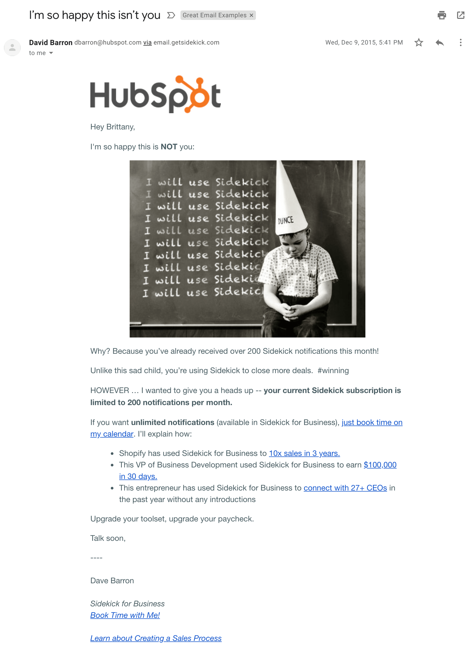
10. I’m so happy this isn’t you
Sender: HubSpot
Why it’s great: This email subject line sparks immediate fear. Seriously. What terrible mistake did I narrowly avoid?
In this case, the only grave mistake I made was not upgrading to a more expensive product tier. *Wipes sweat off forehead in relief.*
But the subject line shouldn’t be overlooked. Two reasons this email ranks on this list: The word “you” makes this email feel deeply personal and the topic fills me with curiosity.
This tone is in line with many of HubSpot’s other emails. Other email subject lines that almost made this list instead included “thought you should know” and the incredibly simple yet heart-breakingly vague “FYI.”
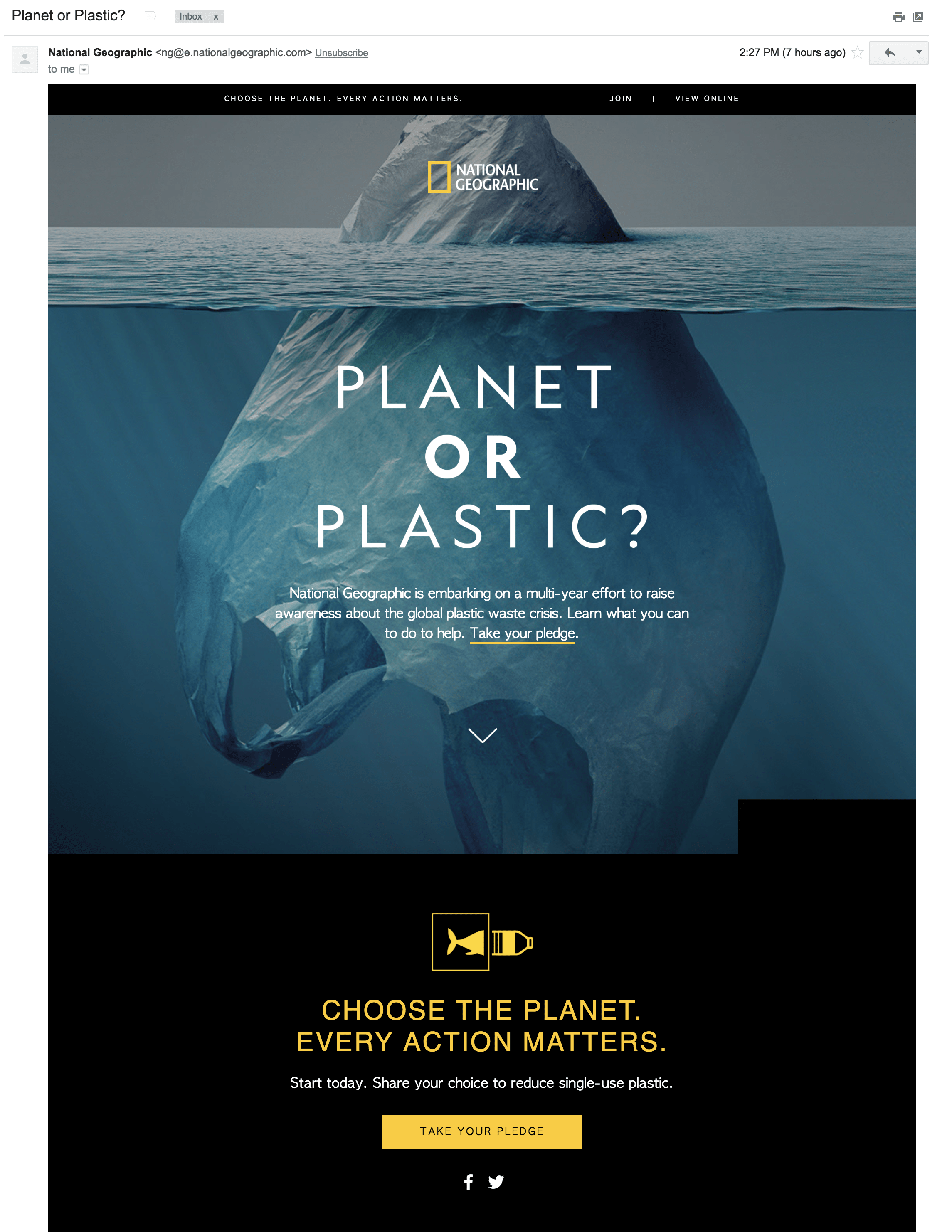
11. Planet or Plastic?
Sender: National Geographic
Why it’s great: There’s nothing quite like an ultimatum to make you stop in your tracks and pay attention. In only three words, “Planet or Plastic?” National Geographic forces you to choose what you value more: the earth or your convenience. It was a campaign that ran beyond email and certainly got me on board.
Oh, and National Geographic earns extra credit for the understated alliteration with the letter P, and a clever design of an iceberg morphing into a plastic bag.
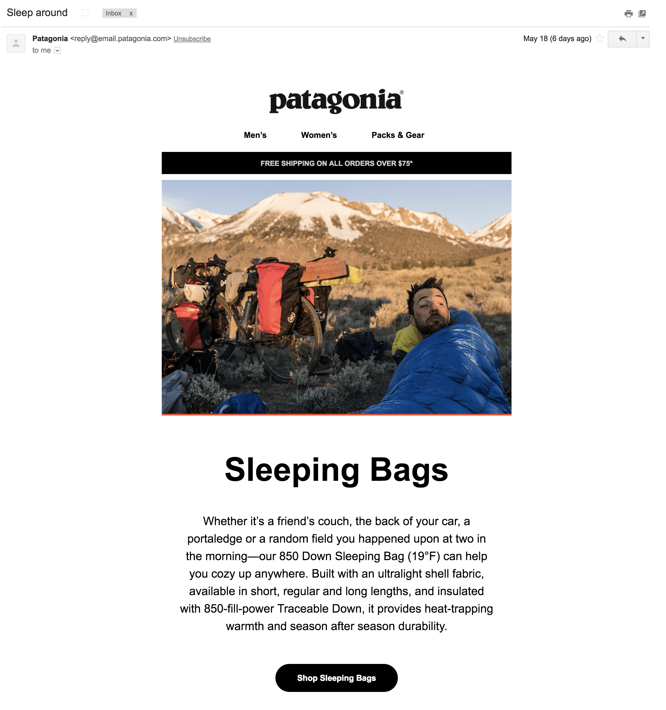
12. Sleep around
Sender: Patagonia
Why it’s great: It’s 2018 and we’re still primitive beings. By that, I mean sex — even the merest allusion to it — sells.
To market its high-tech line of sleeping bags, Patagonia came up with a playful line encouraging campers to “sleep around” in its gear. And after they got my attention, a one-paragraph description of the sleeping bag’s perks and a clear CTA persuaded me I needed this product in my life.
And a small note at the top about free shipping pretty much seals the deal.
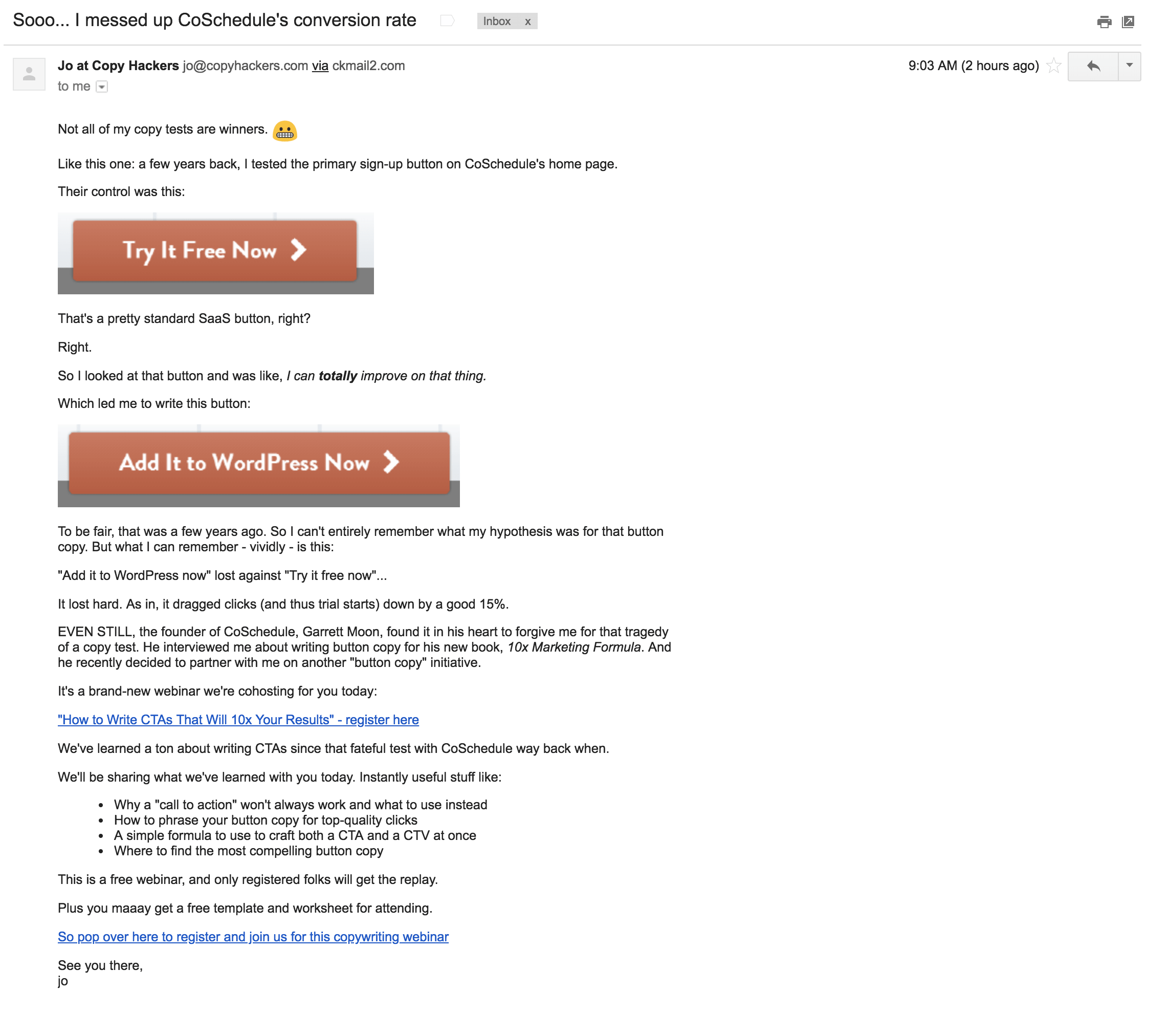
13. Sooo… I messed up CoSchedule’s conversion rate
Sender: CoSchedule
Why it’s great: I know, I know — we already mentioned CoSchedule above. But I loved both of its examples so much, I couldn’t pick just one.
Each email utilizes a totally different tactic, each compelling in its own right. And, honestly, we should all come to expect email subject line greatness from CoSchedule, because they built an Email Subject Line Grader, alongside a whole slew of email best practice content.
In particular, this email caught my eye due to its raw honesty. The writer saw an opportunity to optimize a button, crafted new copy, and was completely wrong in the hypothesis. What they thought would be the winner was undoubtedly the losing version.
But the experiment made for a great email. And I’m glad CoSchedule shared its failure with readers — it helps ensure that we don’t make the same mistake.
Because of this subject line, we’re all better off.
—
Want to read more? Download our Mobile Marketing Trends report, Not Your Grandma’s Email: The Transformation of Email in a Mobile World.

