In the mother of all moves toward vamping up the Apple App Store, SVP of Worldwide Marketing Phil Schiller unveiled an all-new iOS 11 redesign this year at the Apple Worldwide Developers Conference (Apple WWDC 2017). This is the most significant update since the App Store launched nearly a decade ago — and one that will undoubtedly transform the app marketplace as we know it.
The new iOS 11 App Store mimics the aesthetics of the Apple Music store with a feed-like design, all-in-one scrollable pages, end-to-end graphics, and immersive videos that play automatically. Yet the new App Store surpasses all other Apple Services in terms of its in-depth and fresh editorial content, which is inherently tied to Schiller’s lofty quest to transform the App Store into a trendy hub and news source users are more inclined to visit on a daily basis.
These hefty changes affect both Discovery Pages and App Store Product Pages, and will ultimately require that you revisit your App Store Optimization (ASO) strategy. To set you sailing in the right direction, we have compiled a list — informed by tests we have already performed on iOS 11 — of the top three ASO tests you should run on the all-new App Store.
But first …
App Store User Journey
Before we get into the nitty-gritty of testing on iOS 11, it’s important that you have a solid understanding of App Store visitor behavior patterns.
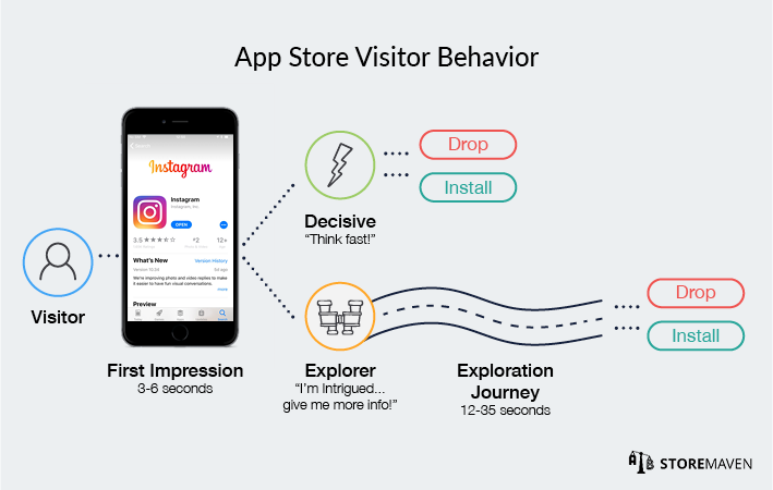
Lucky you, we’ve made a fancy schmancy infographic to help you better understand.
StoreMaven’s findings after analyzing how 500 million+ users behave on App Store and Google Play.
After analyzing App Store visitor engagement for what seems like an eternity, one of our biggest learnings is that we can classify App Store visitors into two distinct groups, based on their behavior patterns.
- Decisive Visitors: These iron-jawed folks decide to install or leave your app store without ever engaging with the page. In other words, these visitors are only exposed to creatives that appear in the First Impression Frame (everything above the fold), and their only action is either tapping the install button or leaving the page altogether. Believe it or not, but Decisive Visitors make up 60 percent of App Store users. This means your First Impression Frame is pretty darn important.
- Explorer Visitors: These curious trotters choose to browse through available content in your app store in an effort to make a more informed decision before installing. Because Explorer Visitors are exposed to more information, they are often more excited about your app and, in turn, boost higher post-install KPIs. Explorer Visitors make up the other 40 percent of App Store users.
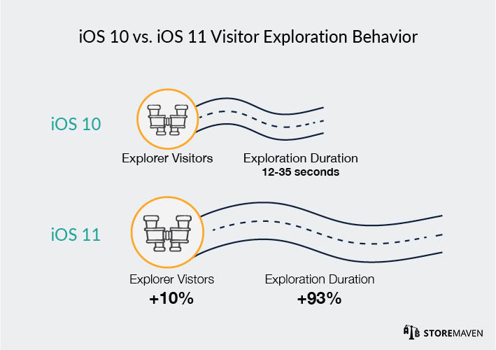
What’s particularly interesting is that based on our initial tests on iOS 11, these behavior patterns are shifting. Check this out.
Insights from StoreMaven’s Initial iOS 11 User Behavior Tests.
What do these results mean?!
More visitors are exploring your Product Page, and you need to get ready to pounce on this new opportunity to gain higher quality customers!
We know what some of you might be thinking: these findings could simply be a result of the new layout. And you folks are quite clever. The new layout certainly plays a role in provoking more visitor exploration and we will have to continue testing beyond the iOS 11 debut to truly understand how the new layout will affect long-term visitor behavior. Regardless, this is still a good opportunity to leverage the curiosity surrounding the new layout to get more qualified customers!
So, let’s talk testing…
#1 Video Performance Test
Since App Preview videos became available on the Apple App Store in 2014, they have proven to be a powerful tool for developers to effectively communicate the look, feel, and utility of their app (read this and this if you have doubts). Where developers are able to more quickly highlight their unique selling points, customers are able to make more informed decisions whether to install. Therefore, videos have the concomitant benefit of driving more qualified installs and, in turn, improving customer retention.
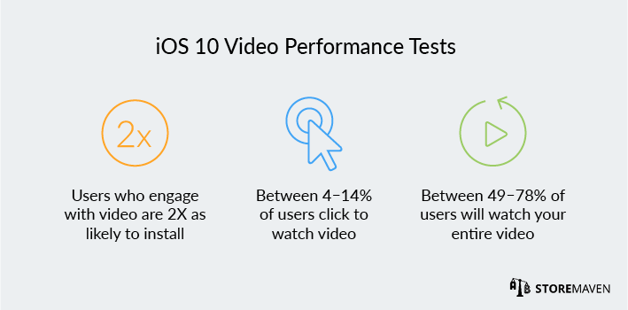
But hey, don’t trust us … trust our numbers.
Insights from iOS 10 Video Performance Tests in Games Industry Conducted by StoreMaven (Sample Size: 1,426,604 Visitors).
Despite ample evidence of the awesomeness of App Preview videos, many developers still choose not to use them. With the iOS 11 App Store updates, however, you will quickly discover that if you are not utilizing video, you are falling behind.
If you are not utilizing video, you are falling behind.
What’s New With Video on the iOS 11 App Store?
Several upgrades have been made to videos in the iOS 11 App Store that will be an absolute game changer in the realm of app discovery and conversion optimization. Here’s an overview of the most significant improvements.
- The Gallery can now host up to three App Preview videos (each can be 30 seconds in duration).
- The first video will play automatically, but sound will be muted by default.
- The second and third videos will play automatically when users scroll the Gallery.
- Videos will also autoplay accordingly in Search Results Pages.
- You can now localize your videos for all available App Store languages.
These upgrades function to create a more immersive user experience and help developers better communicate the features, functionality, and user interface of their app to customers. Hence, the new App Store offers unique opportunities to leverage the consummate utility of video to take on heavily entrenched competition, improve conversion rates, and drive more qualified installs.
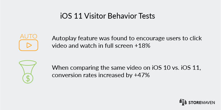
Still unsure? Check out these findings.
Insights from StoreMaven’s Initial iOS 11 User Behavior Tests.
These results are even more proof that now is an important time for you to bite the bullet and invest in your creatives so that you can incorporate good App Preview videos into your App Store marketing strategy.
Initial Test Recommendations on iOS 11 App Store
Test Video Content
Before, apps could jam-pack a lot of cool app features into one single App Preview trailer. Since the Gallery can now host up to three videos instead of just one, creative teams will have to learn how to tell stories across multiple video assets. At the same time, creative teams will have to conjure up ways to make App Preview videos stand out alone, as well as have cohesion and tell a broader, compelling story in relation to other videos in the Gallery.
Tip: We recommend using each video asset to focus on a different aspect of the app. For example, in the game industry, you can divide three video assets into the following themes: game play, lifestyle associated with game, and game level progression.
Test for Optimal Number of Videos
Based on a plethora of data that we have collected on iOS 10, we know that having a video results in greater engagement with the Gallery. Therefore, other assets suffer a lack of engagement at the expense of a video. So, having three videos that autoplay will undoubtedly have an impact on the exploration journey — and not necessarily a positive one for your target audience. Therefore, we recommend testing to determine the implications of multiple videos on the Explorers’ journey.
Tip: Start by testing the following variations: no video, one video, two videos, and three videos. This is an initial test and based on these results, you will be able to better strategize. From there, you can begin to test video sequence to determine the optimal order of your video assets.
#2 Gallery Orientation Test
App Preview videos (up to three) and screenshots (up to five) can still be oriented in either portrait or landscape formats within the Gallery. For more information on which orientation is best for your CVR, this is a great resource.
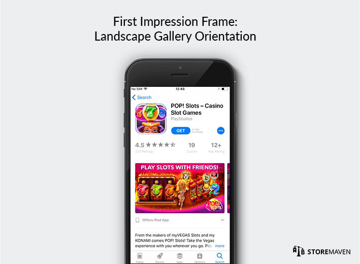
Just like the iOS 10 version, when developers choose to use the landscape orientation, then only one App Preview video or screenshot will appear in the First Impression Frame.
The benefit of a landscape orientation is that it allows you to set a clear and focused First Impression Frame. In other words, visitors are not distracted by other assets in your Gallery, as they will only see one landscape video/screenshot upon entering your app store.
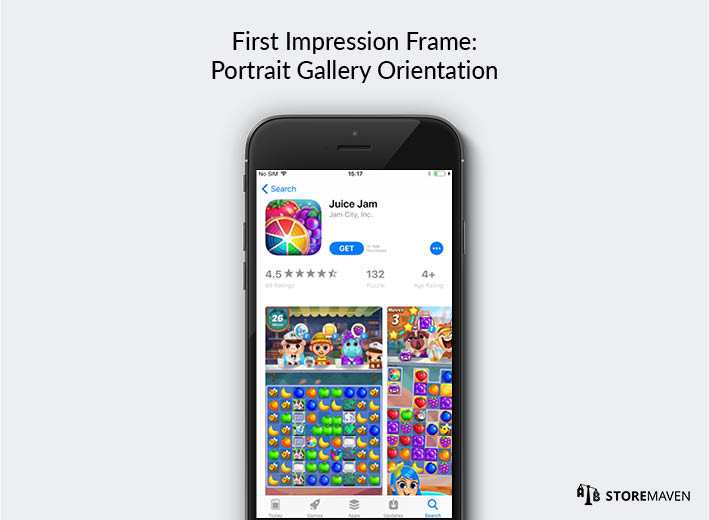
When developers choose the portrait orientation, two App Preview videos and/or screenshots will appear in the First Impression Frame.
The benefit of a portrait orientation is that you will have two videos/screenshots that can be used to grab your visitors’ attention. The portrait orientation naturally acts to provoke curiosity in a way that encourages users to scroll the Gallery — almost instinctively.
What’s New About the Gallery on the iOS 11 App Store?
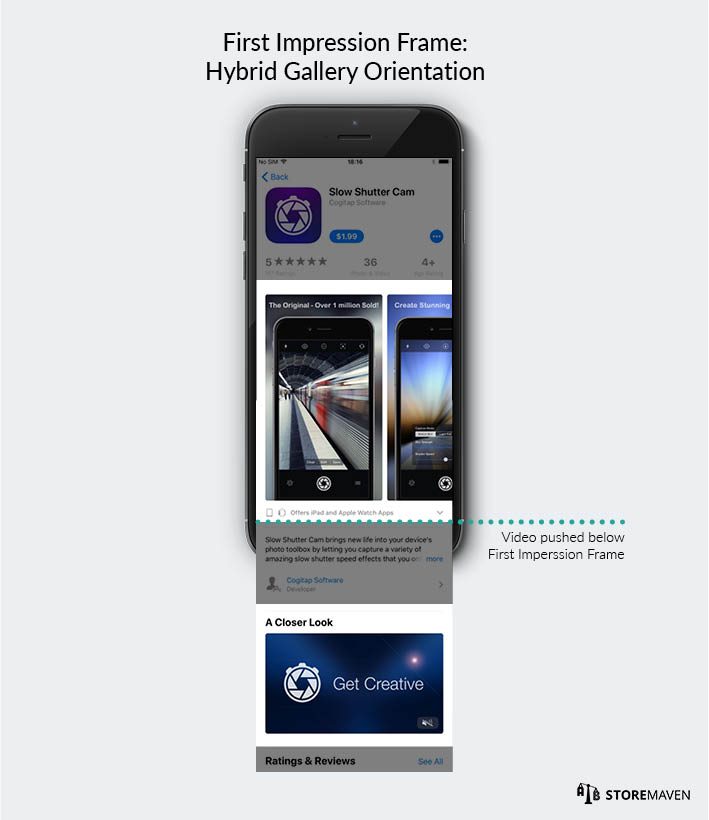
As previously mentioned, you can still choose a landscape or portrait Gallery orientation on iOS 11. However, what has changed is the layout of the hybrid Gallery orientation (a video in the landscape format with portrait screenshots). When you choose to have a hybrid Gallery, your Product Page will be completely altered, as the video will be pushed below the Gallery.
Video orientation is ever more important, as visitors will no longer be exposed to a static video thumbnail but rather a video that plays automatically. Each orientation comes with its own set of implications, which is why Gallery orientation testing is important.
Initial Test Recommendations on iOS 11 App Store
Test Gallery Orientation
As previously discussed, Gallery orientation will have implications on your First Impression Frame. Since we know that your First Impression Frame has a significant impact on your entire funnel in terms of dividing behavior patterns into Decisive and Explorer Visitors, it is crucial you make this a data-informed decision.
Tip: We recommend testing the following variations: landscape Gallery orientation (dedicated design), portrait Gallery orientation (dedicated design), and a hybrid Gallery orientation (combination of respective designs).
#3 Remarketing Test
The new App Store offers unique remarking opportunities with regard to the “What’s New” section. The “What’s New” section is still a place for developers to communicate any updates made to their app. This section is crucial for highlighting any changes and encouraging existing customers to re-download the latest version of your app.
What’s New About Remarketing on the iOS 11 App Store?
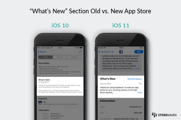
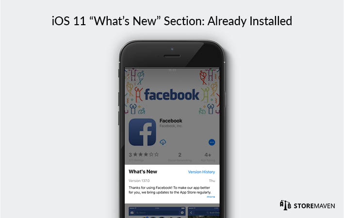
In the iOS 10 App Store, the “What’s New” section was located below the Description. In iOS 11, the position of this section depends upon whether the visitor has ever installed your app. If a visitor has have never installed your app, then it will appear below the Gallery as depicted above.
If the visitor has at any point downloaded your app (even if they have uninstalled it), this section will now appear at the top of your Product Page, as depicted above.
Initial Test Recommendations on iOS 11 App Store
Test “What’s New” Content
Apple always had the “What’s New” section, but now the location shifts according to whether a user has ever downloaded your app. This is a unique opportunity to refine messaging for two reasons.
- Convince existing customers to reinstall the latest version of your app. Data shows that only 21 percent of iOS users upgrade to the latest version of your app within a week of it going live.
- Convince unsatisfied, former customers to re-download your app. Just because a user has uninstalled once, doesn’t mean they’re lost forever!
Tip: Analyze your reviews to better understand why customers may be unsatisfied with your app. The common issues that people have articulated about your app are the points to address in the “What’s New” section. Hence, content should rely on a review analysis. You should also do market research to identify features that are trending. Once you do this, you will also be able to include related content in your “What’s New” section.
Summary
From the initial tests we have conducted on iOS 11, we know that the new App Store increases visitor exploration behaviors. More specifically, we saw that 10 percent more visitors are taking the time to explore App Store Product Pages beyond the First Impression Frame. Also, the exploration journey itself has increased by 93 percent. These changes represent an exciting opportunity to gain higher quality customers.
In order to help you pounce on this new opportunity, we’ve recommended three ASO tests you should start with on iOS 11. Here’s a recap for all you skimmers that feed off summary sections…
#1 Video Performance Test
We recommend taking full advantage of the new video assets available on iOS 11. We simply cannot speak enough of the power of good App Preview videos in increasing conversion rates and driving more qualified installs. To help you best utilize your video assets we recommending testing:
- Video Content
- Optimal Number of Videos
#2 Gallery Orientation Test
Since your Gallery orientation has implications on the First Impression Frame, which has a direct impact on defining visitor behavior patterns (i.e. dividing visitors into Decisive and Explorer Visitors), your Gallery orientation should be a data-informed decision. Hence, we recommend testing:
- Landscape vs. Portrait vs. Hybrid Gallery Orientations
#3 Remarketing Test
The new iOS 11 App Store has a mechanism that identifies whether a user has ever downloaded your app and, in turn, shifts the location of the “What’s New” section accordingly. If users have ever installed your app (even if they have uninstalled it), this section will now appear at the top of your Product Page. Therefore, you have a new opportunity to refine your messaging to convince existing customers to reinstall the latest version of your app, and leverage the prominent new location to convince unsatisfied, former customers to re-download your app. Hence, we recommend testing:
- “What’s New” Content
All-in-all the iOS 11 App Store redesign offers exciting new opportunities to capture more qualified customers. However, it requires that you revisit your ASO strategy and you do so now, in order to reap the rewards.
If you have any questions, feel free to contact us! That’s what we’re here for.


