In today’s App Engagement Analysis, we’re diving into Candy Crush Jelly Saga, the gelatin-packed version of King’s hit game. This iteration of Candy Crush introduces new candies and mechanics, yet it’s intuitive enough for first-time players to enjoy.
For mobile games, the first 10 minutes is critical for user retention. During this time period, users are going through tutorials and learning how the game works. If the game isn’t immediately fun and intuitive, players might just move on to something else.
Therefore, good engagement is essential for delivering a game that people love. A clean, simple, and intuitive user experience helps newbies get hooked on your game as soon as they boot it up.
First-Time User Experience
What Candy Crush Does Well
Candy Crush does a few different things to keep new users engaged. Let’s go through them one by one.
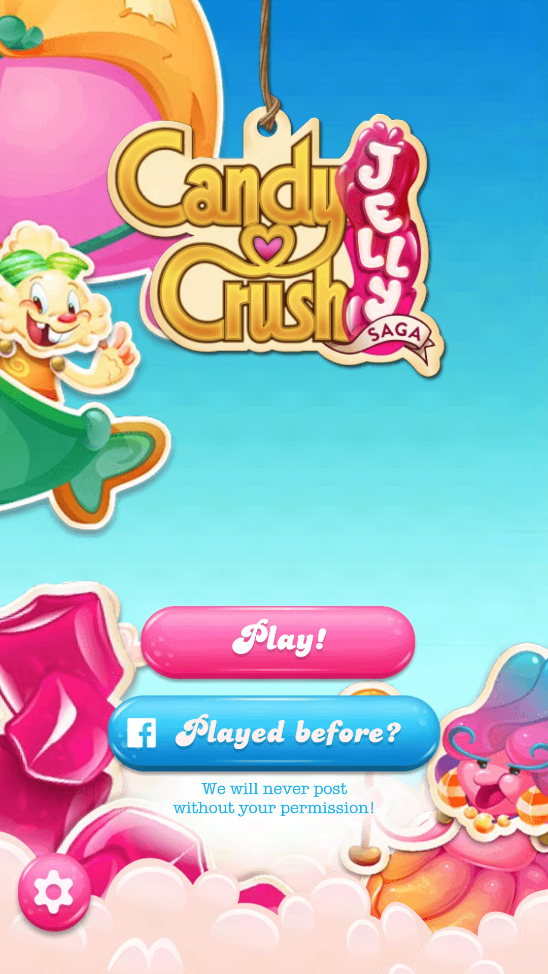
For starters, the game’s title screen presents a call to action for both new and returning users. This is a good decision because many “first-time” users of Jelly Saga won’t be first-time users of Candy Crush in general. This way, there’s no worry that players will have to start from scratch and re-add their friends.
Of course, logging in through Facebook is useful for retention too. This helps users keep track of their scores and connect with their social networks. There are many examples of apps that have increased retention by encouraging social logins.
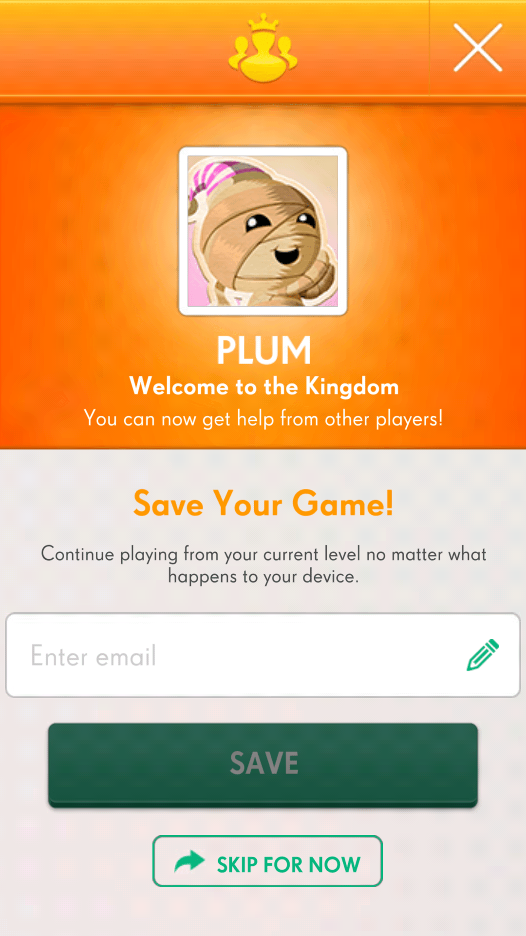
Interestingly, the game doesn’t force new users to create an account. It’s possible to jump straight into the first level and play on your local device. However, if you open the settings, you can set a username, avatar, and email address. This means tying your game progress to an online account and syncing it to any other devices you might have.
It’s generally beneficial to get users to sign up for an account. For instance, if you have access to a player’s email address, you can send re-engagement messages or offer discounts to bring them back to the game.
But, there’s a catch — you may not want to force players to sign up before experiencing the game. Forced signups mean the user must commit to the game before even knowing what it’s about. App developers frequently recommend a “try before you buy” approach, giving users the option to skip account creation until later in the lifecycle.
One Thing To Improve
It’s good that creating an account isn’t mandatory, but the app could do a better job of prompting users to create an account and input their email addresses. For example, the UX team could make the settings button jiggle or glow, indicating that the user is missing profile information. Another option is to wait until the user’s second play session before showing an in-app prompt that asks for registration. These are relatively non-obtrusive ways to get new users to sign up without interrupting their first-time experience.
Alternatively, in line with the “try before you buy” approach, Candy Crush Jelly Saga could wait until a day after the player’s first session and send a push notification asking them to come back to the game, register, and take advantage of capabilities — like syncing across devices.
In-Game Experience
What Candy Crush Does Well
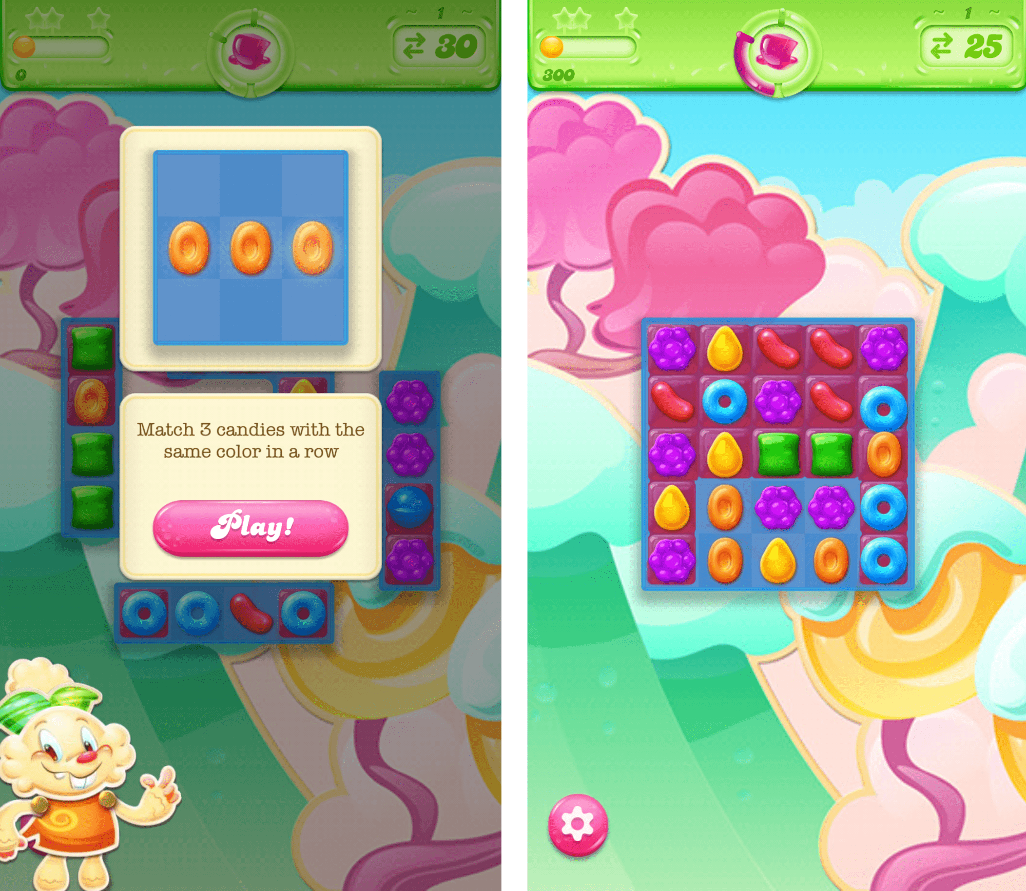
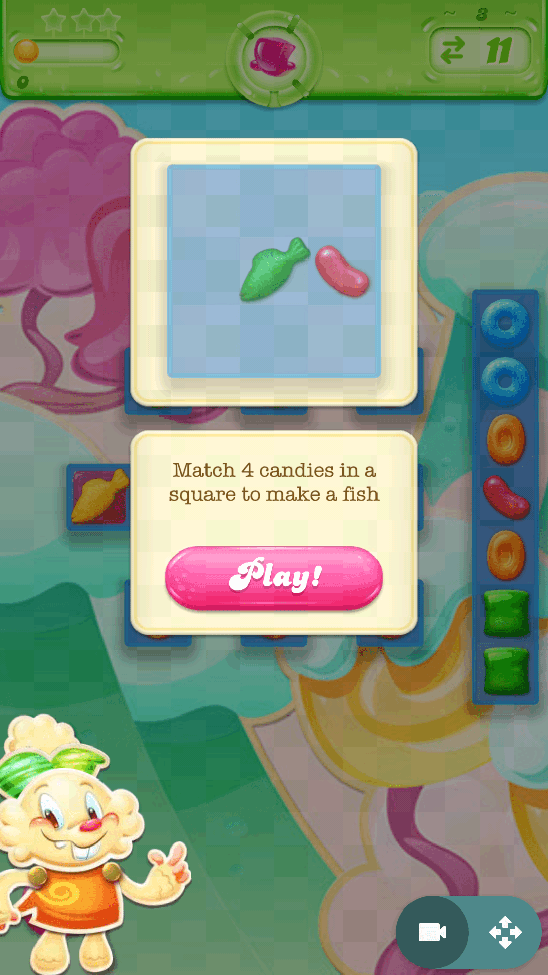
The gameplay is the core of Candy Crush’s app experience. The app does a good job of explaining the rules of the game, in case it isn’t immediately obvious.
The first few levels don’t explain any of the complex mechanics — they just tell you the basic rules and let you experiment. Later on, the game explains how the other mechanics work via in-app messages.
By and large, this works well because it gets players into the game without overloading them with information.
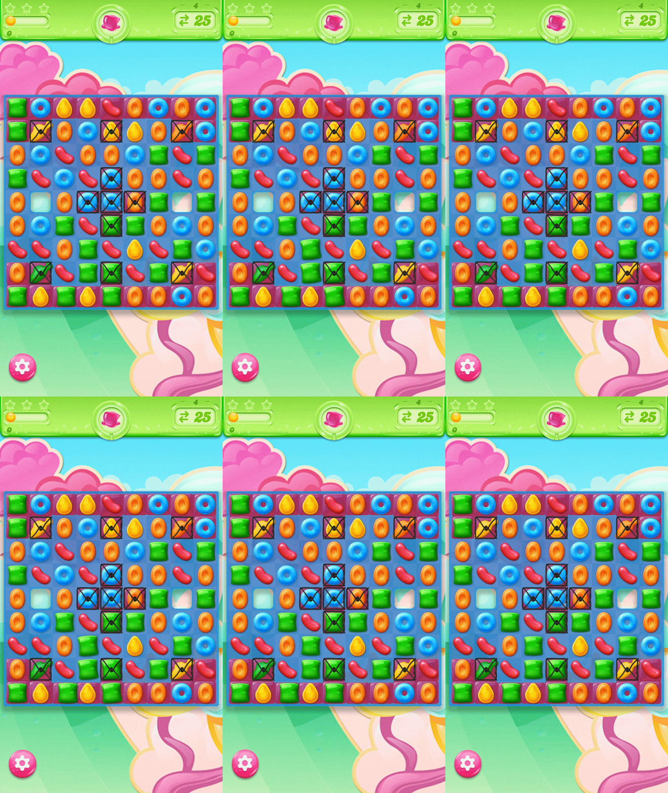
Additionally, if you get lost and can’t find a match, the game will give you a hint, Candy Crush provides players with hints in case they get stuck, like the wiggling squares below.
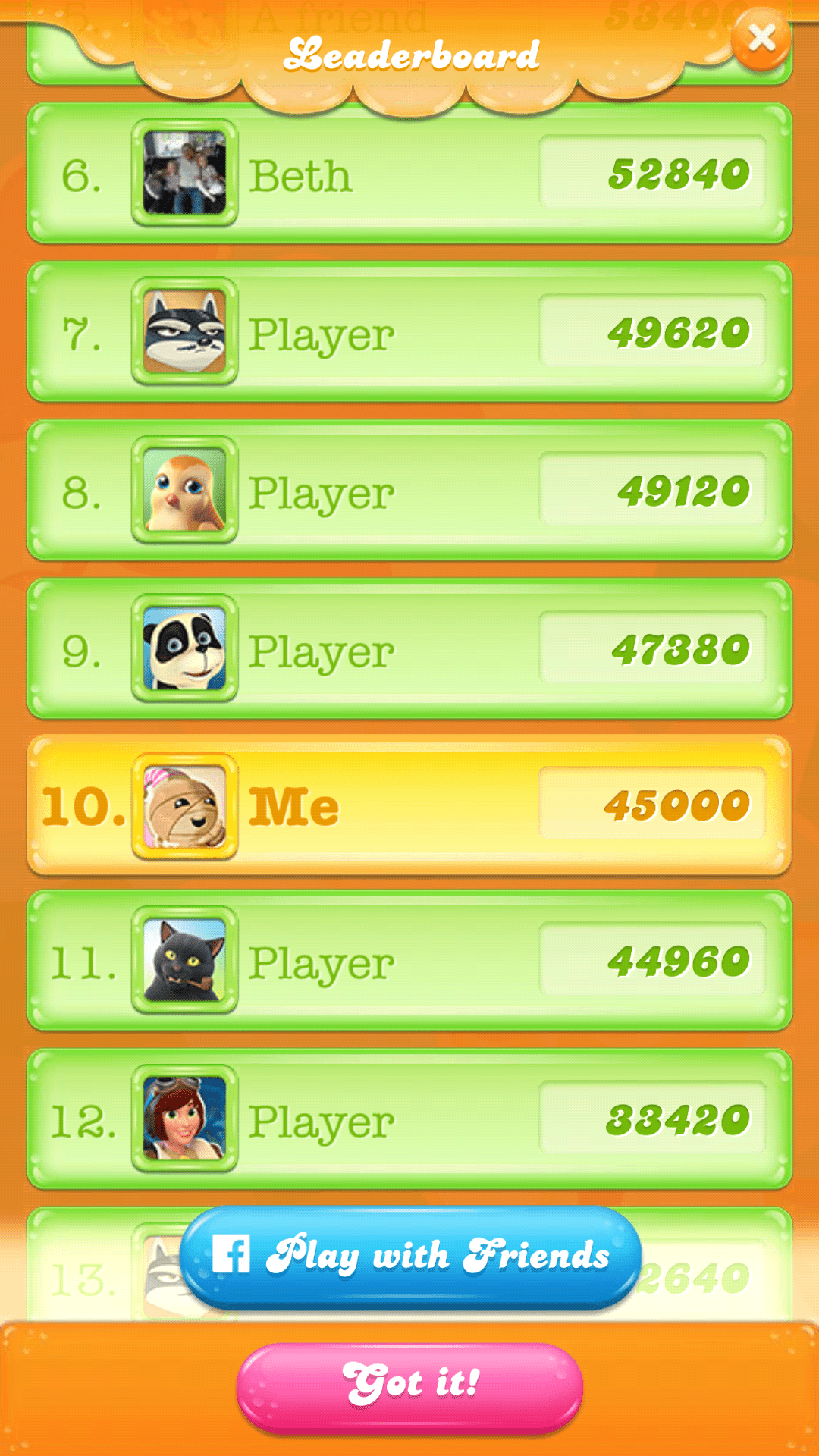
Finally, each level ends with seeing how you stack up on the leaderboards. Your score is compared against a group of other players. The game doesn’t tell you where this list is pulled from — it could be a random selection of players, or perhaps based on location. In either case, it provides some incentive to retry the level and get a higher score.
Of course, the incentive is stronger if you connect your Facebook account and compare your score against friends. Not only does the leaderboard encourage users to integrate their account, but it gives them another reason to keep playing and competing, driving them a little deeper into the mobile engagement funnel.
One Thing To Improve
While it’s helpful that the game doesn’t overload you with information at the start, this can be confusing in its own way. The game doesn’t tell you how the more complex candies work, but they still work — meaning that you see the effects of certain candies without understanding what you’re doing.
This is most noticeable during the end-of-level bonus, which occurs without any user input. It seems to be an important part of the game, but it’s not explained within the first 10 levels.
The game could benefit from providing more in-app messages to explain the game mechanics. If these messages are too obtrusive, the app team could perhaps create a separate menu for instructions.
Monetization & Re-Engagement
What Candy Crush Does Well
Monetization is one of the biggest challenges for free apps. The app team must somehow convert their player base into paying customers, even though the base game is free. Furthermore, they need their players to keep coming back. Otherwise, they’ll be forced to pay the cost of acquisition to replace each person that churns.
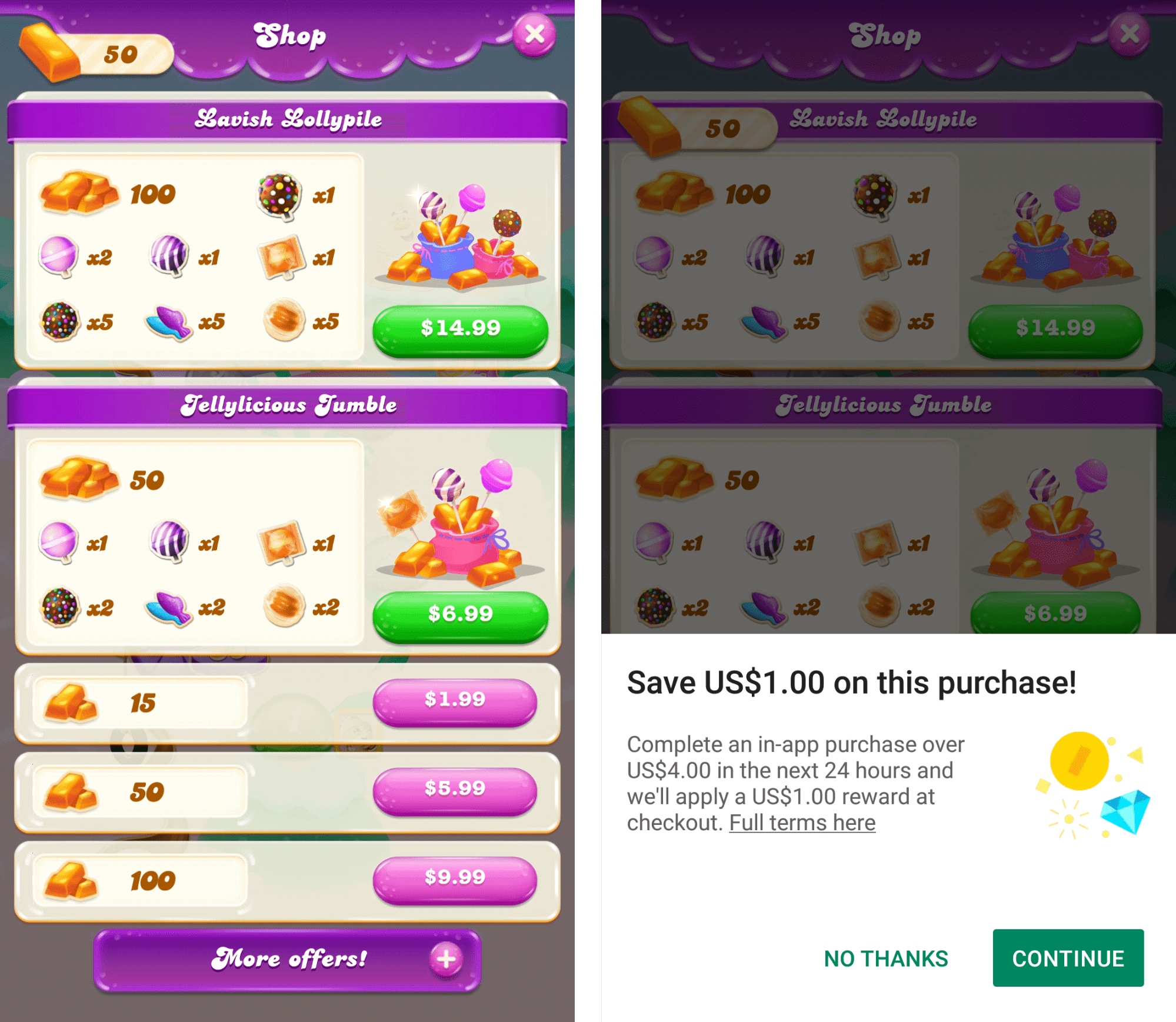
To turn candy into cash, Candy Crush turns to in-app purchases. The left screenshot is from the in-game store. You can buy a variety of items to get a higher score, replenish your health if you run out of moves, and more. These items aren’t necessary at first, but come in handy once you reach later levels of the game. When the difficulty ramps up, players have more incentive to buy items.
As a monetization tactic, in-app purchases prove especially effective. Candy Crush made waves in 2015 for making $1.3 billion in one year. More recently, researchers learned that in-app purchases account for $2.8 billion of all purchases made through Apple’s app store. But most of those purchases are made by 1 percent of users. So Candy Crush tries to appeal to a wider base by offering discounts.
When I tapped the purchase button, I received a discount (the screenshot on the right). There are other discounts built into the app that triggers at various times — making it more and more enticing to splurge on an in-app purchase.
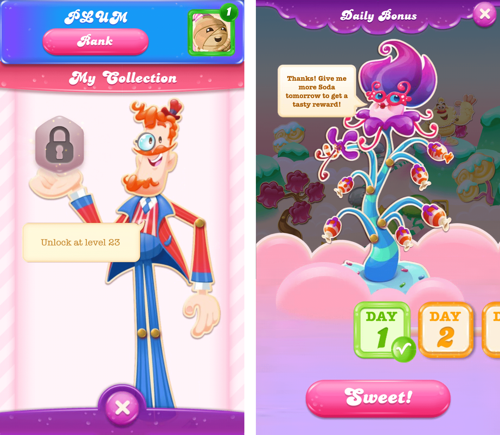
These are a couple more retention mechanics used in the game. We have the Rank system (left) and Daily Bonuses (right). Your Rank increases as you play the game and achieve a higher score on past levels, while Daily Bonuses are rewarded — you guessed it — every day. It’s an incentive to play the game a little bit every day.
Both mechanics increase the player’s drive to progress and keep them returning to the app in the long run.
One Thing To Improve
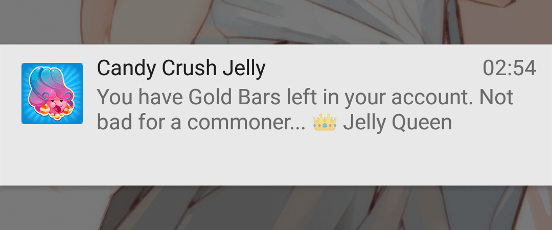
When I first downloaded the app, I played roughly 10 levels and then stopped. After two weeks, I received only one push notification, shown below.
This is a great push notification because it gives the player a reason to return to the game — and it’s even written from the perspective of an in-game character.
However, there’s room to go even further with this. If a dormant player doesn’t want to re-engage, you can send a push notification offering free in-game items or a flash sale on in-app purchases to sweeten the deal. When you want to deliver that message, you can tweak your message timing to find the perfect frequency. This message was delivered almost a full two weeks after I downloaded the game; that’s quite a long break for a first-time player. A (more successful) re-engagement message could be sent sooner to new players that are at greater risk of churning.
To give your retention strategy greater life, set up an automated lifecycle campaign that reaches dormant users on a regular cadence for a set period of time. Try day one, day three, day seven, etc. — until players come back. The glory of automating a series of messages like this is you can “set it and forget it,” so you can focus on scheduled campaigns, while triggered or re-engagement campaigns continue to work for you in the background.
If push notifications aren’t an option because you don’t have push permissions, coordinate with email. Data shows that sending emails in combination with other channels — like push notifications — increases the average weekly number of sessions by 3x. The game gives players an incentive to input their email addresses; this can be used for re-engagement messaging as well.
Crushing the In-App Experience?
Does King crush the in-app experience with Candy Crush Jelly Saga? In many ways, the answer is yes. The game is easy and intuitive to play, and it’s filled to the brim with incentives to keep coming back day after day.
Overall, the main element of mobile engagement that could be improved is messaging. Instead of passively waiting for users to return, the app could better proactively ask for push notification permissions and send re-engagement messages. The app ecosystem is crowded, but no matter how many new games a user is trying out, setting up re-engagement campaigns will keep the app top of mind.
For more app engagement analysis, check out our ever-growing list, which includes Farfetch, KLM, Spotify, and more.
—
Leanplum is a mobile engagement platform that helps forward-looking brands like Grab, Tinder, and Tesco meet the real-time needs of their customers. Schedule your personalized demo here.


