Imagine this: You come across a new app that promises to do exactly what you want it to, and you eagerly hit the download button. A moment later, the app launches, and you’re ready to get started. But first, you have to sign up for an account, before giving the app permission to access your location and send you push notifications. Then you have to go through the tutorial, and so on!
Here’s the scary truth: It doesn’t matter how useful the core of your app is if the user never gets to see it. And that’s why app user flow is so important.
What is User Flow?
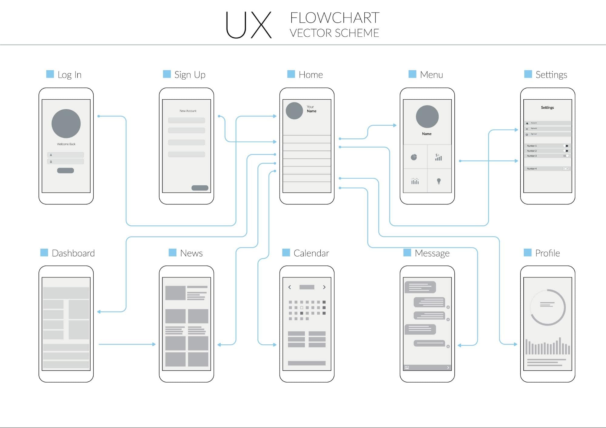
A user flow is the sequence of actions that users perform to access different parts of your app. The user flow I described above is user onboarding: it’s the process of downloading an app and setting it up for the first time. Depending on the type of app, other user flows might include purchase/checkout, playing a session in a game, or searching for products in a store.
If users encounter friction in one of your flows, there’s a chance that they’ll leave your app for good. That’s why it’s critical to optimize each and every one of your mobile user flows.
So, how can you make user flows that are simple, effective, and friction-free? Here are a few oft-overlooked techniques that everyone should know.
Why Do We Use User Flow in UX design?
User flow helps your app create an intuitive user experience, your users can move through your platform with ease and gives users an easy way into the app which increases the chances of them signing up or purchasing.
Secondly, user flow charts help you figure out what is working and what isn’t. Mapping out user flow will give you the insight you need to improve the overall UX design of your app.
Finally, user flows are so useful for all interface and web design that they are the ideal way to showcase what is being created or in progress to visualize solutions to your larger team.
1) Use Data to Optimise App User Flow
As a rule of thumb, the numbers come before everything else. There’s not much you can safely do in marketing without collecting data to inform your decisions.
Changing your app’s user flows based on gut feeling is risky, to say the least. At best, it might improve your app in some ways while hurting it in others — but at worst, it could cost you users. If you want to consistently improve your app rather than leaving things to chance, your best bet is to base your decisions on user data.
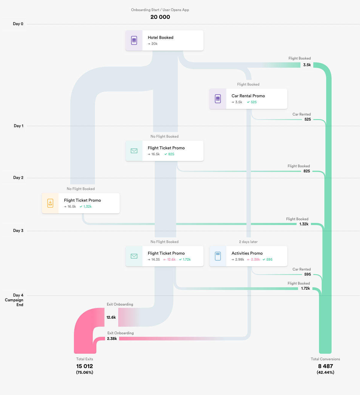
There are many ways to collect user data for your app, but the most efficient option is to use an integrated mobile marketing solution that can consolidate data from multiple sources, for example, as the Leanplum mobile engagement platform does. Instead of importing and processing data from a siloed analytics platform (which may be error-prone), you can access your data directly and use it to optimize your user flows.
Seeing the customer journey big picture courtesy Journey Analytics in Leanplum
2) Find What Works and What Doesn’t
Now that you have some data to work with, your next step is to figure out what works and what doesn’t.
Let’s say you have a text-heavy tutorial in your app, and know that some users drop out of the flow by skipping it. You’ve identified part of your user flow that’s causing problems. And that’s your cue to throw together a quick A/B test to see if the app user flow can be improved. If people respond more positively to an image-based tutorial, then — congrats! You’ve figured out what works.
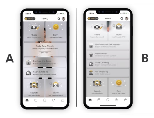
Look to other successful apps to see how it’s done. Avatar-based social platform IMVU used Leanplum to test and optimize its home screen experience, displaying different versions of the screen based on different stages of usage. The move paid off, leading to a five percent increase in retention and a 13 percent increase for in-app purchases. Download some of the leading apps in your field and try them out for yourself, thinking carefully about the user flow and how its been optimised for every user.
IMVU A/B testing: Optimizing the home screen for its users
You can (and should) repeat this process for every important user flow in your mobile app. Testing is the best way to mitigate risk when changing the UX of your app, so if you’re serious about improving user flow then this is something you definitely shouldn’t skip!
3) Learn From the Best
When individual tweaks and situational A/B tests don’t cut it, you may have to design (or re-design) a user flow from scratch. This requires high-level planning that can’t always be purely data-driven.
For an assist, study user flows from other apps in your industry. There’s a plethora of advice, including these few examples:
- Page Flows hosts a collection of app user flow videos for both websites and mobile apps.
- User Onboarding analyzes the — you guessed it — onboarding flows of various web apps.
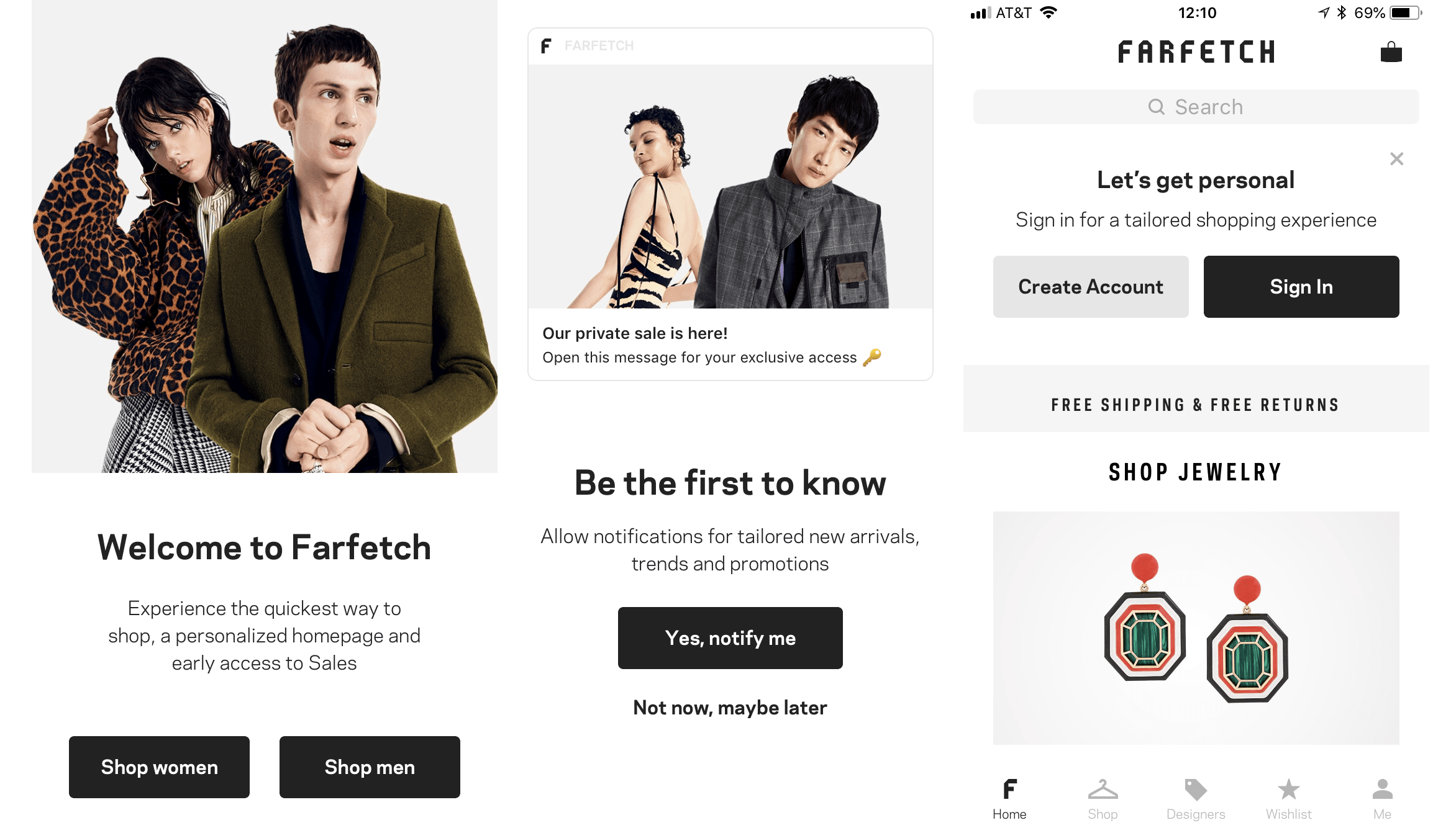
- Leanplum’s own App UX Analysis series covers all of the major user flows — our latest analysis was on the m-commerce app Farfetch.
From welcome to opt-in to account creation in three steps: Farfetch’s minimal onboarding flow
It can be intimidating to make high-level changes to your app, and it’s always safer to roll out updates in a controlled fashion rather than pushing the change to every user at once. Just don’t get too trigger-happy with user flow overhauls and you’ll be fine.
Developing and Perfecting Your Mobile App User Flows
As with most things in marketing, user flows are both an art and a science. It takes a bit of creativity and trial-and-error to come up with UX ideas that will really “wow” your users — but it’s always best to base those ideas on data, instead of relying purely on gut feel.
That’s where mobile marketing platforms can help. With a platform like Leanplum, you can use robust user data and flexible A/B tests to fully optimize your App UX by developing your user flows. Stop settling for a less-than-ideal product, and start developing your user flows today.
—
To learn more about what Leanplum can do for your team, check out these resources:
- Read the Just Eat Takeaway.com Case Study to see how Just Eat Takeaway.com achieved a 17% increase in total order volume
- Read our article Ten Tips to Supercharge User Engagement
- Watch our full session with Popsa, From Batch and Blast to Personalization at Scale to learn how mobile-first companies optimize engagement, experience and revenue
- We are the only engagement platform with a focus on Subscription Apps and On-Demand & Mobile Retail
- Check out the Product Tour to see Leanplum in action
- Set up a complimentary personalized demo of Leanplum


